Assignment Five: Personal Project

This final assignment asks you to apply all you’ve learned in the course to build a collection of 10-12 final images on a theme of your choice.

When you’ve completed your collection, return to the brief that you set yourself at the start, and consider how well your completed project matches up to your original intentions. Write a reflective account of around 500 words to accompany your images. Below are a few ideas:

  • How did you choose your theme?
  • Was it a good choice?
  • What went well?
  • What went badly?
  • Did you stick to your original brief or did you find yourself departing from it? If yes, then why?
  • What technical problems did you experience?
  • How did you solve any technical problems?
  • Are you pleased with your final collection?
  • What could you have done differently?

Before I begin this assignment, I remembered that my tutor gave me some advice regarding this upcoming final assignment. Below is his advice:

“Jumping ahead a little it might be worth thinking about the following in relation to the fifth and final assignment.  The shots an editor would be expecting to see in a photo story would be Establishing [setting the scene], Portrait [Human Condition], Action and Detail shots.  Obviously depending on what you are trying to say with the work, they would not always include all of these.

Photographic stories are the visual communication of a personal experience.  They can be considered unique and can provide an excellent vehicle for personal expression.  In order to communicate effectively, you must try to make a connection with what is happening.  In order for this to work, you must research your subject thoroughly and if the story includes people, patiently observe before starting to photograph them.

Just to dwell on the subject of the photo story for a while, it is important for you to have a ‘point of view’ or an ‘angle’ for the story.  With this work you could argue it was capturing the space of yesteryear. You must have an opinion about what is being recorded and this should in turn come across.

The most popular subject for the photo story has always been the ‘human condition’.  The aim is usually to select one individual or group of individuals and try to relate their story to the viewer.  The story may then relate the experience to a brief or extended period of time.”

After taking my tutors advice into consideration, I decided on a subject that I wanted to focus this assignment on. During my studies of Photography 1: The Art of Photography, my fifth and final assignment was Assignment Five: Applying the Techniques of Illustration and Narrative. For that assignment, I focused on Bristol zoo, and decided that I would base that assignment around the ‘Good Sides’ of zoos and conservation. I remember reading through my previous tutors feedback regarding that assignment, and it has played on my mind ever since. Below is some of her feedback regarding that assignment:

“I think that you have chosen a great subject in Bristol Zoo, you might be interest in the work of Britta Jaschinski “ZOO” where she took monochrome images within zoos but challenge the celebratory image of the zoo that the organization would want to put across, showing an oppressive place with animals shown very much as in captivity, perhaps with more of a political slant than the images you have produced.”

“You have adequately realised your ideas in this project and presented your work well. You show the zoo in some images as a place to visit to see these particular animals but I feel some images look a little more snapshot in appearance as they include the wires of the cages which you wouldn’t usually see in images to promote a place, zoos battle against this view that people have of animals in cages and focus more on the conservation side of things. It is more likely to see these sort of images in a more challenging work on zoos. For promotional work showing the positive side of zoos I would expect to see more images of animals looking like they are in their natural environment, for example the meerkat, bird and reptile images.”

I remember her feedback mainly because I agreed that some images I used included cages or glass windows, which is not something that you would want to include in a photograph if you were promoting zoos and conservation. As my tutor stated, if you were promoting a zoo, you would want to show the animals in their natural environment, not behind cages or glassed enclosures.

Thinking back to my tutors advice for this assignment; “Just to dwell on the subject of the photo story for a while, it is important for you to have a ‘point of view’ or an ‘angle’ for the story. You must have an opinion about what is being recorded and this should in turn come across.” Therefore, this meant that I have chosen to focus this assignment on ‘Bad Side’ of zoos and conservation. I would have to multitask whilst completing this assignment, and re-do my previous assignment ( Assignment Five: Applying the Techniques of Illustration and Narrative ) , as it wouldn’t make sense to keep the images which included cages in the previous assignment.

Therefore, for this final assignment, I will be focusing on showing the bad side of zoos and conservation. I will take my previous tutors feedback and I will study Britta Jaschinski. When shooting for my final images, I will focus on showing the animals in their cages, glassed enclosures and I would try to focus on their expressions to see if I could capture any depressed faces.

Before I began photographing any images for this assignment, I decided to do research regarding the bad side of zoos and conservation. We don’t usually hear about the bad side of zoos and conservation. I personally think that it is withheld for a reason, so that we don’t question their work, the captivity side and any deaths for example. However, I also think that we purposely shield ourselves from even thinking that there is a bad side to zoos and conservation. When we visit a zoo, we think that out ticket monkey will go to help pay for the upkeep of the animals and the zoo itself, and when we are inside, all of the animals are happy, well fed, looked after, enjoying where they are, however, this may not be the case, and these false smiles and fake behaviour could in fact be hiding something much more shocking and upsetting. I wanted to make sure that I began with research, in order to see the wider perspective of this subject. I didn’t want to be just influenced by my feelings and my previous experiences of zoo visits, I wanted other people’s views and opinions, to help me gain knowledge of bad experiences that they may have witnessed for example.

I began by reading an article written on the PETA website regarding the reality of zoos. The article was written by Michelle Carr in 2013. http://www.peta.org/living/entertainment/reality-zoos/

Michelle Carr wrote this article, in response to a question she had received from a reader. The question was from an animal lover in St. Louis USA , this reader asks; ‘ I’m a huge animal lover, and I understand why the circus is bad for animals, but what about zoos?’ Carr responds by confirming that not many people are aware of the amount of cruelty behind zoos. She goes on to explain her experiences when visiting zoos as a child and quotes,  ‘When I was a kid, I went to the zoo all the time with my family. I loved pandas as a kid (still do!), and I thought being able to see them in person would be neat. But once I saw them “up close and personal,” I realized that the animals were miserable. It instantly became very clear to me that the animals imprisoned in zoos are sad and don’t want to be kept in artificial environments, have people gawk at them, listen to children who bang on the windows of their enclosures, or have cameras flashing in their faces. To put it simply, zoos are imprisoning animals who want to be free’.

This is sad to hear, as my own personal experiences when visiting zoos as a child, have been exciting and good. I have always loved visiting the zoo, and still do, so to hear that someone who was a child at the time, noticing something like this and realising that something was wrong, even back then, makes you question what really goes on behind closed doors, and how long has this been going on for.

Carr goes on to explain that captive animals are essentially deprived of everything, from their natural environment, all the way up to the correct type of food suitable for that animal. She advises the reader, that captive animals can sometimes suffer from ‘Zoochosis’, a heart-breaking condition which affects animals who have been confined for a number of years. This is usually shown by the animal rocking back and forth, or pacing around their enclosures. This is something that I have previously read about and have watched on documentaries on the television. It is an awful thing to watch, and I am fortunate to have not witnessed this in my local zoo. Carr explains that animals suffering from Zoochosis are often given medication such as Prozac, which will alter their mood, essentially calming them down and making them more docile, in order to stop the symptoms, as visitors to zoos were stating to witness the behaviour problems first hand, and were raising the issues with the zoo itself.

I read an article written by Liz Tyson on 23 June 2014, after she had visited Chester zoo, UK. She mentions that she witnessed an elephant showing the symptoms of Zoochosis with constant head rocking and swaying. Her article includes a short video which is extremely sad to watch, but I have included a link below so that you can read her article and watch her video. https://www.thedodo.com/community/Liz_Tyson/if-we-really-care-about-animal-601151421.html

Carr advises us that a gorilla named Jabari in a Dallas zoo, was shot dead by police, after an attempt to escape his enclosure. A witness described that a group of teenagers had been tormenting the gorilla, throwing rocks at him and taunting him, causing the male gorilla to attempt an escape. He jumped over the walls and moats of his enclosure, only to be fatally shot. This is an extremely sad story, something which makes you sit back and question just exactly what must have been going through the gorillas mind at that time. Imagine if roles were reversed, and that was a human, being taunted, stoned with rocks and shouted at by another group of humans…. Not only is that illegal and should be a prosecution case, but it is disgusting behaviour, and the gorilla must have been terrified and petrified. Just because it happened to a wild animal, who was imprisoned in a cell, doesn’t mean that what happened was ok. This animal was shot dead because he wanted to escape this bullying and stoning. What makes this ok? Has this happened in other zoos? I hope it hasn’t, but I was shocked to even read that this has happened.

Carr then goes on to explain that un-natural weather environments such as severe cold, rain and wind, can debilitate certain animals. Lucy, a lone elephant from Edmonton zoo is usually locked inside her barn during the frigid cold winters. This means that Lucy only has a small amount of room to walk around, and is therefore locked inside for a long period of time. The constant confinement during these winter periods, have left Lucy with extremely painful and debilitating arthritis. Elephants are known to walk 30 miles in one day, but Lucy doesn’t even come close to walking that long. She has been withheld from her natural instinct and is now left with this crippling arthritis, she will be able to walk even less than she did before.

How is this ok? Why are we not told about this….? Are we only shown the ‘Pretty’ side when we visit, when in reality, behind closed doors, these things really are happening? Perhaps we as visitors are held back at a long enough distance, so that we don’t see the truth behind what really happens. Carr mentions that we as visitors, only usually spend a few seconds or minutes at the enclosures, waiting for the animals to do something exciting. So we don’t actually spend enough time looking and observing the enclosures, or the animals. Therefore we miss things.

In addition, captive animals don’t get to choose who they mate with, like they would in the wild. They are in fact, usually artificially inseminated for breeding purposes, leading to sales and trading of young between other zoos. This artificial breeding can lead to miscarriages, death and rejection between mother and baby, probably because they don’t actually know what this baby is and what to do with it, because they haven’t been taught by their mothers. This is really sad, and especially the loss of a baby, and in some circumstances, it’s a baby of an endangered species which makes it even more precious.

In regards to what Michelle Carr advises regarding zoos, she quotes; ‘ Instead of going to the zoo, you can learn about animals by watching nature documentaries or observing the animals in their own natural habitats instead. Now that I know the reality behind zoos, I don’t go to the zoo, and I encourage my friends and family to boycott them as well. I love animals, and I want to see them free, not held captive behind bars!’

I read a further two articles regarding the bad sides of zoos and conservation. Both of these articles have bullet points as to how zoos fail, and what is actually happening behind our backs. I have included the link to both articles below, however, I will include the bullet points from article two below.

Article One: PETA – 13 Times Zoos Were Bad for Animals – http://www.peta.org/features/zoo-animal-abuse/

Article Two: CAPS – 10 Facts about Zoos – March 3rd 2010 –  http://www.captiveanimals.org/news/2010/03/10-facts-about-zoos

Captive Animals Protection Society / CAPS – 10 Facts about Zoos – March 3rd 2010:

  • Zoos are miserable places for animals
  • Zoos can’t provide sufficient space for the animals
  • Animals suffer in zoos
  • Animals die prematurely in zoos
  • Surplus animals are killed
  • UK Zoos are connected to circuses
  • Animals are trained to perform tricks
  • Animals are still taken from the wild
  • Zoos don’t serve conservation
  • Zoos fail education

After doing my research regarding arguments against zoos and conservation, I decided to do photographer research. I decided to begin with Britta Jaschinski.

Britta Jaschinski

Britta

Britta Jaschinski by Spiros Politis

Jaschinski is a world-renowned, award-winning, German photographer. She learned the skill of photography whilst working in a German advertising studio. She studied photographer’s art whilst at Bournemouth College of Art and Design. Ever since she was young, she had empathy for animals.

On January 1st 2010, Sublime Magazine published an article about Britta Jaschinski called ‘Cage Fighter’ written by Stephen Armstrong.

Britta Jaschinski Sublime Magazine January 1st 2010 Article 'Cage Fighter' by Stephen Armstrong.

Britta Jaschinski, Sublime Magazine. Article ‘Cage Fighter’ by Stephen Armstrong, January 1st 2010

Her parents quoted that they would find Jaschinski ‘Scooping insects out of her sandpit, worried she might squash one, she turned vegetarian at 16′. Her animal and nature photography has won her a dedicated and strong international following.

Walking past London Zoo gave her an idea which later turned her into a well-known international photographer.  Jaschinski quotes in an article for Sublime magazine  ‘Even as a kid I felt uncomfortable going to zoos but I could never express why,’ she explains. ‘While other kids licked ice creams and laughed at the animals, I just felt an intense pain in mind and body. And when I developed my photos I could see why I felt so deeply depressed about the fate of the animals incarcerated in the name of education and conservation. My Zoo book was the result.’

On May 13th 1996, Phaidon Press published her Zoo book. 112 pages of black and white, bold, captivating photographs which showed animals in concrete cells, glass compounds and caged exhibits. Below are two reviews for her book;

Britta Jaschinski Zoo Phaidon Press ISBN-13: 9780714834726 ISBN-10: 0714834726

Britta Jaschinski
Zoo
Phaidon Press – 1996
ISBN-13: 9780714834726
ISBN-10: 0714834726

‘A point forcefully made through outstanding photography.’ (Amateur Photographer)

‘Here is a book with almost no text, but full of unease and mystery…’ (The Good Book Guide)

Her second, Wild Things followed in 2003. This photo book is quite simply apologising to the world for human interference and destruction.

She is a member of CAPS, which stands for Captive Animals’ Protection Society

She quotes:

“We talk to animals but we don’t listen to them. We stroke them with one hand and beat them with the other. CAPS gives animals a voice and fights for their rights. Animals don’t need us but we need them. We must protect them from ourselves.” Britta Jaschinski.

Britta Jaschinski, Zoo 1996

Britta Jaschinski, Zoo
1996

This image is saddening, elephants are beautiful, majestic animals, and when I think of elephants, I think of them in their natural environments. Seeing an elephant behind bars, to me symbolises the same as being a prisoner in a cell. The trunk of the elephant is reaching out almost to touch the walls trying to find a way out, or shouting after someone for help to get out of the cell. This is a very strong image, and as a viewer, it is sad to see this. You don’t want to think of an animals stuck behind bars in a zoo, however, if you were to perhaps look deeper into the story behind this elephant, it may not stay in this cell all day, it probably only sleeps in there or perhaps is in there for a short period of time, and in fact has a bigger enclosure somewhere. However, seeing this image shocks you first into thinking about this poor elephant trapped, and not necessarily thinking about the story behind the image.

Britta Jaschinski, Zoo 1996

Britta Jaschinski, Zoo
1996

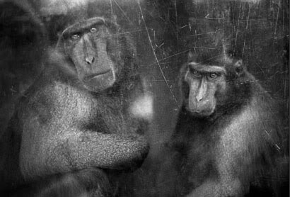
This is an interesting image. Jaschinski has managed to incorporate the scratches on the glass windows of these primates enclosure. For me, when I visit the zoo, I stand for ages looking into the eyes of the primates, as you can tell so much from their eyes. You can see when they are sad, happy or even depressed. Jaschinski has managed to capture both of these primates eyes, which can be hard, as usually one animal always moves or looks away when you try to photograph them. Capturing both sets of eyes is great, as this has created a depressing looking image. You can see the boredom and depression in their eyes. The scratches on the panes of glass can be interpreted as escape attempts, or boredom. This is a very interesting image, and something I will keep in mind when photographing the zoo.

Britta Jaschinski, Zoo 1996

Britta Jaschinski, Zoo
1996

When I think of a camel, I think of the desert, lots of sand, beaming sun. However, this is thee complete opposite. Concrete walls and wire to keep the camel from escaping. The enclosure doesn’t even look as though it is suitable for a camel to reside, it looks small. Similar to the elephant photograph, perhaps there is a story behind why the camel is in this concrete enclosure, however, a photograph speaks a thousand words, and when you see this first, you immediately think that the camel is trapped in a cell.

Britta Jaschinski, Zoo 1996

Britta Jaschinski, Zoo
1996

It’s hard to say that this is my ‘Favourite’ photograph, however, it is. Jaschinski has captured an amazing image here of this gibbon monkey. When I look at this photograph, I can almost feel the sadness, the depression, the boredom of this little monkey. She manages to compose this image so the monkey is in the centre of the frame, surrounding it with what looks like a circular toy or running wheel, keeping him as the main focal point in the image. She keeps the monkeys eyes visible, in order to see his expression clearly. She also manages to capture the cage wires ever so faintly in the foreground, they aren’t distracting which is good, as you want the focus to be on the monkey, however, you can still see that there are wires, and this monkey is enclosed and bored in his enclosure. This is such a brilliant photograph, and I hope to capture something similar when I photograph the zoo.

Looking at Jaschinski’s Zoo photographs, one thing that is noticeable is that she uses black and white / monochrome. Using black and white enables you to bring the viewer’s attention to details within the image such as the wires from the cages, scratches on the panes of glass and the look of depression in the animals eyes. Using colour within photographs like this may distract viewers from the main subject, keeping to black and white gives you the impression of depression, bleakness, coldness, giving the appearance of a dull world that these animals live in. You are also able to show the detail from the scratching of the glass, dirt on the walls or wires, which you may not see so clearly in a colour photograph,

Keeping the cage wires, scratches in the glass windows and black and white final images, is something that I will remember when shooting my photographs and when I am processing my final images.

The second photographer I researched was Garry Winogrand.

Garry Winogrand Self Portrait

Garry Winogrand Self Portrait

Garry Winogrand was born January 14th 1928, in New York City. After high school, he enlisted in the US Air Force, but later returned to New York in 1947 to study painting at City College of New York and Columbia University.

He later decided to focus his studies on Photography and Photojournalism, which he proceeded to study in college. In the 1950’s and 1960’s, Winogrand began working as an advertising photographer and a freelance photojournalist.

In 1969, Winogrand’s photographed his observations of the Bronx Zoo and Coney Island Aquarium.  A collection of these photographs completed his first photo book called ‘The Animals’, which contained images showing the connections between humans and animals.

‘Winogrand’s zoo, even if true, is a grotesquery. It is a surreal Disneyland where unlikely human beings and jaded careerist animals stare at each other through bars, exhibiting bad manners and a mutual failure to recognize their own ludicrous predicaments’.
–John Szarkowski

Garry Winogrand, The Animals. Published By: The Museum of Modern Art, New York; 2nd edition (April 2, 2004)

Garry Winogrand, The Animals, 1968.
Published By:
The Museum of Modern Art, New York; 2nd edition (April 2, 2004) ISBN-10: 0870706330 ISBN-13: 978-0870706332

Garry Winogrand, The Animals, 1968.

Garry Winogrand, The Animals, 1968.

This image for me represents young children’s attention spans. You don’t normally see rhino so close, it’s not an everyday occurrence that we are fortunate to one. When I think of rhino’s, I think of the African safari sites. However, these children clearly aren’t interested in looking at these beautiful animals, which by the way are an endangered species, but they are more interested in hanging off of the railings like monkeys hanging from monkey bars. Even the mother is more interested in watching these two children messing around, then looking at the rhino. This is an interesting subject, and knowing that there will be similar situations at Bristol zoo when I go, I will keep an eye out for situations like this, which I can photograph.

Garry Winogrand, The Animals, 1968.

Garry Winogrand, The Animals, 1968.

This is a sad image. Winogrand manages to capture the eye of this rhino, looking up to this gentleman. In the real world, unless you are on safari, lucky enough to get this close to a rhino, then there is no way you could possibly be this close. Capturing this intimate moment of curiosity, shows how this rhino is not acting how it would in the wild. It is sad to see that an animal which should be scared of humans, is actually showing it’s helplessness, and it’s need of human love. When shooting my images, curiosity from the animal to the visitor, is something that I would love to try and capture, as we should technically be curious about them as well.

Garry Winogrand, The Animals, 1968.

Garry Winogrand, The Animals, 1968.

Who says that animals don’t have feeling! This is such a brilliant photograph. There is a saying ‘It’s like being in a zoo’, you normally hear that when you are in a crowded situation, being stared at. You may encounter this in a waiting room or a job interview. Imagine being in cages, enclosed for the rest of your life….. hundreds of scary, noisy people staring at you, shouting at you, poking you every day of your life. This is what it is like, being an exhibition piece in a zoo. Winogrand has captured a  photograph showing the true feelings of what this bear thinks about being poked at. This is great! I have to keep this in mind when I shoot my images. Animals facial expressions and behaviour, can tell you a lot about how they are feeling in that current situation, and this bear does just that. I want to try to capture the expressions on the animals face when I shoot my photographs, as their expressions can really help make an image.

Garry Winogrand, The Animals, 1968.

Garry Winogrand, The Animals, 1968.

This photograph is similar to Jaschinski’s photograph of the elephant in the cell room. Similarly, both of these elephants have their trunks stretched out, almost looking for attention, help, or a method to escape. This elephant is being hand fed by visitors by the looks of it, not something that would usually happen in the wild. The positioning and stance of this elephant is somewhat slumped and leaning, almost as though it has given up hope.

Garry Winogrand, The Animals, 1968.

Garry Winogrand, The Animals, 1968.

This is an interesting photograph. To me, the visitors are more interested in other things, that they are not even looking at the seals. One woman looks like she is crying, one woman is being kissed by a male, whilst looking bored and uninterested, and one male isn’t even looking at the seals. From my point of view, the seals look more interested in the visitors, than the visitors being interested in the seals. This shows how we as visitors take these animals for granted. You wouldn’t normally be able to see these animals this close in the wild, so why not appreciate seeing them this close now…… They are positioned directly in front of you, yet you still ignore them…. This is something that I need to look out for in the zoo when I shoot my images. Lack of interest from the human side, yet much interest from the animal side, shows almost a role reversal.

The composition of this photograph is also interesting, as Winogrand has composed it so that there is only a small amount of water visible. It doesn’t look as though it is enough water for all of them to reside or swim in on a daily basis. I personally think that this is done purposely, to portray and even smaller enclosure and lack of room or space, making us as the viewer concerned about how small their enclosure must be.

Comparing Winogrand’s work to Jaschinski’s, I can see some similarities and some differences. Thee most obvious being that they both have used black and white / monochrome photographs. Thus meaning that each image draws the viewer’s attention in without the distraction from any colour. The second being that they both decided to keep the cages, wires and glass in the image, adding to the hidden message of captivity and depression. Winogrand, however, makes a purpose of including people within his photographs. Including guests at the zoo, observing the animals, with the animals observing the guests gives the image two stories. One being what the people within the photograph were thinking when looking at the animals, and the second being what the animals were thinking when looking back at the people. The inclusion of people looking at the animals and the animals looking back has a sad message of captivation, not being able to leave that enclosure, being stared at constantly with little children making strange scary noises, and banging the cages or glass windows. The saying ‘ It’s like being in a zoo’ springs to mind, when I look at photographs like this, because we as humans don’t necessarily enjoy being stared at by fellow human beings, however, on a daily basis, these animals are being watched, stared at, tormented and locked in an enclosure.

This is very interesting and is something that I will think about when shooting my photographs. Including people in the image may help make an interesting photograph.

I have found an interesting blog regarding zoos and Winogrand’s work. Written by Peter Barker on February 28th 2013, http://peterbaker.org/the-animals/

Barker writes about whether or not Winogrand was photographing the ‘Truth’ about what really happened / happens at zoos, whether he was finding the confinement of animals who had to perform tricks for food funny, or whether he just photographed these situations for us, the viewers to make our own choices. Peter Barker doesn’t agree that Winogrand’s zoos are everywhere, and there is infact brilliant zoos around. Zoos which don’t humiliate animals in the return for treats, zoos which care for the conservation of the species, and zoos which show that animals are happy in the environment that they are in.

However, Barker then goes on to question whether or not these ‘Happy’ outer appearances are in fact just for show, and whether deep down, Winogrand did actually manage to see beyond the ‘Front cover appearances’ and captured the sadness within each animal.

‘Until relatively recently zoos were called menageries, and were hobbies of princes, serving the same function as court dwarfs and court musicians. After the rise of modern science such simple entertainments seemed frivolous, so menageries were called zoological gardens—the idea being that they were really laboratories for the study of animal behaviour. While this concept is superficially plausible, a moment’s thought makes it evident that one cannot very well study the behaviour of lions and gazelles, for example, as long as they are locked in separate cages. The real reason that zoos have been built, and even sustained with tax money, is that people think that the other animals are (1) noble, or (2) funny looking. Winogrand’s book proves that those who hold the second opinion are correct. The other animals are indeed funny looking.’ Peter Barker

‘For those of us on the other side of the bars the case is less clear. We are there because animals look funny, or conceivably because they look noble, but there may be a darker side to the satisfaction we find at the zoo. It may be that we are relieved to find that even the animals, with their much-­‐publicized supposed virtues—sharp of tooth, swift of foot, courageous in protecting their young, good eyes, etc.—that even the animals can be reduced to a state of whimpering psychic paralysis if they are forced to live in circumstances similar to those of the typical modern urban dweller. After all that has been said in the past fifty years concerning man’s deep-­rooted inadequacies, it is bracing to go to the zoo and observe that the orangutang, magnificent though he may be in the jungle, is no better than the rest of us when forced to live in a modern city.’ Peter Barker

Whether what Peter Barker is saying has any truth to it, and whether or not you or I agree or disagree with what he is saying, you can see from Winogrand’s photographs, that there is indeed some truth to this. Zoos have been called Zoological Gardens to make it sound ‘Better’ and more appealing to us as customers. We want to think of the animals in their natural environments, even though we know that’s merely impossible as we are entering a concrete jungle, filled with cages and windows, for us to peer in and look at them. One can argue that yes, zoos do a brilliant job at saving animals, helping with conservation so that in years to come, when several animals which are then extinct, can be used to re-produce to then re-populate the wild. However, is keeping them locked away in these concrete, caged houses, really the best thing for them in the end. This is a discussion that could have many answers, and can be looked at from many different angles, linking it to things such as hunting and poaching. The possibilities are endless.

The third photographer I researched was Michel Vanden Eeckhoudt.

Michel Vanden Eeckhoudt

Michel Vanden Eeckhoudt

Eeckhoudt is a Belgian photographer, who lives in Brussels. He is well-known for his animal photography, just like Jaschinski and Winogrand. Usually, his animal photography looks into the troubling and sad relationships between pets and their masters, however, in 1982, a book called ‘Zoologies’ was published containing sad images of captive zoo animals.

Zoologies Michel Vanden Eeckhoudt Paris: Delpire, 1982. ISBN: 2851071041

Zoologies
Michel Vanden Eeckhoudt Paris: Delpire, 1982.
ISBN: 2851071041

“The clear, cold and cruel eye of Michel Van Eeckhoudt forces us to see what onlookers zoo perhaps forget to see: that the animals in the pen are the largest permanent exhibition of sadness.”

Zoologies 1928 Michel Vanden Eeckhoudt

Zoologies 1928
Michel Vanden Eeckhoudt

This too is a sad image, similar to that of Jaschinski’s gibbon monkey. With this monkey however, having it almost pleading for help with hands on the glass, is extremely sad.

Zoologies 1928 Michel Vanden Eeckhoudt

Zoologies 1928
Michel Vanden Eeckhoudt

To me, this shows the sheer ignorance of humans. Eeckhoudt has captured a moment in time which shows one of thee most majestic, powerful and dangerous animals on this earth, being harassed by a man in a suit, somewhat sticking his face or head, into the lion’s head and mouth area. Fair enough, by all means get a close look at one of these incredible animals. When I’ve visited the zoo before and the Lion enclosures, I’ve stood for ages just watching the lions, simply because I will never be able to get that close to a wild animal like this again, unless I am fortunate in the future to go on a safari. However, I don’t torment the animals, by poking them, sticking my face in theirs and so forth. The sheer ignorance of this man astonishes me, if this was in the wild, this Lion would have eaten you. Just because it’s behind bars and it’s dignity, rights, and life has been taken from him, doesn’t mean that we as visitors have the right to not respect them still. You are tormenting him, and almost taunting him by showing that you are now the dominant male, and I can do what I want because I know that these bars will stop you from eating me………… I hope not to see something like this on my visit, but you never know. If I do, I may have to photograph it to show human ignorance and lack of respect for animals.

I also find this an oddly composed photograph, I am unsure as to why he never cut the males face out from the right hand side of the frame, and only focused on the male in the background?

Zoologies 1928 Michel Vanden Eeckhoudt

Zoologies 1928
Michel Vanden Eeckhoudt

This is similar to the enclosure we have at Bristol zoo, for the lions. People are able to get this close to the glass panels. I hope to shoot images like this, because I want to show again, how something that could kill a human being, is now stuck behind a pane of glass or a cage, still following you and looking at you as though you are prey….. the only thing is that these bars, and windows, are stopping them.

Comparing Winogrand’s and Jaschinski’s work to Michel Vanden Eeckhoudt, you can again see similarities and differences. The three of them use black and white / monochrome photography, to stop colour from distracting the viewer and to enhance to main message or subject within the photograph. Like Winogrand and Eeckhoudt, they both include the visitors to the zoo, within the photograph.  They all include the cages, glass windows, scratches on the windows and depressed faces on the animals.

My Personal Project:

Taking my photographer research into consideration , I now know that for this assignment, I want to produce a set of photographs, using inspiration from all three of the photographers I have researched. Taking inspiration from my previous assignment, Assignment Three: Monochrome, I will convert my final photographs to monochrome, as by removing any colour distractions, I will be able to include different textures and details on the wire cages, glass panels, walls, details on the faces of the animals, sharper details on the facial areas. I will also be able to show different shapes and tones of enclosures. With the removal of colour and the inclusion of details and texture, I believe this will help to create a sombre, cold, depressed and sad feeling to each image, as it will show elements of the zoo, which can be missed or overlooked in a colour photograph.

I want to compose my images so that I include cages, glass windows, concrete enclosures and zoo visitors in my photographs. I will try to capture the moment when the animal(s) look back and the visitor(s), perhaps looking at each other through a cage or a window. I want to try and capture the expressions of the faces of the animals, including their eyes, as I believe this will help produce a better final image.

Therefore, for this assignment, I will be revisiting my local Zoological Gardens, Bristol Zoo. Pre-visualizing how I wanted my photographs to look, and knowing what animals I wanted to photograph,  I decided that I would take my usual Canon 18mm-55mm lens, and my Sigma 70mm-300mm lens. Taking both a 55mm lens and a 300mm lens, enabled me to capture any small details on the animals faces, or capture any animals which were too far away in their enclosure. By using a long lens, I am also able to zoom into an enclosure, cutting out vacant space or parts of the enclosure I don’t want in the frame, and I am able to portray an even smaller enclosure, similar to how the photographers I researched have composed their images.

Having being born in Bristol, and visiting the zoo on that many occasions, I pretty much know my way around in the dark, however, with techniques learned at the beginning of this course, in Exercise: Your Own Workflow, I still decided to plan my visit so I knew exactly where to go and what animals to see first before any crowds arrived. I arrived at the zoo at approximately 11:00am. The zoo was quiet with only a handful of people walking around. I decided to go straight to the Lion enclosure, as I thought that by going there first, I would be able to photograph them without anyone in the way, especially as I know that throughout the day, the lion enclosure is extremely popular and would be busy. Unfortunately, they were sound asleep and wouldn’t budge for anyone. I was surprised that I was on my own, and I was able to take a quantity of photographs from different angles, of the lions asleep. At one stage, one of them woke up, and at the right time, I was able to shoot some images of him looking out the window as if to see where the visitors were. Of course, I did want to take photographs with visitors in the shot, similar to Eeckhoudt’s photograph of the tiger, however, being the only one there, I knew that I would have to revisit the lion enclosure later in the day for those shots.

After visiting the lion enclosure, I walked through the butterfly house, which was much too hot, and being as it was an actual reproduction of a tropical rain forest, I knew that this wasn’t the best place for taking ‘Captivity’ shots, as these butterflies and moths were almost in a real jungle environment, but that didn’t stop me from taking photographs which I knew I could use later on, with other assignments and projects.

After cooling down from the butterfly house, I decided to visit the giant tortoise, and reptile houses. By this time, it was mid-day, and therefore, crowds of people had arrived. It took me a while to manage to shoot the giant tortoise, as there were too many people stood in front of their glass enclosure. I could have photographed this, but as you couldn’t see that giant tortoise, I knew that this would be a wasted photograph, as it would only show a crowd of people looking into an enclosure, but we as viewers wouldn’t be able to see what was in that enclosure. Using my senses, I managed to find a small room where two other giant tortoise were. They were in a barren room, with just some bedding and lights. No one was looking at them, and to me, I knew this could be an interesting shot. I took several shots of this pair, however, I was then engulfed by people who had somehow managed to find this secret enclosure, which meant I then had to move along.

I worked my way around the zoo, until I reached the primate section and gorilla island. These have always been one of my favourite areas in the zoo, and I stand for ages watching the primates. You have to watch their every movement, as they always do something interesting, quirky or funny. Unfortunately though, I’m not the only one that loves the primate section. It was crowded and full of people. I knew that this was the perfect timing for me to stand back from the crowds, and shoot them watching the primates, as the primates then watched them in return, keeping in mind the work of Winogrand and Eeckhoudt. It is fascinating to watch, especially when you look at the primates eyes, and you can see confusion, depression and sometimes even sadness, at the simple fact that us visitors are stood staring at them whilst they go about their daily business. Once I had managed to shoot photographs of the visitors, I decided to focus on trying to capture some shots of the primates, similar to that of Britta Jaschinski’s work, especially of the gibbon monkey. They have an outside enclosure, which is caged off from the visitors. I decided to stand by the fences, and see whether or not they would venture out from their glass enclosure, as they were becoming agitated with the noise from children banging on the windows. I was extremely luck, and one brown spider monkey, decided to venture out into the caged enclosure. I was quick enough to be able to shoot some photographs, whilst he was climbing along the cages. And to my luck, he decided to sit right in front of my camera, on a tree, and positioned himself similar to that of Britta Jaschinski’s monkey. I was thrilled, and shot away making sure I captured this moment before he moved off inside again.

After this, I decided to visit the Gorilla island. By this time of the day, hundreds of visitors were now inside the zoo. They were doing a lot of renovation to the gorilla island area, and only the male silver back was inside the 360 degree glass enclosure. The rest of the gorilla family were outside, asleep on their island. I decided to focus on the male silver back, and stood at the back of the crowds, in order to shoot several images of the gorilla being watched by the visitors. Once I had photographed this, I managed to squeeze my way into a corner of the window area. I stood and waited with camera ready, and shot the male silver back, looking back through the windows at the visitors. He decided to lie down with his head resting on his hands, and I noticed that there was a sign on the pillar I was stood next to. I positioned myself so that the pillar and the sign were visible, but the depressed gorilla was in the centre of the frame. I knew that this would be a great shot.

I then moved onto the seal and penguin coast area. This was packed with visitors because they were doing the specialised talk about the penguins and it was feeding time for them. I knew this would be great for taking shots of the crowds and the hand feeding of fish which the penguins were receiving. I wanted to try and get the hand feeding in with the crowds of people, as the hand feeding of fish, is not something that ‘Normal’ penguins would do or receive, so by including this into my photograph, I would be able to show the unnatural way of feeding. I managed to squeeze into a corner near a rock. I was angled so that I could photograph the zoo keeper feeding the penguins, whilst being able to incorporate the crowd of people, watching the penguins. Moving onto the seal section, this was not so crowded, however, whenever I seem to think that, the crowd of people then decide to appear from nowhere and engulf you. I managed to cling to the wooden railings overlooking the seals. They were very active as they knew it was nearing feeding time for them too. I managed to shoot several photographs of them jumping through the water, however, I struggled trying to use the correct shutter speed, and by this time, they had moved on, and were interested in something else. Once I had found the correct settings, I managed to shoot three of the seals, looking up at the visitors, as they looked down upon them. This was similar to that of Garry Winogrand’s photograph of the seals he captured. I composed the images, using a long lens, so that the enclosure looked smaller, and I could focus on a small amount of water with them in it, and the visitors watching them. I also then managed to shoot the seals during feeding time on the ‘Pride Rock’ until they decided to move the seals to the separate enclosure.

Afterwards, I decided to visit the Meerkat enclosures. I knew that this would be a popular section of the zoo, so I was expecting to be here for a while. When I arrived at the enclosure, I realised that it wasn’t too full, and I was the only person photographing the Meerkat’s in their outdoor, glass enclosure, yet the inside glass enclosure was full. I decided to start shooting with my 55mm lens, taking shots of them in their surroundings, digging the corners of the enclosure, as it trying to escape, then I decided to use my 70-300mm lens. I decided to use this, as there was one meerkat sat on his ‘Pride Rock’ almost posing for his photograph to be taken. I positioned myself so that I could zoom in for close detail and zoom out for the background. In the outdoor enclosure, there is a ‘Mole Hill’ type area, with glass or plastic windows, in which you can climb into to be ‘Inside’ the meerkat enclosure yourself. Two young male children decided that they would use these and were messing around as their parents attempted to photograph them with the meerkat in the photograph. I decided that like Winogrand and Eeckhoudt, I would use this opportunity to shoot this photograph, showing that these young boys were only interested in messing around, and weren’t interested in actually looking and appreciating the meerkat. I knew that this would turn out as a great final image.

After the Meerkat section, I made my way around the rest of the zoo, taking opportunity to photograph any animals I missed, and incorporating the crowds of people who had descended on the zoo. I left the zoo at closing time which was 16:30, I had been there all day. I knew that I had managed to capture some great images which would work well for final images, and that on some occasions, I was lucky enough to capture images similar to that of the Jaschinski, Winogrand and Eeckhoudt. When I got home and looked through the 500 photographs I had taken, several immediately jumped out at me and got my attention. I knew that these would be the ones I would use for final images, as they were exactly what I was hoping to have photographed.

Final images:

Choosing my final images was not that hard, as the ones that caught my eye, I knew were the ones that would make great final images. I had to keep in mind that I would be processing these into monochrome images. I opened a separate file in my images, and copied these images into the folder. I chose 20 in total, even though I knew I was only to select between 10-12 final images, however, I knew that by selecting 20, I would be able to process them, and decided whether or not they work well in monochrome, as sometimes, an image may look better in colour, rather than monochrome, and vice versa. I decided to use Lightroom 4.4 for processing my images into monochrome, as I am comfortable using Lightroom settings. I have gained experience using the settings such as converting the image to black and white, then altering the colour tones, lights, darks, blacks, whites etc, in order to produce a well composed monochrome image. I would then use Photoshop Elements 9 for any brush tools, such as lightening eyes, details, dodge and burn areas, as I am comfortable using these adjustments in Photoshop.

Regarding processing and adjustments, for each image, I tried to use the same adjustments. I converted the colour image into black and white in Lightroom, I then used the colour sliders to alter the tones of the areas within the image, to make them lighter or darker. I then adjusted the tone curve, contrast, brightness, darkness, clarity, sharpness and exposure. Once this had been done, I then saved the image, and opened it in Photoshop Elements 9. Once in Photoshop, I used the smart brush tool and enhanced details, dodge and burned areas, sharpened areas, and lightened eyes.

The Photographs:

IMG_6168 - Copy copy

Photograph One: Asiatic Lion Enclosure – Bristol Zoo – 2015

When taking this photograph, I used inspiration from Michel Vanden Eeckhoudt’s photograph of the tiger in the glass enclosure. I wanted to achieve somewhat the same type of photograph, however, at the time when I shot this, there was no one around except myself. This meant that I could then focus on taking photographs, portraying the loneliness of the lions. These lions slept the whole time I was at the zoo, so I was lucky enough to photograph this lion waking up, only because he heard a helicopter flying past. As this enclosure was almost a 360 degree enclosure, I decided not to shoot from the front on, but rather to go around the back, and photograph them with the windows the opposite side, in the shot. This would give the perspective of what the lions see on a daily basis. Through the eye of the lions you could say. In a way, with no visitors around, and only the Lion looking out to a vacant zoo, it appears as though the Lion is somewhat happy that there are no visitors, and now he can get some peace and quiet. It was just unfortunate that there were no visitors standing, watching them through these windows, as this could have been interesting, seeing what the lions see on a daily basis.

By shooting from this angle, I was able to compose a photograph which showed a small area of glassed enclosure, portraying it as being smaller than it actually was. Similar to the work of Winogrand and Eeckhoudt.

I decided to focus the lions face in the middle of the frame, whilst keeping two stickers on the windows visible and framing his face. The stickers on the windows are of a female lioness and a giraffe. I found this interesting, as in the wild, it has been known for lions to hunt giraffes. Keeping these stickers in the shot, allowed me to frame a ‘Lazy, Sleepy’ Lion, with an active hunting type scene.

I am very pleased with the final image, I believe that this image works well in monochrome, more than colour. I was able to enhance the texture of the wood chippings, the details and texture on the lions face and mane and in some places, you can see the scratches on the glass window panels. I also like the different tones in this photograph, the difference between light and dark, you are also able to see the small white glint in the Lions eye. I am to use the colour version of this image in the future, I would probably work on the saturation of colours, brightness and darkness, and sharpening the details.

Photograph Two: Asiatic Lion Enclosure - Bristol Zoo - 2013

Photograph Two: Asiatic Lion Enclosure – Bristol Zoo – 2013

I took this photograph in 2013, whilst photographing Bristol Zoo for my other assignment. The two male brothers, Kamran and Ketan, were only one year old, so were still babies. My tutor back then, advised me that this image would not be suitable for portraying the ‘Good Side’ of zoological gardens and conservation, as by showing cages, in fact does the opposite, and symbolises captivation, and entrapment. I took her advice, and decided to no longer use this image, but I saved it for another time. For this assignment, I looked back through my previous zoo photographs, and decided to use this image as one of my final images, because it is similar to Michel Van Eeckhoudt’s photograph of the gentleman in the suit, sticking his head into the lions mouth almost.

I know it is not the exact replica of Eeckhoudt’s photograph, but I don’t want it to be. I decided this would be a good final image because it is showing that again, humans aren’t supposed to be this close to wild animals, especially Lions. To be this close to a predator is unusual when you think about it, and similarly to Eeckhoudt’s photograph, it’s only the cages and wires, keeping this zookeeper from being this male lions dinner.

The raised hand in fact had a chunk of raw meat inside, in order to grab the lions attention, as this zookeeper was feeding them treats with a stick. However, showing this raised hand, is almost portraying a circus feeling, when you grab the attention of the animal to jump or stand on its hind legs, to show off to visitors. This was a similar situation, only involving meat on a stick, which made these lions jump up the cages. During this time and situation, I was unable to shoot a clear shot of them jumping with the meat dangling off of the stick, as I needed to change shutter speed, and I was being pushed by crowds, so this was the only clear image left showing what was happening.

I am pleased with this photograph, especially in monochrome. I was able to enhance the texture of the wire cages and the different tones within the image. It definitely works better with this assignment, as to my previous one that I used it for. If I could re shoot this image, I would compose it so the sign board wasn’t in the frame, however, I was unable to do so, because there were too many people stood watching. I think this is a photograph that will have multiple meanings depending on the viewers, however, this is interesting, to see how others interpret this photograph.

Photograph Three: Giant Tortoise Enclosure - Bristol Zoo - 2015

Photograph Three: Giant Tortoise Enclosure – Bristol Zoo – 2015

I spotted this hidden cell which enclosed two giant tortoises. It was barren, apart from the bedding area which one of the tortoises was already sat in. I waited for a while, waiting for the second tortoise to join the first, and managed to capture this photograph. I thought it was an interesting situation, especially as the rest of the tortoises were outside in the outdoor enclosure, yet these two were stuck inside. The one tortoise was trying to climb on top of the other tortoise, and being situated directly below a large glass window, I thought it would create an interesting final image.

Similar to Jaschinski’s monkey photograph, and Eeckhoudt’s monkey photography, I perceived these giant tortoise attempting to look out of the window. Others could perceive it as being loneliness, especially as no one is looking at them through the opposite window. It’s as though they are hidden away, almost forgotten about.

I decided to compose this image by zooming into the room, cutting out the vacant concrete flooring in the foreground, and by only focusing on the two tortoise, the window and the lights above, portraying a small room. I decided to burn the detail into the opposite window, in order to bring out the detail from the trees outside, which would then show the difference between the barren, concrete cell inside, and the sunny outdoors with trees.

I am pleased with this photograph. I am glad that I managed to burn the detail back into the window, which wasn’t that clear in the colour version. I think this is an interesting image, especially as it shows heat lamps, yet outside, it was hot and sunny, and with it being in monochrome, you can’t see the red heat coming from the lamps. Without the inclusion of the red heat from the lamps, it helps to portray this room as being cold.

Photograph Four: Brown Spider Monkey Enclosure - Bristol Zoo - 2015

Photograph Four: Brown Spider Monkey Enclosure – Bristol Zoo – 2015

When I visited the primate section of the zoo, I kept in mind Britta Jaschinski’s work. Her photographs of the gibbon monkey behind cages really stuck with me, especially the facial features and the eyes.

I knew that attempting to compose an image similar to Jaschinski’s would be hard, especially as you are unable to tell the monkey where to sit, and animals don’t usually stay around long enough to shoot clear photographs. However, I positioned myself outside the cage, leaning on a wooden railing, and I was lucky enough to have this brown spider monkey sit directly in front of my camera, but only for a short time. As I previously described above, the noise from inside drove him out, and the noise then outside drove him back in. However, I managed to shoot some brilliant photographs of this monkey.

I positioned him in the frame similar to Jaschinski, I wanted to keep the focus on his face. Photographing him quickly, whilst being able to keep him in focus, yet keep the cage in shot was difficult, but I managed to achieve it. I made sure that I kept his eyes visible, in order to see his facial expression and the depression and sadness, similar to Jaschinski’s gibbon monkey. Even his posture is similar to her photograph.

I was extremely happy with this photograph, and converting it to monochrome was a good decision. It brings out the detail of his hair, eyes and facial features, the ropes from his enclosure and the wires from the cages.

Photograph Five: Brown Spider Monkey Enclosure - Bristol Zoo - 2015

Photograph Five: Brown Spider Monkey – Bristol Zoo – 2015

This was the same brown spider monkey, whilst he was swinging across the cage away from the noise. I decided to use this as a final image because it is similar to Michel Vanden Eeckhoudt’s photograph of the monkey behind the glass window, holding his hands up.

I composed this image making sure that he filled the frame, I wanted him to dominate the photograph, holding onto the cage as if he was a prisoner, or was trying to escape.

My interpretation of this photograph, is captivity, not being able to break through these cages, not being able to climb over the top, but being able to see through the cages the outside world. This brown spider monkey’s eyes and face show these emotions in my opinion. His facial expression is similar to Eeckhoudt’s monkey, the expression of ‘Help’ and confusion as to why this ‘Thing (Cage)’ s holding me back, why can’t I get out.

I am pleased with this photograph, as with the previous image, it works better in monochrome, as you can see the details better, and the tones in contrast.

Photograph Six: Brown Spider Monkey Enclosure - Bristol Zoo - 2015

Photograph Six: Brown Spider Monkey Enclosure – Bristol Zoo – 2015

Taking inspiration from Michel Vanden Eeckhoudt, I decided to photograph the pair of the brown spider monkeys whilst they were inside their glass enclosure. I photographed them with the cages and wires, similar to that of Jaschinski’s work, however, I wanted to include an image which showed the glass windows and people looking through at the animals, whilst the animals looked at the visitors, similar to Eeckhoudt’s work.

Composing this image was difficult, as there were many people inside the glass enclosure area, so I knew that I had to stand at an angle to the glass windows and the visitors, in order to show the layers of glass windows and the people the other side. I made sure that I composed the image, to include the window frame in the centre of the image, as this broke the image up, making the enclosure look even more smaller. I knew that there would be reflections in the windows from the lighting, people and posters, however, I knew that this would be a great image. If I hadn’t of stood at an angle to the window, I wouldn’t have been able to include both the monkeys, the glass from the window and the people on the other side. I also made sure that I included the door where the zoo keepers enter the enclosure, in the frame, as this portrays it being an artificial enclosure.

Converting this to monochrome was a good choice, as the amount of detail, tones and contrast is great. I was able to show the reflection from the glass panels, the people looking through the glass windows, the detail on the wooden structures, the monkeys and much more. I am really pleased with this image. This photograph will have many different interpretations to different people, depending on how they view it.

Photograph Six: Gorilla Island - Bristol Zoo - 2015

Photograph Seven: Gorilla Island – Bristol Zoo – 2015

Although none of the photographers I have researched, photographed a male silver back gorilla, I do find similarities between this image and the works of Garry Winogrand. I took Winogrand’s approach at standing back and allowing visitors to do as they please, whilst you shoot away, taking photographs of them looking upon the animal, whilst the animal looks upon them. Although in most of Winogrand’s photographs, the visitors are ignoring the animals, but the animals are interested in them.

With this photograph, I decided to stand back and shoot. I saw this opportunity of photographing this young child, who was actually intrigued and interested in this male silver back gorilla, unlike the children in Winogrand’s photographs.

I composed this image so that the glass window panel was framing the gorilla, again showing that this powerful animal was only enclosed between a glass window and us. It was great that the young child put his arms up onto the railings, that gave the child that interested stance. The gorilla was extremely fed up and his eyes said it all. Like I mentioned previously, when you look into a primates eyes, you can see exactly how they are feeling. This male gorilla flopped into this position and then proceeded to rest his head on his hand, thus showing the human characteristics of how we rest our head on our hands if we are sad, bored or depressed.

I was unsure whether or not to crop the right hand side of this image, making the focus be only on the young child and the gorilla in the window, however, when I made a copy of this image and cropped it, I didn’t find it appealing. I personally believe that by keeping the right hand side of the image still in the frame, I was able to give it the feeling of perhaps a prison cell, with the dividing line from the glass window frame splitting the two rooms. You can also see a second gorilla asleep in the top right hand corner, with the vacant cell below. Converting it to monochrome also helps with the portrayal of a prison cell, as I was able to remove any colour distraction which enabled me to show the blank, colourless walls. Giving the Gorilla, an almost dull, boring and plain room.

Photograph Seven: Gorilla Island - Bristol Zoo - 2015

Photograph Eight: Gorilla Island – Bristol Zoo – 2015

I took the opportunity to move to the other side of the enclosure, so that I could see the gorillas face, in order to see his facial expressions. I noticed an interesting sign on a post where I was stood, it said ‘Please do not cross the barrier’.

I knew that this could be a great photograph if I composed it well. I decided to bend down slightly, in order to focus on the gorillas face, I wanted to frame him with this post and the post inside his enclosure. By doing so, I was able to frame him in an almost triangular shape. I kept him in focus, which therefore made the writing on the sign out of focus, however, it was still visible and readable.

Keeping in mind that we were in a 360 degree glass enclosure, with only the framework holding up the glass, there was no way we could ‘Cross the barrier’ as we would technically walk into a glass panel. Therefore, this sign has an interesting meaning, and can be see to represent the ‘Barrier’ stopping, holding and keeping this gorilla inside this enclosure. That is why I wanted to include it into the shot.

On the other side of this post, was the details from the cage door, which lead into the second bedding area. This therefore again, shows the cages and not being able to get through them or get out of them.

I am pleased with this photograph, I am glad that I was able to photograph a clear image of this gorilla’s face and his expressions. Framing him in the triangular section was an interesting composition for me. Converting this to monochrome, again was a good idea, as I could show the detail, contrast between the different materials. The white writing on the sign also stood out better.

Photograph Nine: Meerkat Enclosure - Bristol Zoo - 2015

Photograph Nine: Meerkat Enclosure – Bristol Zoo – 2015

Whilst visiting the Meerkat enclosure, we have a see through dome which you as visitors are able to be inside the enclosure, to see the Meerkat’s up close and in detail. I was stood photographing this little meerkat on his pride rock, whilst keeping the glass panels from the enclosure in shot, showing that even though he looks as though he is in the wild, he is enclosed by glass.

However, as I was photographing him, I noticed that two young male children were playing around inside the dome area. Their mother was trying to photograph them with the meerkat in the shot, but they kept messing around. I knew that this was a similar situation photographed by Garry Winogrand of the Rhino’s.

I decided to use my long lens for this image, as I could zoom into the enclosure, cutting out the wide enclosure full of sand in the foreground. Therefore, I could compose it so the focus was only on the two young male children and the meerkat on his pride rock. I managed to capture this photograph at the right moment when both boys were laughing whilst posing for their parents photograph.

What I like about this photograph, is the posture of the meerkat, he is posing like a model, waiting for his photograph to be taken. Yet, he doesn’t realise that behind him are two boys who are laughing at him. It is similar to us humans posing for a photograph, and someone behind making a silly face or ‘Photobombing’ causing you to have a bad photograph. However, this isn’t a bad photograph, and I am in fact pleased with this image. It shows that like Winogrand’s rhino photograph, these boys aren’t interested in the meerkat, they are only interested in making silly faces at the camera, and jumping around.

Photograph Ten: Penguin Coast - Bristol Zoo - 2015

Photograph Ten: Penguin Coast – Bristol Zoo – 2015

I decided to photograph the penguin coast during feeding time, in order to show how in captivity, you wait to be either hand fed, or you wait until the fish is thrown into the water for you to ‘Catch’. This is not what it is like in the wild, as penguins have the opportunity to hunt for fish every second of the day, not just at certain times like how it is in a zoo or in conservation.

I wanted to copse this image so that I could include the zoo keeper handing fish to each penguin. As you can see, the penguins are still huddled together and are unsure whether or not to approach the keeper, even though she has food. In my opinion, this shows that they are uncertain of their environment, and even though the smell of fish is appealing, they still aren’t sure whether or not to approach, as if they do, they could be in danger.

I also wanted to include visitors in the background, similar to how Garry Winogrand shoots his photographs. By doing so, I can incorporate the feeling of the penguins being similar to an exhibition piece, people constantly watching your every move. I used my cannon lens for this, as I would be able to compose an image which contained everything in it. However, I did zoom in slightly to cut out the buildings opposite the enclosure, which therefore cropped the image.

Photograph Eleven: Seal Coast - Bristol Zoo - 2015

Photograph Eleven: Seal Coast – Bristol Zoo – 2015

Photographing the seals was not the easiest of tasks, especially as on this day, they were very active, and were jumping through the water, showing off to the visitors. Seal coast is normally very busy with visitors, so I was thankful that I was able to position myself close enough to photograph them.

When photographing the seals, I kept in mind the photograph of seals taken by Garry Winogrand. I wanted to create something similar, where the seals were looking up at the visitors, and either the visitors were looking back at the seals, or the visitors were looking away, uninterested.

I was fortunate to have been able to photograph the three seals, just as they stopped near the bridge, with visitors looking down at them. Unlike Winogrand’s photograph, all of the visitors in my photograph are interested in looking at the seals. This photograph shows a lot of curiosity, more so from the seals. They look curious as to who is watching them, and what the ‘Click, Click’ noise is from the camera.

In terms of showing the bad side of zoos, I believe this photograph shows that especially in terms of the small water space. Like Winogrand, I composed this image by zooming in and focusing on including the visitors and the seals, making sure that I only showed a small amount of water and the closeness of the visitors, to portray a smaller enclosure and to give the photograph an almost ‘Enclosed’ feeling. By doing so, when you look at this photograph for the first time, you immediately think, ‘Is that really how much water they have to swim in?’. However, what people don’t realise, is that I cut out from the frame, the rest of the seal coast, which contained extremely deep water with underwater viewing galleries, and several mountain type rocks, for them to sleep or rest on. If I hadn’t of composed the image this way, and included the rest of the coast are in the frame, I don’t think it would have the same impact, and I personally believe this is what Winogrand was thinking when he shot his photograph of the seals.

Photograph Twelve: Seal Coast - Bristol Zoo - 2015

Photograph Twelve: Seal Coast – Bristol Zoo – 2015

Keeping Garry Winogrand’s photographs in mind, I decided to shoot photographs of the seals during feeding time. I decided to compose the photograph so that the focus was on the seal in the centre of the frame, in order to balance the photograph. By doing so, I was able to then include the visitors either side watching the seal.

Similar to Winogrand’s photograph of the seals, I noticed that several people were not interested in the seal, and were in fact more concerned about their mobile phones. I noticed a monotonous expression on the face of the zookeeper, which to me shows how his excitement for caring for this animal may be expiring. Perhaps he has worked with seals for years, and the mundane task of feeding the seals for entertainment purposes has begun to bore him too. It’s as though the zookeeper is showing the facial expressions, of what the seal is probably thinking himself.

In my opinion, this is a very lifeless photograph. The seal is sitting waiting for the food, as he knows that the keeper in the suit is the only one that feeds him. The facial expressions on the visitors are somewhat lifeless, as there is only about 4 people who actually look happy to see the seal. Converting it to monochrome also helps to add a lifeless, boring feeling to the situation in the photograph, as by removing colour distractions, I have made the visitors faces the target to look at.

Conclusion:

At the beginning of this assignment, I read through my tutors advice;

“Jumping ahead a little it might be worth thinking about the following in relation to the fifth and final assignment.  The shots an editor would be expecting to see in a photo story would be Establishing [setting the scene], Portrait [Human Condition], Action and Detail shots.  Obviously depending on what you are trying to say with the work, they would not always include all of these.

Photographic stories are the visual communication of a personal experience.  They can be considered unique and can provide an excellent vehicle for personal expression.  In order to communicate effectively, you must try to make a connection with what is happening.  In order for this to work, you must research your subject thoroughly and if the story includes people, patiently observe before starting to photograph them.

Just to dwell on the subject of the photo story for a while, it is important for you to have a ‘point of view’ or an ‘angle’ for the story.  With this work you could argue it was capturing the space of yesteryear. You must have an opinion about what is being recorded and this should in turn come across.”

His advice was very helpful, and when I answer the questions below, you will be able to see why I decided to choose this theme to study my personal project on, and any technical issues etc that I may have had.

When you’ve completed your collection, return to the brief that you set yourself at the start, and consider how well your completed project matches up to your original intentions. Write a reflective account of around 500 words to accompany your images. Below are a few ideas:

  • How did you choose your theme?
  • Was it a good choice?
  • What went well?
  • What went badly?
  • Did you stick to your original brief or did you find yourself departing from it? If yes, then why?
  • What technical problems did you experience?
  • How did you solve any technical problems?
  • Are you pleased with your final collection?
  • What could you have done differently?
  • How did you choose your theme?

As previously mentioned at the beginning of this assignment, I remembered some feedback that I received from my previous tutor, regarding an assignment I had submitted. For that assignment, I decided to study my research around the ‘Good Side’ of zoos and conservation, however, her feedback advised me that some of the photographs I had submitted, included cages and windows, which gave the photograph the opposite feeling of what I wanted to portray, and I was in fact showing a bad side, by including these cages. She advised me to research Britta Jaschinski and Garry Winogrand, in order to understand why she was advising me that I should perhaps remove these photographs from my submission.

Therefore, I decided to research Britta Jaschinski and Garry Winogrand’s work, and I was taken back by how amazing yet how sad their work was. I had previously researched animal hunting, animal cruelty, the fur trade and cosmetic testing, so I had some knowledge of researching works for this and photographing the bad side of these subjects, however, I wasn’t aware of photographers who had shot works of the bad side of zoos and conservation, until now. After looking at these photographers, I knew that if I had the opportunity in the future, that I would research them again and study this subject, in order to make my own set of photographs and works based upon this theme.

Ever since I was a chid, I have always loved visiting zoos and zoo like environments, unlike Britta Jaschinski, so for me, getting my brain around the idea that I would have to stop thinking about the good side of zoos and animal conservation, and that I would have to in fact look closer at the bad side of zoos and conservation, for me was going to be slightly difficult, especially as I didn’t want to then stop enjoying any future visits to the zoo. I suppose I thought to myself that once I opened my eyes to the truth behind the animals being born in captivity, never knowing what it’s like to be in their natural environment, never experiencing freedom, it would shock me and I would then start to question myself whether or not a zoo environment was actually a good place or whether or not it was all for show, and deep down it wasn’t all as it appears to be.

This is similar to the blog article written by Peter Barker in 2013, regarding Garry Winogrand’s photographs, portraying what he believed to be the real side of zoos.

I think that by researching the bad side and hidden side of zoos and conservation, before I began this assignment, I was able to get the other side of what we usually see when we visit the zoo. It’s the harsh truth perhaps, and we as visitors are unaware that these things happen behind closed doors. It is slightly hard to believe, and I don’t for one minute believe that my local zoo is anything like these zoos mentioned in these articles, however I wanted to study this theme, in order to decided for myself, whether or not bad sides of zoos and conservation existed, and Jaschinski, Winogrand and Eeckhoudt’s photographs do in fact reveal to us the truth, or whether or not there is some underlying falseness to their works and to the accusations.

  • Was it a good choice?

100% Yes, it was a good choice. For me to be able to research this subject, something which I had no previous experience of studying, really opened my eyes to something that I never knew really happens or takes place. I have seen things like this on documentaries, and you sometimes hear about these things in the news regarding the mistreating of animals whilst in zoo care or perhaps circuses, however, it is very few and far between that the news do in fact report on stories like this. I personally believe that this is not reported on purposely, as it will cause major problems if the truth behind captivation and the bad sides of zoos, really did come to light, and was publicised. I find this a very upsetting subject, as I am for animal rights, and I hate to see any type of mistreating of animals, hence why this is a topic that I wanted to study, to see whether or not it was in fact true and whether I saw anything like this at my local zoo.

My photographer research enabled me to compare all three of their works, and to see whether or not there were any similarities regarding the cages, enclosures etc. It also enabled me to compare how each of them composed their photographs.

Once I had found similarities between all three of them regarding how they composed their photograph, making sure that they cropped the enclosures, portraying them to be smaller than they were, making sure that they composed it so the cage wires were visible, glass panes were visible and visitors were visible, made me question whether or not all three of these photographers purposely composed their photographs in order to falsely portray the bad side of zoos, or whether they were composed to actually show us as viewers, what it is like to be one of these animals, in one of these small enclosures every single day.

Therefore, yes, it was a good choice, because I would be able to see what is the truth and what isn’t the truth. What has been falsely represented and what is real. Since I was a young child, I have never seen any mistreating of animals in out local zoo, in fact they have been known to rescue mistreated animals from other conservation areas. So for me, to think that my local zoo was covering up the captivation by making it look as though the animals were in their real environment, by painting on their enclosure walls, adding natural sources such as sand, wood etc into their enclosures, was hard to try to believe or disbelieve. I suppose I just wanted to know the truth.

  • What went well?

I was able to get the shots that I wanted. I must admit, it wasn’t easy, but I will explain why below, but I am happy with what I managed to shoot.

I was glad that I planned my visit. Taking two lenses so I could change the view of the image, was a good idea. I was pleased with the weather, thankfully it wasn’t raining and it was a lovely sunny day, which meant that I wouldn’t have to worry so much about lighting, getting my equipment wet, or having to trudge around soaking wet.

I was pleased that I managed to arrive early, enabling me to photograph scenes quietly, so I was able to photograph the lions for example, easier alone, than if there was a huge amount of people around. I don’t think I would have been able to achieve some of the shots, if I hadn’t of planned my visit beforehand.

  • What went badly?

People! I know that zoos are a favourite attraction, but I found the crowds of people, and the manners of the people ever so rude and annoying. I tried to keep calm, I didn’t get flustered, I just wanted to take my time, shoot what I needed to shoot, and then I would move onto the next part. However, I just find that people inside of zoos, can sometimes act worse than the animals that live in them. I was constantly pushed around, causing blurred images, which meant I would have to steady myself again to reshoot the image, I was move along, when I didn’t want to move. It wasn’t thee best. But I suppose that is what shows the difference between the well-mannered animals and the ill-mannered humans viewing them….

I remember my tutors advice regarding photographing people, ‘you must research your subject thoroughly and if the story includes people, patiently observe before starting to photograph them.’  I took this advice on board, and I made sure that in any situation with a large crowd of people, I stood back and waited, photographing along the way, but I made sure to wait for the right moment which could be the right shot.

Another thing that didn’t go to plan was the animals….. They say never work with animals or children. Well, unfortunately, the zoo was renovating some enclosures, so some animals were not available to view, which meant some pre-planned shots, were not available for me to take. Some animals were asleep, or were hiding in their enclosures, which meant that again, I was unable to photograph them how I had wanted. I can’t blame them, I would probably be asleep or hiding from the crowds too, but when I had a pre-planned vision of what animals I wanted to photograph, and they weren’t around, made me somewhat disappointed.

  • Did you stick to your original brief or did you find yourself departing from it? If yes, then why?

I did stick to my original brief.

  • What technical problems did you experience?

It is hard for me to say really, I found it difficult when shooting in the twilight world. In the twilight world, we have nocturnal animals, which meant it was completely in the dark except for a few small red heat lamps. When shooting under here, it was advised as a rule to not shoot with a flash, which was completely understandable, so I had to adjust my settings manually, in order to photograph them in the small amount of available light. However, it took me a while as I was being pushed again, causing my camera to move, which meant that my photographs were blurred. I was slightly annoyed when leaving this area, as I found the manners of people very rude and annoying. I decided to not use any of these photographs for this assignment, simply because I didn’t feel that they were suitable.

Another thing regarding shutter speed, was when I was photographing the seals. They were extremely active due to it being feeding time, which meant that I had to adjust my settings manually, in order to capture them. However, again I had to stand my ground and stop myself from being nudged and pushed against the railings, causing me to shake, blurring some images.

I also had to decide when to change lenses for certain enclosures, and halfway through, I had to check my images were being saved on my memory card, and I had to add a second memory card, as the first one was full.

  • How did you solve any technical problems?

It was just common sense really, I used my settings on my camera and adjusted them accordingly to the situation I was shooting. I positioned myself against railings or rocks, in order to stop camera shake and to steady my hands when photographing moving animals, as I was unable to use a tripod.

  • Are you pleased with your final collection?

Yes, I am extremely pleased with my final collection. I am glad that I was able to use the inspiration from my photographer research to help me when I was shooting for these, as I was able to compose these images with their inspiration in mind, which I may not have done if I hadn’t researched beforehand.

I am pleased that I chose to convert all of these to monochrome final images, as I believe that this has made them better. By converting to monochrome, I was able to enhance the contrasting tones, the details on the cages, windows and the animals. This would have been slightly challenging with colour images, as the colour would have been too distracting.

  • What could you have done differently?

I don’t think that I could have changed anything regarding my final images, as I am pleased with them. However, I think if I could have done anything differently, It would have been taking more photographs. Unfortunately as I previously mentioned, some animals were unavailable due to renovations on their enclosures, however, if I could have changed that, and they were available, then I would have photographed them, the same with the animals that were hiding or were asleep.

I could also have composed different photographs, especially if there weren’t too many people around. I may have been able to have shot more interesting photographs, however, the amount of visitors stopped me from doing to as I was unable to reach places.

My Personal Opinion:

I really enjoyed the freedom of this assignment. At the beginning, I thought that it may be quite difficult to think of something to base this assignment on, as when you are given the freedom to study a theme of your choice, I usually find it hard to think of something that I haven’t previously studied. You also have to decide whether or not it would make an interesting set of final photographs, and whether or not the subject would be easy to photograph. However, being able to choose your own subject and theme to focus this assignment on, was great for showing something that you felt strongly about.

For me, I have always been an animal lover, and I am against the mistreating of animals in any way shape or form. I have studied other themes regarding mistreating of animals, such as hunting, fur trade, cosmetic testing etc, however, I have not studied the bad sides of zoos and conservation. I remembered feedback from my previous tutor regarding an old assignment, when I had studied the good side of zoos. She mentioned to me that I should research Britta Jaschinski, a photographer who focused on the bad side of zoos and conservation. After researching her work, I knew that sometime in the future, I would most definitely want to study the bad side of zoos, and use Britta Jaschinski’s work as inspiration for any images that I shot. When this assignment came up, I knew that this subject would be perfect for me to focus on. Therefore, researching and studying the bad side of zoos would be a first for me, and I thought that it was be very interesting and would lead to an interesting set of final images.

This meant that I would have to begin this assignment by researching into the bad side of zoos and conservation. I found some very interesting articles online which shocked and saddened me, as to the extent of what really is hidden from us on our visits to zoo type environments, and also what is hidden from us in the media. Doing photographer research also really helped me.

When I was doing my photographer research, I noticed that they all had similar composition, focusing on the animals enclosures, expression, cages and glass windows. I noticed that how they stood whilst taking these photographs could cause perhaps a misrepresentation of the enclosure and the situation at the time. These techniques when shooting, would allow them to produce sets of images which portrayed smaller enclosures, and depressed animals, when in fact, they were cropping out perhaps a huge part of the enclosure, in order to give the shot in the frame an enclosed feel. This was done purposely, to give the final image a better impact on us as viewers. I took note of these techniques and I used them whilst shooting for my images, and I must admit that where you position yourself, and what lens you use can alter your image dramatically. I was able to make enclosures looks smaller than they were. I was able to focus on cages, glass windows and visitors. Some may argue that this is entirely wrong and I have purposely shown smaller enclosures to mislead people, and I couldn’t agree more. I have purposely done this.

I think by doing so, I was able to show that perhaps Jaschinski, Winogrand and Eeckhoudt didn’t shoot the bad side of their zoos. Perhaps they have taken misleading photographs, in order to make it a better story and a talking point. Are their photographs lies? Are they misleading? or are they truthful, and have they actually been able to capture the truth behind the bad side of zoos. I suppose it is something that we will never know the real answer too, however, I can admit, that I used their techniques whilst photographing for my final images, and I believe that I have been able to produce some very interesting, very striking final photographs for this assignment. I have never seen any mistreating of zoo animals at my local zoo, and I don’t believe that what I shot that day shows any mistreating, however, I do believe that I used my composition skills, software processing skills and techniques I have learnt from research, have enabled me to produce a final set of photographs that you could argue, show that my local zoo cages and encloses depressed animals, bored animals, and lonely animals.

I suppose this is a subject that we will never fully understand, nor will we ever be told the entire truth about, as it would cause uproar. However, some zoos and conservation places are fantastic and do care 100% for the animals and their wellbeing. It was hard for me to try to portray a good zoo, as being a bad one. I knew that I would have to in order to produce these photographs, however, it does make me question whether or not these other photographs I have seen, and articles I have read are in fact truthful or not, or are they in fact good zoos that have been portrayed badly, just for a talking point.

I don’t think that we will ever know, however, my view on my local zoo is still a good one. I still love going to the zoo. Maybe I am wrong for those thoughts, but I love animals, and seeing wild animals who are endangered, up close, for me is a special, unique opportunity, that my children or grandchildren in the future, may never get the chance to see for themselves. I treasure the chances that I get to view a majestic lion so close, and I only hope that others do from here on. I also hope that in the future, any problems regarding mistreating of animals in zoos, small enclosures etc, can be changed, and perhaps if light was shone on this subject more, than maybe zoos which are struggling, could receive the help they may desperately need.

References:

PETA article – The Reality of Zoos – Michelle Carr – 2013

http://www.peta.org/living/entertainment/reality-zoos/

Liz Tyson article – 23rd June 2013 – Chester Zoo, UK.

https://www.thedodo.com/community/Liz_Tyson/if-we-really-care-about-animal-601151421.html

Article One: PETA – 13 Times Zoos Were Bad for Animals – http://www.peta.org/features/zoo-animal-abuse/

Article Two: CAPS – 10 Facts about Zoos – March 3rd 2010 –  http://www.captiveanimals.org/news/2010/03/10-facts-about-zoos

Jaschinski, Britta.

Britta Jaschinski – Zoo Book – Amazon.

  • Hardcover: 112 pages
  • Publisher: Phaidon Press (13 May 1996)
  • Language: English
  • ISBN-10: 0714834726
  • ISBN-13: 978-0714834726

Britta Jaschinski Photograph, By Spiros Politis, Jan 01, 2010,

Website: http://www.brittaphotography.com/projects.php

Winogrand, Garry.

Garry Winogrand – The Animals Book – Amazon

  • Hardcover: 48 pages
  • Publisher: The Museum of Modern Art, New York; 2nd edition (April 2, 2004)
  • Language: English
  • ISBN-10: 0870706330
  • ISBN-13: 978-0870706332

Garry Winogrand Photograph, Self Portrait.

Master Profiles: Garry Winogrand

Garry Winogrand, The Animals Photographs,

http://peterbaker.org/the-animals/

Peter Barker Blog Article, February 18th 2013 –

http://peterbaker.org/the-animals/

Vanden Eeckhoudt, Michel.

Michel Vanden Eeckhoudt – Zoologies Book – Amazon

  • Hardcover
  • Publisher: Delpire; First edition (1982)
  • Language: French
  • ISBN-10: 2851071041
  • ISBN-13: 978-2851071040

Photo Book and Photographs –

http://www.agencevu.com/photographers/photographer.php?id=83
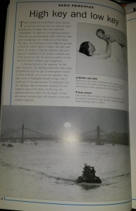
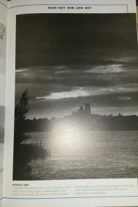
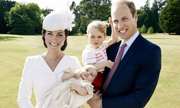
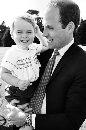
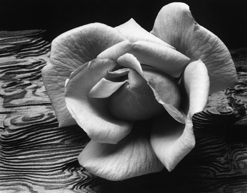
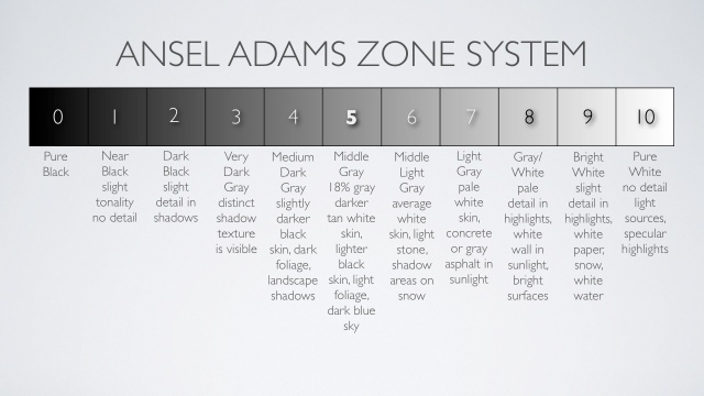
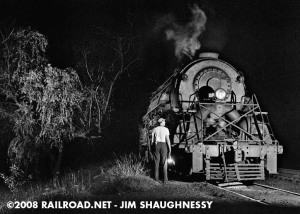
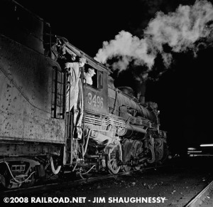
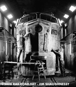
Assignment Three: Monochrome

While the technique of alerting colour sliders in order to adjust the tones as they appear in black and white will play an important part in this assignment, more fundamental is the different creative effect of a monochrome image. During the course of the previous three exercises, you should have had the opportunity to consider what makes a good subject and picture conditions for black and white, and what different image sensibilities you should bring to the photography.

For this assignment, you are to choose a theme or a subject that you will conceive, shoot and process in black and white, attempting to bring out the monochrome image qualities of form, tonal contrast and texture, perhaps also experimenting with key.

To accompany the final images (5-10), you should write an account of why you chose this particular theme or subject, and what you set out to achieve from the point of view of black and white imagery, and to what extent do you feel you have succeeded.

Research:

Before I began this assignment, I decided to research tonal contrast, high and low key and texture and form, in black and white photography. I purchased a helpful photography book called John Hedgecoe’s Complete Guide to Black and White Photography.

480415._UY200_

This guide discusses basic principles in black and white photograph, from tone, texture, contrast, grain and much more. Therefore, I knew this guide would be great for advice regarding black and white photography.

  • Tonal Contrast

Tonal contrast is the difference between the light and dark areas within a photograph. The greater the difference, the more attention the area attracts. It is easier to see tonal contrast in black and white photographs, because there is no colour to distract your eye from the brightness values within the photo. With a black and white photograph, instead of colours, the photograph is composed of different shades of grey, ranging from solid black to stark white. With a digital file, this means that the histogram for the image has values at all 256 levels of grey, with no gaps. It is not unusual for photographers to expose a negative or digital image knowing that it will contain a restricted tonal range, and then to enhance this even further, either through their choice of developer and paper grade or by levels and curve adjustment in the digital darkroom.


Below is an example from John Hedgecoe’s guide, showing a photograph which contains a full tonal range. As you can see, the photograph contains a range of grey tones, from the white tone in the bright window areas and the black tones in the unlit shadow areas.
20151226_143544
Below is another example from the guide, showing a light toned photograph and a dark toned photograph.
20160204_163109
The light toned photograph is a portrait of the artist Henry Moore cycling past one of his sculptures. The image has a restricted tonal range to the light end of the scale. The dark frame of his bicycle, the shadow area beneath his coat and the sculpture itself , however, help to ‘Sharpen’ the overall appearance of the print.
The dark toned photograph is a view of a refinery that was taken against the light and most of the subject is therefore seen in shadow. This is relieved by the small, but intense highlight in the middle of the frame, which attracts the eye and also prevents the image appearing flat and two-dimensional.

Contrast:

In photographic terms, contrast refers to the exposure difference between the brightest highlight in a scene and the deepest shadow. This is relevant because in both film and digital imaging chips, are capable of recording subject detail in both of these parts of the frame only if the exposure difference is not too great. The contrast that they can ‘see’ without loosing detail is far less than that which the human eye can deal with.

In general, it is reasonable to assume that a slow to medium film for example ISO 200, will be able to record a wider contrast range than a fast film of ISO 800. Similarly, film in general is slightly better at dealing with high contrast than digital devices.

  • High Key and Low Key
Two types of contrast effect, known as high key and low key, use unusual tonal distributions to impart their own particular ‘atmosphere’. In High Key, the lighting produces tones that are predominantly light, with any dark areas occupying only a small area of the frame. To reinforce high key lighting, take your exposure reading from the darkest available area if the picture so that the aperture widens or the time the shutter remains open lengthens.
Below are two examples of High Key photographs, from Hedgecoe’s guide. The high key lighting has given an open, airy feeling to the photograph.
20160204_163202
A Low Key photograph is the complete opposite of a High Key photograph. Low Key lighting result in a photograph where dark tones dominate most of the image, creating a dramatic atmosphere. Any light tones or highlights should occupy only a small amount of the image. To emphasize low key lighting, take an exposure reading from the brightest area of the frame. In this way, the aperture will close down, or the length of time the shutter remains open will shorten to produce a darker exposure.
Below is an example of a low key photograph taken from Hedgecoe’s guide.
20160204_163220
Using low key for this photograph has enabled the photographer to capture the brooding, slightly ominous quality of the castle on the far bank.
  • Texture and Form

Once you extract colour from a photograph, other surface characteristics of the subject or location become more important. Texture is extremely important in black and white photography as texture shows the degree of roughness or smoothness of the subject, which adds vital visual information and interest to a photograph. Surface texture gives you the sense that the picture you are viewing has a tactile quality to it which enables the viewers to feel as though they can almost reach out and touch whatever is depicted in the photograph.

Texture in a photograph is created when light strikes the surface of the subject at a distinct angle. The light therefore illuminates the high points, whilst casting shadows that leave the corresponding hollows or low points, in darkness. With a portrait, moving in closer to your model can give the skin of the model a three dimensional reality, in a landscape, it can make you feel as if you could walk into the frame.

Below are three examples of photographs taken from Hedgecoe’s guide, showing how texture has been used when photographing still life and the human body.

20160204_163315

20160204_163323

When photographing still life, using the photograph above of the leaf as a reference, the low angle of the light has illuminated only the highest surfaces of the dried leaf, leaving the cool shadows on the lowest parts. This gives the leaf an almost 3D feeling, making it stand out.  You can see the texture of the dried veins in each leaf. The roughness of the stone wall has also been accentuated.

I love this photograph of the hands above. The use of daylight has enabled strong lighting to fall on the skin, highlighting the smoother parts of the skin, whilst the wrinkles are darkened by their own shadows, helping them to stand out more. You are able to see all of the different textures on the hands, from the smoother areas of skin to the rougher, more wrinkled areas of skin, you can also see the small ridges in the nail beds, showing a different type of texture. This photograph shows an extreme difference between light and shadow, producing a photograph where texture is the main subject.

When you select a small part of a subject in a photograph, you are able to emphasize the texture of that certain area, which may have otherwise been un-shown or less visible.  In reference to the bottom photograph above, this was a selection taken from a larger photograph of a Buddha statue. By zooming into the frame and selecting a smaller section, you are able to see all of the smaller details on the statue. The contrast between light and shade in this photograph, produces a sense of depth.

Digital Camera World published an online article written by Jeff Meyer, which gave advice on techniques to help you produce the best monochrome photograph. Meyer quotes “Look out for subjects that feature simple, strong lines and shapes. It’s often the shadows that define shape and form, so pay attention to areas of darkness, as well as light … Fine detail, or strong textures such as weather-beaten stone, foliage or clouds, can help to give your black-and-white shots depth and interest” Jeff Meyer for http://www.DigitalCameraWorld.Com

http://www.digitalcameraworld.com/2015/01/26/black-and-white-photography-how-to-make-monochrome/

Composition and viewpoint play a major role when attempting to capture texture and form in a monochrome photograph. Photographers usually use the rule of thirds when shooting, however, many cease to use this rule when shooting for monochrome images. For example, if I am photographing a tree, knowing that I would be producing a final monochrome photograph, rather than framing the tree in the centre of the frame, showing the full trunk and branches, I would consider moving closer to the tree, perhaps closer to the trunk. I would position myself so I could include as much texture, detail and form, of the tree trunk, as by doing so, I will be able to produce a final monochrome photograph which is full of the texture and detail of the tree trunk, giving it an almost tactile 3d effect, where the viewer can almost touch it through the photograph. Of course, the angle in which I frame the trunk will help and the way the lighting falls on the trunk will play a role too. This is where I would then experiment with the camera and shoot from different angles and viewpoints.

But why Monochrome?

If colour is great, then why do we continue to photograph in black and white? Many argue that colour within a photograph is a distraction and can be too busy. Colour captures your attention, however, it can obscure details, texture and tones and can also distract you as a viewer, from understanding the purpose of the photograph. However, colour is not a bad thing and it can be used to produce amazing photographs. You are able to use a variety of colour hues and tones that you cannot use in black and white. Colour contributes a broader effect to an image, as it helps us judge time. Autumn leaves are yellow and red, as opposed to green in the summer. Early morning and late evening light is more golden than midday light. Removing color de-emphasizes time, which is useful if time doesn’t matter to your vision for the photo.

You should opt for colour if colour is the key element in your photograph. For example, take Steve McCurry’s famous portrait photograph ‘Afghan Girl’.

sharbat-gula-steve-mccurry-famous-photographer

Afghan Girl. Steve McCurry 1984, Afghanistan.

Whilst photographing freelance in India, McCurry learned to watch and wait whilst photographing people. Even though this quote was not said in regards to his work in Afghanistan, I believe it sums up this photograph well, McCurry quotes “If you wait, people will forget your camera and the soul will drift up into view.” Steve McCurry, India. Sometimes, the best portrait photographs are those in which the subject is entirely relaxed. If the model is relaxed, their own personality and soul will begin to show through in the photographs.

This world famous photograph was taken in colour rather than black and white. McCurry has managed to use complementary colours rather than contrasting colours. By doing so, the colours are subtle, harmonious and work well together, rather than contrasting colours which can be bold, harsh and clash if you don’t use them correctly. He has used a background colour, similar to the girls beautiful green eyes. Knowingly or un-knowingly, he has incorporated a dark red scarf, which frames her olive skinned face and shoulders.  It balances the photograph as it breaks up the green coloured background and helps to draw the attention to her eyes.

Because there isn’t much texture or detail within the image, as she has beautiful, soft smooth skin and a plain scarf and background, converting the image to monochrome would not be a great idea. The complementary colours would be similar in tonal contrast when converted to black and white and would therefore not stand out that well and would blend in together. Her eyes wouldn’t have that much of an impact as the beautiful colour is what makes this a world famous photograph as they stand out and draw the viewers attention in. Canadian photojournalist Ted Grant quotes, “When you photograph people in colour, you photograph their clothes. But when you photograph people in Black and white, you photograph their souls!” Ted Grant
I can somewhat agree and disagree with his statement. I agree that when photographing in black and white, you are able to focus more on the details, textures and tones rather than worrying about the colour. You are able to focus on the persons facial features such as their eyes, which can draw the viewer in. However, in regards to the Afghan Girl, I disagree with this statement. McCurry hasn’t photographed the girl in ‘Colourful’ clothes as the clothing is of subtle colours and is therefore are not harsh, so they don’t distract the viewer to an extent. There is a well known saying that the ‘Eyes are the windows to the soul’. Dis-regarding Ted Grant’s statement and remembering that if this was taken in black and white, the eyes wouldn’t have had the same impact, I believe that McCurry has managed to use colour photography to take advantage of the colour of her eyes, to produce a beautiful photograph which captures her soul through her eyes.

American photographer, Paul Outerbridge quotes, “One very important difference between color and monochromatic photography is this: in black and white you suggest; in color you state. Much can be implied by suggestion, but statement demands certainty… absolute certainty.” Paul Outerbridge. So why do we choose black and white over colour. Is it because we are unsure and uncertain whether or not the colour within our photograph is distracting, have we chosen the right decision to shoot in colour, or is it because some photographers are cautious when converting their photographs to black and white, as manipulating their photographs can sometimes be harder than you expect. Everyone’s opinion is different, I don’t believe that photography should be limited to shooting in black and white or colour simply because of the subject or location you photograph. I believe that there are certain cases where shooting in colour is appropriate and in times where black and white is appropriate, it is also a personal choice as some prefer colour photographs and some prefer black and white.

There is nothing more classic than black and white photography. It is timeless and nostalgic and reminds us of the past when black and white was the only medium available. Black and white is the foundation of photography, as this was the starting point when the first ever camera was made. Photographer Paul Gallagher, wrote an article for the Practical Photograph Magazine regarding black and white photography. He quotes, “Having taught photography for many years, I still feel it should be a starting point for any budding photographer because it only deals with luminosity. When you train your mind to identify light and dark without being distracted by colour, then this opens up a whole new world of ‘Seeing’.” Paul Gallagher, Practical Photography Magazine.

When I was studying photography at college, we began with the basic 35mm film camera. We were taught the basics of black and white photography, then moved on to learning how different camera settings could be used in order to produce a well shot black and white photograph. When shooting, I had to remember that I was shooting with a black and white film, and therefore when going out photographing, I would have to look at certain subjects, objects and locations in a different way than I would with colour, as I would need to look our for different types of lighting, texture, shapes and forms, different tones in buildings, colour tones etc. Black and white allows you to concentrate on the image itself, rather than worrying about colour. You are able to focus on certain details in the composition which may have been lost or obscured by colour, it allows you to cut back on the distractions and to only focus on the importance of texture, shape, form and tones.  You therefore find yourself photographing pieces of buildings or objects that you would not have thought to shoot in colour, such as the small details on a leaf or the roughness on the buildings wall. You are able to emphasize drama within a photograph, by using strong contrasts with high key and low key.

In regards to black and white photography, rather thank thinking about why you want to convert the image to black and white, you should focus on what type of message or feeling you are trying to convey. Focus on what elements of the photograph you want to emphasise and enhance in order to create a certain mood or feeling, and decide whether or not by converting it to black and white, it will have the effect you want, or if colour would work better. If you are looking to produce a timeless piece which is nostalgic and pay homage to the past, then the black and white medium is definitely the way to go.

Portrait photography in monochrome is classic, elegant and timeless. It is a medium which has always been popular and I doubt it will ever go out of fashion. Choosing monochrome to shoot portrait photographs, enables the photographer to discard any distractions caused by colour, allowing emphasis on certain emotions and moods within the photo, from sadness, depression, scared, happiness and much more. As mentioned previously, photographer Paul Outerbridge quotes “…in black and white you suggest; in colour you state. Much can be implied by suggestion” Paul Outerbridge. One portrait can have several emotions or moods, by simply changing an expression or the lighting, something which could be difficult with a colour portrait as you have to take into consideration the colour of clothing, backgrounds, make up and much more.

A good portrait is never primarily about photography, the light or technical settings. It’s about the person, the moment and the expression. A great portrait is one which draws the viewer in, it creates a reaction or an emotion from the viewer. A portrait which answers all of your questions is boring, a great portrait is one which leaves the viewer with more questions than answers. Portraits are unpredictable, it is a powerful thing to be able to capture a person as they are at a particular point in time. The photographer essentially freezes that moment in time.

Mentioned previously, photographer Ted Grant quoted “When you photograph people in colour, you photograph their clothes. But when you photograph people in Black and white, you photograph their souls!” Ted Grant.  When we ‘Look’ at a persons face, we usually focus on their eyes, as the eyes can tell a lot about a person. For example, if you are having a conversation with someone, you tend you look at them in the eye, not only out of respect, but by doing so, you create a connection between you and the other person. You are also able to perceive how the other person is feeling. The eyes are also windows to the soul and can tell a story about the person. With the removal of colour distractions, a monochrome portrait enables the viewer to focus on the eyes of the subject, helping them to perceive the emotion and mood in the image, building a strong connection between them.

A monochrome portrait provides a great tonal range between the deepest blacks to the whitest whites, which means that no matter what ethnicity, colour or race you are, monochrome portraits will always work. With the correct use of lighting, shadows and highlights can reduce or enhance the texture of the persons skin. Lines, wrinkles, imperfections, scars, pigments and discolouration of skin can also become enhanced or reduced with monochrome, depending on the lighting and contrast. For example, keeping scars visible in the portrait can help to tell a story and can provide an emotion within the photograph, or you can reduce the tone of a scar in order to hide it in the photograph.

Photographer Peter Lindbergh has built an entire career shooting portraits almost exclusively in black and white. In January 2015, Lindbergh was commissioned to shoot portraits of model Kate Moss, for the fashion magazine Vogue Italia. Their main goal for this shoot was to keep it ‘Natural’. The magazine insisted that model Kate moss wore barely any makeup, and that every photograph was to remain untouched by Lindbergh.

katemossvogueitalia-3-900x1357

Kate Moss, Vogue Italia 2015 by Peter Lindbergh.

katemossvogueitalia-14-900x1341

Kate Moss, Vogue Italia 2015 by Peter Lindbergh.

katemossvogueitalia-11-900x675

Kate Moss, Vogue Italia 2015 by Peter Lindbergh.

Lindbergh produced a set of untouched photographs which show just how talented he is when shooting in black and white. He has used lighting and composition to produce portraits which all have even skin tones. There are no visible skin discolouration’s, scars or imperfections of the skin. Even with basic makeup, he has used lighting to produce highlights and shadows which give the effect of contouring make up which is used in most portrait photography. Contouring makeup gives the effect of visible cheekbones, thinner nose area and brighter eyes, however, Lindbergh has managed to produce the same effect with the use of lighting and composition, causing highlights and shadows in certain areas. The details and textures are also very clear in the photographs, giving us the viewer, the feeling as though you could almost step into the photograph and be on the set of the shoot. I am unsure as to what emotion or mood Lindbergh was attempting to create in the portraits of Kate Moss, however, my personal opinion is that the portraits have a calm, relaxed mood to them.

In 1997, photographer Mario Testino produced a set of 15 portraits for the magazine Vanity Fair, of the late Diana Princess of Wales. An exhibition was opened at Kensington Palace in 2005, which showcased the last ever official portraits of the Princess, before her unfortunate death later in the year. Testino quotes “Photographing Diana, Princess of Wales for Vanity Fair in 1997 was one of the most memorable days of my career. I am honoured to have been asked to show some of the photographs from that day in surroundings as unique as Kensington Palace and design the rooms that pictures and dresses are to be exhibited. I hope that the design will reflect my respect and admiration for her in this light celebration of her life” Mario Testino.

When meeting Diana for the first time, Testino quotes “…I knew from the start that this shoot would be different …. I was amazed by this person who, even though she had everything, she would go to feed the homeless and visit sick children and Aids victims. It was like a fairy tale. Who was she really? Why did she do this? She was trying to find love. I wanted the world to see her kindness, her humility: I think she realised that would be her way.” Mario Testino. However, even though he was somewhat star struck, Testino did not hesitate to orchestrate every detail of this shoot, down to his subject’s eyeliner: “I did say to her, ‘More black here, less curl here, more lipstick here.’ But that is how I work. I spend the day with the subject, make them relax, we eat together, we drink together and when we are having a good time I say, ‘Let’s decide what the look should be…” MT.T

diana-princess-by-mario-testino-famous-photographer.preview

Diana, Princess of Wales, London, Vanity Fair 1997. By Mario Testino

In regards to the portrait above, the words elegant, beautiful, classic and entrancing spring to mind. Testino has used tonal contrast, to produce a well balance portrait. The dark black dress covers the lower half of her body, (except for one area of her leg poking through), making her stand out against the pure white sofa in the background. From the way the light is falling in this photograph, it would seem as though there is a window off to the right hand side of the frame. The dress is extremely dark, however, the highlights from the light have fallen on the creases of the dress, enabling you to see the folds. It gives the dress form and texture, in what would have otherwise been an extremely dark area within the photograph.

The pure white sofa in the background, has been used to help frame the smooth, even toned, porcelain skin of the Princess’ top half. With the use of lighting, the sofa has been burned out in places, and some of the detail is missing. The pure whiteness in certain areas of the photograph, gives the Princess a somewhat angelic aura around her top half. With the positioning of her arm, Testino breaks up the large amount of dark black dress, thus leading your view to her facial area. Testino quoted that he wanted to show Diana’s kindness and humility in these portraits. When I look at Diana’s facial expression in this portrait, I take into consideration Ted Grant’s quote “…When you photograph people in black and white, you photograph their souls”. Ted Grant. Even though she is smiling, I find her smile somewhat false. Comparing the portrait above and first portrait below, she seems sad. I get the feeling from these portraits, that she enjoyed herself somewhat. Perhaps she did feel comfortable with the photographer, as Testino mentioned that they both relaxed before the shoot, however, it can be awkward being photographed. Maybe she was a little nervous being photographed, however, she seems to be hiding sadness, her eyes give it away. No matter how hard you try to hide sadness behind a smile, you will never be able to hide it completely. We must remember that not long after these portraits were taken, Diana sadly passed away. Did she somehow know that these would be the last portraits of her, is that why she is sad, or is she sad because of things troubling her at the time? I suppose we will never know. I think that is what gives these portraits a sad mood to them.

DIANA_PRESS_03-1400x1095

Diana, Princess of Wales, London, Vanity Fair 1997. By Mario Testino

As mentioned previously, one portrait can have several emotions or moods, by simply suggesting. Changing an expression or the lighting can give one portrait several different emotions. In regards to the portrait below, this could not be any more true. With this portrait, Testino has captured Diana smiling and laughing, but not directly at the camera. This one portrait does have a different mood and feeling to it, compared to the others and Diana does seem happy in this portrait. Is it because she isn’t looking directly at the camera, she is looking off to the side. Because we cant see her eyes, we assume from her large smile and in mid laugh, she is happy. Again this is caused by Mario Testino simply making her laugh before the shot was taken, in order for him to suggest to us that she was happy in this shoot.

Mario-Testino-Princesa-Diana-2

Diana, Princess of Wales, London, Vanity Fair 1997. By Mario Testino

Testino not only photographed Diana in monochrome, he also photographed her in colour on the same day. In regards to the photograph below, Diana appears somewhat uncomfortable. Her pose does seem comfortable and it looks staged as though Testino told her how to pose in this photograph. Her smile still looks uncomfortable and false. It is a lovely photograph, however, the use of a white dress on a white background is confusing, especially with it being a colour photograph. He has used her tanned skin to help break up the whiteness within the photograph. If I had to choose between his colour portraits or his monochrome, I would choose the monochrome, as they show a lot more texture, tone, form and detail.

tumblr_m6sdcxHvL71r90m4vo3_1280

Diana, Princess of Wales, London, Vanity Fair 1997. By Mario Testino

I read an extremely interesting article written in July 2015, by columnist Jonathan Jones for the Guardian online. The article is called ‘Testino’s Portrait of William and Kate is a Sickly Sweet Lie’. Even from the name, you get the feeling that this columnist is not a fan of Testino’s work.

will and kate testino

The Duchess of Cambridge, Princess Charlotte, Prince George and Prince William. Princess Charlotte’s christening, London 2015. By Mario Testino

“No one can photograph a fake smile like Mario Testino can. I am not saying the huge cheesy grins on the faces of Kate and William in his christening portrait of the royal nuclear family are fake. After all, they have plenty to smile about – the free houses, the free money, the free adulation, the fact there’s no chance of their kids ever having to worry about student loans, tax credits or the minimum wage. All smiles all the way. But Testino, the world’s most horrible flatterer of wealth and status, makes every smile look phoney. He makes reality itself seem a glib and cynical charade. Their faces lit up by hysterical joy, their hair wispy in the sun, their teeth shining like diamond walls of privilege, and their eyes betraying no signs of thought whatsoever, the Cambridges are robbed of true personality by Testino’s faux-honest glamour shot. Their children are so glossily celebrated that they look like fashion accessories, hired for the day. George, you can tell, is bored and hating this. He gives away the fact that, far from casually encountering Testino’s lens” Jonathan Jones

In regards to columnist Jonathan Jones statement above, I agree with some of his views and disagree with other parts. I especially agree with the section where he quotes “…makes every smile look phoney. He makes reality itself seem a glib and cynical charade….” Jonathan Jones.  As mentioned in regards to the portraits of Princess Diana, I believed that her smile was somewhat false, as you could see that she was hiding her sadness. You could therefore say that Testino has made her smile look ‘Phoney’, almost put on just for the camera. I disagree with his quote “…and their eyes betraying no signs of thought whatsoever”, as I believe that Diana infact shows deep sadness through her eyes.  In regards to the portrait of The Duchess and Prince William at Princess Charlotte’s christening, I also disagree with his statement. Testino has managed to capture a ‘Happy’ family on what was a joyous day for them. The Duchess and Prince William both look happy and you can tell this from their eyes.

I do understand how Jonathan Jones could believe that they look fake and false in the photograph. When photographing children, it can be a long day trying to make sure that the children are looking directly at the camera, therefore, I think Testino has done well by capturing both Prince George and Princess Charlotte, both looking directly at the camera lens. Yes, this may have been the 5th or the 20th attempt at taking this photograph, making sure that everyone was looking where they should be, but I don’t agree with Jonathan Jones criticism and judgement in regards to how Prince George is ‘Looking’ “George, you can tell, is bored and hating this.”.  Below is a second portrait taken on the day in monochrome, of just Prince George and Prince William. In this photograph, both Princes’ look extremely happy, again you can tell this not only from their smiles, but from their eyes, therefore Jonathan Jones criticism does not apply to this photograph. It’s hard to say which photograph I prefer out of the two, as they are both completely different. The photograph below looks more relaxed and jolly, as though Prince William said something to Prince George in order to make him laugh or smile, whereas the photograph of the whole family does look ‘Staged’ and formal to an extent.

will testino

Prince George and Prince William, Princess Charlotte’s Christening. London 2015, By Mario Testino

“They deserve better, and so do we. Testino is a bland and banal photographer whose images lack any shred of emotional depth” Jonathan Jones. I completely disagree with this statement. As mentioned previously, I believe that some photographs look better in black and white, and some look better in colour. It all depends on the colouring, the lighting, details, texture and form and contrast. Testino has produced a set of beautiful portraits of Princess Diana. I do believe that Testino completed what he set out to achieve, and that was to capture Princess Diana’s humility and kindness. His use of lighting and shadows and highlights, have produced portraits of her where she is framed by the light, making her appear some what pure and angelic in a way. Her eyes speak a thousand words, and even though these are beautiful portraits, you can see the sadness in her eyes. Of course we know now that she would not be alive long after these were taken, and I think that by knowing this, we seem to look differently at these portraits of Diana, compared to other portraits of her taken previously beforehand. We as viewers of these portraits are captured by her eyes and a connection is made between us where we can then see her sadness within these photographs.

I do not agree that Testino is a bland and banal photographer. Testino has produced a vast range of portrait photographs of many celebrities. Each portrait is different and I congratulate him on the fact that he has managed to produce a unique and different portrait depending on the person. He has not ‘stuck’ to the simple portrait photography. He has experimented with colour and monochrome photography and by doing so, he has captured individual portraits relevant to the certain model being photographed.

Photographer Research:

When I think of well known monochrome photographers, I instantly think of Ansel Adams. Ansel Adams was born in San Francisco in 1902. He began his career in photography after an encounter with photographer Paul Strand in 1930. Strand’s use of ‘Pure Photography’ made a lasting impression on Adams and motivated him to clarify his own intentions. In 1932, Adams began using certain compositions and techniques with his photography which enabled him to emphasize the greatest depth of field as possible and the sharpest reproduction of details. He particularly favoured close ups of individual subjects. “Some photographers take reality… and upon it impose the domination of their own thought and spirit. Others come before reality more tenderly and a photograph to them is an instrument of love and revelation.” Ansel Adams. The Portfolios of Ansel Adams.

Rose on Dritwood - Ansel Adams

Rose on Driftwood, Ansel Adams 1933. Gruber Collection.

In regards to Rose on Driftwood, Adams has used the full range of tonal contrast for this photograph. He has composed the image, so the light has fallen onto the rose, creating shadows on certain parts of the petals and highlights on the other parts. The shadows enable you to see extremely fine lines on the petals which are almost like veins, creating texture to those certain parts of the image and the highlights have produced areas which look smooth. You as a viewer can almost reach into the photograph and feel the petals between your fingers, feeling the smoothness of some petals and the texture on the others. The highlights and shadows have produced an almost 3d effect, enabling the rose to have a 3d form within the photograph. Each petal is curved and rounded and is not flat in the photograph, this helps it stand out against the background. The patterns on the driftwood that the rose has been placed onto, breaks up the dark shadow areas, enabling the brighter tones of the rose petals, to stand out from the background. The driftwood has its own texture and details, however, it is not distracting your attention away from the rose.

I don’t think this photograph would have worked well in colour as I believe that the patterns in the driftwood may have been distracting in colour. I think it depends on the colour of the rose. If the rose was an orange or red colour, on a brown driftwood background, it may have worked as it would be almost autumnal colours, whereas a bright pink or yellow rose may not have. If colour was used, you may not have been able to see the full amount of detail on each petal. Monochrome has definitely worked well for this photograph.

Adams became interested in nature and spent a considerable amount of his life as a landscape photographer in America’s National Parks. He wanted to focus his photography on the natural world and man’s relation to it. “To photograph truthfully and effectively is to see beneath the surfaces and record the qualities of nature and humanity which live or are latent in all things” Ansel Adams, The Portfolio of Ansel Adams. He began photographing nature during the time of the great depression. Mother nature was harsh on many people, hurricanes, dust bowls and crop failure was unfortunately very common. His love for the wilderness began after a family trip to Yosemite National Park in 1916. He fell in love with the Sierra Nevada Mountains, and began working as a custodian at the headquarters of the Sierra Club at Yosemite. Soon enough, he began working as a guide, he explored the mountains with his camera in his hand, photographing the sheer beauty of the mountains. Throughout the 1920’s, Adams took hundreds of photographs, progressing from the soft focus, traditional landscapes, to the more direct style he is now famous for.

Adams was known to stay in the wilderness for months at a time and was known to use a large format view camera. Using a large heavy camera in order to shoot, meant that he would have to take tripods, films and portable dark rooms along with him. Adams therefore retreated to the wilderness with the assistance of a donkey who carried his photographic equipment. Using a view camera, enables the photographer to control every step of taking the photograph. Adams would therefore be able to use large format negatives in order to produce prints which would show even the smallest amount of detail. He would have been able to control tonal contrast and controlled which part of the photograph was in focus or out of focus.

However, it was a large, heavy piece of equipment, therefore pre-visualisation of your photograph would have been crucial in order to produce a well exposed, well composed photograph. Adams was a master of using light, and produced the Zone System alongside photographer Fred Archer in 1939-1940. The Zone System is a set of important techniques which enables photographers to have the greatest control over the characteristics of black and white film. This system works well with sheet film, it can be exposed and developed one piece at a time. It becomes the negative used when printing the photograph.

ansel_adams_zones_system

When using the Zone System, you should follow the simple steps below. Below is an explanation of the Zone System, taken from an article written on http://www.CreativePhotography.org

  • previsualize the subject scene in shades of black and white [using the Zone-Scale Card]
  • take a light meter reading of target zones using a hand-held light meter, and sometimes a gray card as well
  • decide if adjustments need to be made in the exposure to effectively record the amount of light on the film
  • determine if the contrast, or range of values from black to white, will need to be adjusted by varying the development time of the film. A shorter than normal development time decreases contrast; a longer than normal time increases it.
  • analyze the print during the printing process to determine if the tones of the photographic image are aesthetically pleasing as they were previsualized.

Definitions:

development: a chemical process, carried out in the dark, which makes the image exposed on the film visible and permanent in negative form.

exposure: the amount of light that falls on the film (which will become the photographic negative). This is regulated by controlling the size of the aperture through which light enters the camera and/or the length of the exposure.

gray card: a standardized card, used for measuring light, which corresponds to Zone V, or mid-tone gray.

hand-held light meter: a light-measuring device that is separate from the camera. A spot meter, which covers a one degree angle, is ideal for measuring target zones.

previsualization: a mental exercise in which the photographer imagines the subject in terms of the black, white, and grays desired in the final photographic print.

spot meter: a type of hand-held meter that allows the photographer to easily measure light falling on very small areas within the subject matter.

zones: a specific set of tonal values consisting of pure black, the base white of the black-and-white photographic paper, and eight or nine shades of gray in between [see Zone Scale Card]. When the Zone System is used, the darkest areas of a photographic image are referred to as low values (Zones I — III), the gray areas are called middle values (Zones IV — VI), and the light areas are high values (Zones VII — IX). The zones are always referred to by roman numerals

ansel adams evening mcdonald lake glacier national park

Evening, Ansel Adams. McDonald Lake, Glacier National Park. 1933-1942


Ansel Adams, Yosemite Valley Winter

Yosemite Valley Winter, Ansel Adams. 1938

Ansel Adams boaring river 1936

Boaring River, Ansel Adams. Kings Region, Kings River Canyon. 1936

In regards to the landscapes above, similar to the Rose on Driftwood photograph, Adams has used the full range of tonal contrast in each photograph. From the distance between the camera and the mountains in the photograph, it is unbelievable that the details in the Yosemite and Kings River photographs are extremely precise and clear. Adams has managed to use lighting and composition, in order to produce highlights and shadows in certain areas. By doing so, he has accentuated the highlights on the white snowy areas, making them stand out against the darker tones, whilst at the same time, using shadows in order to show the texture and forms of the different breaks in the mountains and the details on. You are also able to see the fine details in tree. With Adams landscapes, they are that detailed and textured, you as a viewer feel as though you are inside the photograph looking directly at the mountains yourself. They are simply stunning.

Assignment Three: 

Planning:

I knew that I would be going on a trip to Kidderminster/Bridgnorth on the steam train. As I had not visited Kidderminster or Bridgnorth before, I was unaware of what to expect, in terms of how many trains there would be, would there be a lot of people, what would the weather be like, would I be able to get close to the trains in order to photograph ‘parts’ of the trains, would I have enough time as we were on a time limit.

I planned these previous exercises and assignment around this trip as I knew that this trip would work well for not only producing final photographs for my assignment, but also for the individual exercises previous to the assignment. Therefore, for this assignment, I would be keeping the same theme I have been using for the previous exercises, which was trains. I knew that I would have to plan in advance what type of situations, locations and trains I would be looking out for, and any interesting shots that may occur. I took notes of what the assignment required me to do, and what I would be looing for.

Photographer Research:

After deciding that I would be keeping the train theme, and before I knew what types of images to shoot, I decided to research into photographers who photograph trains, mainly steam trains, and in black and white, in order to gain some inspiration.

The first photographer I researched was O. Winston Link.

O. Winston Link was an American photographer, born in Brooklyn 1914. He was well known for his black and white steam locomotive, railroad photography in the United States in the late 1950’s. In Virginia 1955, whilst on another photography job, Link became focused on the nearby Norfolk and Western Railway (USA). He took his first night shot of the railway in 1955. 20 visits and 2400 negatives later, Link had unknowingly documented the end of the steam era for Norfolk and Western Railway, by the end of 1960.

His decision to shoot at night was simply because monochrome photographs created romantic and dramatic photographs. He was able to enhance the white tone of steam being produced by the trains making it more striking against the dark black background, compared to photographing it in the daylight, which would produce a dirty grey colour steam rather than bright white. Link knew that photographing railroads and capturing moving trains, in the right position, at night would be difficult “I can’t move the sun, and it’s always in the wrong place, and I can’t even move the tracks, so I had to create my own environment through lighting” O. Winston Link. Therefore, he knew that his visions required him to develop new techniques for flash photography on such a large scale. He used an assistant to help set up his equipment and used a 4 x 5 Graphic View camera, with black and white film.

p11-thumb-615x487-100830

Train 2 arriving at Waynesboro Station. O. Winston Link. Waynesboro, Virginia, April 14th 1955.

p48

Lubricating Wristpin. O. Winston Link. Bluefield, West Virginia, June 20th 1955.

p113

Train 17, The Birmingham Special, Arriving at Rural Retreat. O. Winston Link. Rural Retreat, Virginia, December 26th 1957.

OWLink_NW0008m

Electrician J. W. Dalhouse, A Close-up View. O. Winston Link. Shaffers Crossing, Roanoke, Virginia, March 19th 1955.

Similarly to Ansel Adams, Link used a large view camera. By doing so, Link would have to, like Adams, pre-visualize the photograph he wanted before he took it. Shooing at night would also make it difficult for link, as he could not use daylight as a light source, therefore he had to rely on his own lighting and flash. Link would not only have to set up his camera in the right location, he would have to make sure the composition of the frame was correct, the lighting was correct and that each photograph would be exposed correctly, all whilst shooting in the dark and only relying on your own light sources. For any photographer, would be a challenge.

In regards to Links photographs above, I really like them. I am amazed that he took these photographs, not only in the dark, but with black and white film, and relying on his own light sources. No post processing. He used his knowledge of photography to produce well exposed photographs, with a wide range of tonal contrast, form and texture. Each photograph is controlled, planned, and constructed. He used the lighting to create shadows and highlights which fall in the correct places. In reference to the photograph of Train 17, he has used highlights to enhance the white tone of the steam making it stand out against the dark black tonal background. The details in the steam are also extremely clear, as well as the surrounding areas. Each photograph contains sharp details and texture, they each have an almost 3d effect, which makes you as a viewer, feel as though you could be stood at that moment in time, ‘Seeing’ what Link was seeing. Each photograph tells a story, and he uses composition to tell stories that you wouldn’t usually look out for. For example, he photographs the underside of the steam train (Lubricating wristpin), to show the details of the wheels. He uses a slight diagonal composition, in order to draw your attention to the worker, in order to produce a unique final photograph. I will definitely be using inspiration from Links work.

Links work has been published in several books, O. Winston Link: Life Along the Line (Abrams), being one of them. An article was published on http://www.TheAtlantic.com regarding the book. Below is a quote taken from the article.

“Much of the book showcases these employees, men at work on the trains, but whose jobs disappeared with the steam engines … Steam may be just a bunch of hot air, but that hot air packed a lot of power, fueling a region and the people who lived there for decades. In Link’s images we see that power, lighting up a night sky and a lonely town” Rebecca J Rosen.

Taking the statement above into consideration, you are able to understand why this collection of photographs were nostalgic for the workers who lost not only their jobs from the decline in the railways and the boom of the American Car, but their homes and much more. Therefore, similarly to Mario Testino’s portraits of Diana, Princess of Wales, they are beautiful photographs, however they have a sad mood to them. We feel nostalgia around Links photographs simply because this all happened in the past. Everything has changed, everything is modern now, we can’t appreciate the beauty of these hardworking machines because they are no longer there. Link has managed to capture a moment in time which no longer exists.

The second photographer I researched was Jim Shaughnessy.

Shaughnessy began taking photographs in the late 1940s, capturing the end of steam in the northeast U.S., Canada, and Mexico, and continued photographing the first and second generation diesels that followed in New England and throughout the U.S. He photographed railroads for 40 years, between 1946 and 1988. He began photographing steam locomotives in his home town of Troy, New York, and similar to O. Winston Link, He documented the dramatic steam to diesel transition.

Jeff Brouws, a friend, photographer and fellow “rail fan,” to Shaughnessy, helped produce a book, The Call of Trains: Railroad Photographs, showcasing 170 duotone photographs, taken from Shaughnessy’s 40 years as a photographer. Brouws initially had a collection of 300-400 photographs to choose from, but ended up narrowing it down to the 170 final photographs. Brouws wrote an introductory essay that puts Shaughnessy’s work in biographical and historical context within the book.

jim_shaughnessy

On a Cold Night in Sherbrooke, Que. Jim Shaughnessy, February 1957. The Engineer of Canadian National  4-6-2, No 5293 admires his steed.

Shaughnessy_Plate09

Jim Shaughnessy. Taken From, The Call of Trains: Railroad Photographs by Jim Shaughnessy.


Shaughnessy_Plate77

Jim Shaughnessy. Taken From, The Call of Trains: Railroad Photographs by Jim Shaughnessy.


Shaughnessy_Plate20

Jim Shaughnessy. Taken From, The Call of Trains: Railroad Photographs by Jim Shaughnessy.


Similarly to O. Winston Link, Shaughnessy would have had to pre-visualise his photographs before he went to shoot. He too, shot dramatic night portraits that were painstakingly lit and were often staged similarly to Links. They soon became part of his own signature style. Thus meaning that like Link, Shaughnessy would have to rely on his own light sources and available light, in order to produce the required exposure, to produce highlights and shadows that he would need in each of his photographs. He uses the full range of tonal contrast in each of his photographs. With the use of light available, he has managed to produce highlights which show off the smoothness of the snow in photograph On a Cold Night in Sherbrooke, they also show the smooth texture of certain areas on the metal panels on the trains, as you can see in the last photograph of Shaughnessy’s above. Similar to Links Train 17, you are also able to see detailed steam plumes. The shadows enhance the details, scratches, dents and rough textures on the panels, bolts and wheels, which help to show the age of the train and give the trains individual characters and stories.

Shaughnessy quotes in Classic Trains Magazine, “I like pictures with people in them or something, not contrived, that capture a moment in time … There is more to it than just the locomotive. The station scenes, the countryside, umpteen million possibilities.” Jim Shaughnessy. In the final photograph above, similar to Links Electrician J. W. Dalhouse, A Close-up View, his unique composition has managed to capture the workers whilst busy maintaining their locomotives. His use of composition for this photograph, has enabled him to produce a photograph which gives the appearance of the train having a face. The two windows look like large eyes, the round middle area looks like a nose and there is a ridge which could pass as a mouth. The two workers therefore look as though they are ‘Looking after’ or ‘Retouching’ the trains face. Shaughnessy has managed to give the train in this photograph human characteristics, similar to Links Electrician photograph. It is as though the trains are being ‘Pampered’ before their next adventure.

Shaughnessy doesn’t just focus just on the locomotives, he uses his own original compositions, to photograph parts of the railroads, sheds, tunnels, viaducts, yard stations, mechanics and much more. His interest in mechanics led to striking close up photos similar to Links Lubricating Wristpin photograph. His unusual angles made the viewer part of the action, and his inclusion of people within the photograph, similar to Link, helped to broadened the scope of traditional rail photography. Jeff Brouws quotes, “This decision to place [people] within the context of the railroad landscape…became an important component of his emerging style…By seeing the railroad milieu as a social space, he humanized the industrial environment, exploring the relationships between the railroad and the people that interacted with it.” Brouws. By doing so, he has managed to build a collection of unique and interesting photographs which show us as the viewers, an insight into how the railroads worked, how the locomotives worked and the people who worked on them. Like Link, Shaughnessy has managed to capture a key historical era which can no longer be visited.

After studying both of these photographers, I have gained a lot of inspiration from them both. I really admire just how much work they have put into each of their photographs, especially as they both shot their work at night, only relying on available light or their own light sources. You can see that they pre-visualised they type of final photograph they wanted, and each photograph looks controlled, planned and constructed. They have both used the full tonal contrast range, and have managed to produce striking highlights and shadows within their photographs. Each photograph contains enormous amounts of clear detail, thus enhancing textures of scratches, dents, bolts, plumes of steam and much more. They both use their own unique compositions, which enabled them to produce photographs for example of the mechanical side of steam locomotives. Mechanics which we as passengers or public, would not have been able to see up close. They both include workers in their photographs which help to humanize their prints. Below are a few bullet points which I will be using as inspiration when taking my photographs.


  • Use the available light or think about whether or not a flash would work for that certain photograph. Think about how the highlights and shadows will fall.
  • Look out for unusual compositions. Focus on the mechanics of the trains (Wheels, Underneath, The sides of the trains, Bolts, Panels, Damages, Scratches, Dents). Look out for the railroads, or railway tracks. These sometimes have a lot of detail on them and can be interesting.
  • Look out for railway workers. Can I photograph them whilst working on the trains. Will I be able to photograph the engine area with the coal and fire.
  •  Try and think about photographing the train with plumes of steam. Try to include as much detail if possible.
  • Think about my surroundings. Platforms usually have interesting things on them, train related. Maybe they have old parts of trains, suitcases, wheels, cogs etc.
  • Plan for the weather and other passengers. Link and Shaughnessy don’t include passengers in their photographs, so I may not want to.

Decisions:

As this assignment wants you to focus on form, texture and tonal contrast and after my photographer research, I have decided that for his assignment, I would be focussing on all aspects of steam locomotive trains. For example, taking inspiration from Link and Shaughnessy, I will not only focus on the locomotives themselves, but I will photograph train tracks, bolts, cogs, damage to the locomotives, workers on the locomotives, how the locomotives work, platforms and objects and subjects with a lot of detail or texture.

Knowing that I would be shooting these photographs in colour, in order to convert them to monochrome, I knew that when shooting, I would have to not focus on the colour whilst shooting, but focus on the lighting. I would need to make sure that areas with details and texture were correctly exposed, in order to enhance them and make those areas clear, so that when they are converted, they are clear in the monochrome photographs. I also had to remember that unlike Link and Shaughnessy, I would not be shooting at night, as my trip would be taken in the day. Therefore, I would not be able to achieve the dramatic night shots that they both took, however, this means that I can produce my own versions of steam locomotive photographs.

As mentioned previously, I was unaware of what the day would hold whilst I was there, as I have never been on this train journey. I would need to think about weather, other passengers and time as we are on a strict time schedule. Therefore, making sure that I went on this journey with ideas of what I wanted to photograph, a plan in my head and inspiration from Link and Shaughnessy, I knew that I would be ready for any challenge that arose or I could always change my mind once I was there, if things did not go to plan. I knew that I would be unable to go back to the Kidderminster/Bridgnorth train stations to re-shoot any images, as I only went for the day. However, there is a steam train line near where I live, that I would be able to visit if I did need to re shoot any images, or take any more.

Kidderminster-Bridgnorth Railway Journey:

I went on the trip towards the end of October. I was unaware of Halloween celebrations that were taking place in the Kidderminster train station, as they were doing a Halloween special, steam train ride. This therefore meant that the entire train station had been decorated and dressed in cobb webs, dangling ghosts, ghouls and spiders. Not what I had expected, but it did look exciting. Unfortunately though, I didn’t want to include the Halloween decorations in my work, mainly because I wanted my photographs to look authentic and old fashioned, which meant that I had to avoid as many decorations as possible. This meant that for this assignment, the inside of Kidderminster train station would not work for my final photographs. I would therefore have to rely on the outside, and hope that I could get the interesting shots of trains that I was looking for. The weather outside was a mix between bright sunshine at one moment, cloudy at the next, to rain in the evening. Not the situation for taking the photographs.

When stood on the platform waiting for our steam train to arrive, it was quiet and empty. I thought this would be great as I would be able to capture some great shots of the train arriving at the platform. However, my plan was disrupted by the large amount of people who piled onto the platform around me when the train arrived. I was stood out of the way, camera ready, in order to capture the train moving and pulling into the station, however, after being pushed around and hurried along, as I had to board the train in order to get a seat, I was unable to capture the ‘Perfect’ shot of the steam train arriving. Also, as the weather had created a pure white sky, capturing the white steam plume was hard to capture, as I couldn’t use a tripod on the platform due to the amount of people stood in the way, and the time schedule meant that we had to leave fast. Thankfully, my train carriage was the last one on the train, which meant, when I looked out of the train, I was able to photograph the front of the steam train, changing over, to drive up to the ‘front’ of the train now.

As the journey progressed, and we stopped for a while at several train stations, I was able to photograph train tracks, wheels of the other trains that we had stopped by and a variety of other things. I spent most of the journey with my camera, and my head, out of the pull down window, at the back of the train.

Being high up inside the train carriage, and being at an angle to the other trains, train tracks and locations, I was able to compose very interesting images, similar to Link and Shaughnessy, that I knew would make great monochrome photographs. It was great because one of the train conductors who was an elderly gentlemen, enquired as to what I was photographing. After explaining what I was photographing, he told me that he does photography himself, and in his spare time, he photographs some of the trains he works on. He gave me a few tips and advised me where the best stations were to photograph the ‘ mechanical parts’ of trains were, which was a great help.

I took a large number of photographs that day, and when I got home, I decided to visit the Avon valley railway (Bitton) not far from where I live, in order to photograph some things that I was unable to photograph whilst in Kidderminster. I knew that if I took a ride along the tracks, I would be able to see old trains that were damaged, or broken, as they have a large amount of areas where old trains are parked, along with tools etc, behind the railway station itself.

Choosing my final images, and processing:

I had a large amount of photographs to go through, so I opened up a folder and put what I thought would be the best ones, into it. After that, I narrowed it down to 10 final photographs. I chose ones that I felt showed the best texture, form, details and tonal contrast. I wanted final images that would show unique and interesting compositions, similar to those of Link and Shaughnessy. I used Light Room and Photoshop Elements 9, to process my images. I shot some using JPEG and some using JPEG+RAW. I will discuss each photograph.

Final Photographs:

One

IMG_5105 - Copy-2

This first image was inspired by both Link and Shaughnessy. Both of them have photographed steam trains with the steam puffing out from the top, and train tracks in the foreground. This image was taken whilst I was standing, looking out of the carriage window, at the end of the train. The front of the train was changing tracks in order to drive up to the top, which would then take us on our way. I composed this image similar to Link and Shaughnessy, so that the train was off centre, in order to allow the train tracks to guide your eye diagonally, from the train to the bottom of the foreground. It gives the train a ‘Moving’ feeling. The weather at the time, meant that the sky was almost pure white, with hints of clouds, therefore, the white plumes of steam were not 100% clear and visible when shooting in colour.

The colour version of this image was very distracting. It contained a mixture of red, green, grey and brown. Details and texture were not that striking due to the weather and you were definitely distracted by the colour. I converted the image to black and white, and adjusted each colour saturation slider, in order to darken or lighten certain areas of the image. I adjusted the contrast, shadows, highlights, sharpened some of the details, and dodged and burned a few places, in order to bring out more detail. The cloud area was the hardest to dodge and burn, because of the plume of steam. It took me a while to get the plume of steam into the image, as I had to contend with the white sky area as well.

Now that this image has been converted to monochrome, you are able to see a range of tonal contrast. The whites are still a little grey in tone, however this is something which can be altered if necessary in the future. The details and texture of the tracks, bolts and surrounding areas and objects are very noticeable. They could have been clearer if I had used a tripod, however, I was unable to at the time and the train was also moving, therefore, I had to shoot before it drove past.

Two

IMG_9432

The second image contained a bright blue sky, bright green train, and green trees. Colour with this image was a distraction. Some areas were dark and you were unable to see all of the detail, especially towards the bottom of the frame. However, I knew that this situation contained a lot of tonal contrast, a lot of texture, form and details, and would make a striking monochrome image.

I remembered the quote from Rensselaer Magazine, regarding Shaughnessy’s work “His unusual angles made the viewer part of the action” I composed this image in order to lead the viewers eye through the photograph, and to give you the feeling of being on board the train, just about to pull up to the station. It’s also a composition which gives you the feeling that you are either stood on the tracks, walking forward.

I converted this image to black and white, and adjusted the colour saturation sliders in order to lighten or darken certain areas of the image. I adjusted the contrast, shadows, highlights, sharpened the details in the image, and dodged and burned a few places, to bring out more detail, especially in some of the darker areas. I slid the blue colour saturation slider, in order to make a dramatic looking sky, in order to create more tonal contrast.

Three

IMG_9446-2

The third image was taken whilst stationed at a platform. I was stood looking out of the window, at an angle. I noticed that these train tracks would make a great monochrome image, simply because there was no colour, except grey and brown. I remembered that the online digital photography school quoted that simplicity is the key to a great tonal contrast image.The grey rocks/stones, would be great for texture and form, and the tonal contrast between the metal tracks and the grey rocks, would be very striking when in monochrome.

Similar to the previous image, I remembered the quote about Shaughnessy and his unusual angles. I composed this image diagonally in order to lead the viewers eye through the photograph. I wanted to create an abstract image.

I converted the image to black and white, adjusted the colour saturation sliders to darken and lighten certain areas in the image. I then sharpened the detail, adjusted the contrast, brightness, highlights and shadows. I dodged and burned a few places to lighten some of the areas, in order to make the detail sharper.

Four

IMG_5125-3

The fourth image was also taken whilst stationed at a platform. I admired the amount of detail in the train tracks. I noticed that this would be great for showing tonal contrast and texture, and with it being a crossed over pair of tracks, I knew that it would make an interesting monochrome image.

I decided to compose this image horizontally, in order to fill the frame, because I wanted the focus to be on the detail of the tracks.

I processed this image the same as the image above.

Five

IMG_5135-2

The fifth image was taken whilst stationed at a platform. I know I mentioned that I didn’t want to photograph the train stations or platforms, however, I decided to take this photograph because I thought it would be interesting. I spotted the texture and shapes of the brickwork on the bridge and platform. I knew that there was a lot of detail, texture and form in this image, and I knew it would make an interesting monochrome image, because there was a lot of tonal contrast.

I composed this image, in order for the viewer to see the bend of the train tracks. It leads the eye, and leaves this photograph open to the viewers interpretation. It’s a photograph that makes you think. Are you waiting for a train to arrive? Do you want to follow the line and see where it goes? What is around the corner?

I converted this image to black and white. Adjusted some of the colour saturation sliders in order to lighten or darken certain parts of the image. I then sharpened the detail, adjusted the contrast, brightness, highlights and shadows. I dodged and burned a few places to lighten some of the areas, in order to make the detail sharper.

Six

IMG_9471

Shaughnessy quotes “I like pictures with people in them or something, not contrived, that capture a moment in time”

“his inclusion of people broadened the scope of traditional rail photography” Rensselaer Magazine 2008 (Shaughnessy)

The sixth image is of the train driver. I took several of the train drivers whilst working on the train, but this was one of the best I could capture in time. I stood at an angle for this image because I wanted to include the driver, and the insides of the engine room. I knew that area contained a lot of form, texture and tonal contrast.

However, It was also one of the difficult ones to process. The coloured version of this image, only contained brown, black and blue. Nothing too over powering. The sky was over exposed, and had loss of information in areas. When I converted this image to black and white, I had to adjust a lot of settings, in order to still have the tonal contrast, but to show the inside of the engine room detail, which, when converted to black and white, became slightly too dark. I used dodge and burn for the insides of the engine area, in order to bring out the detail of the ‘Nuts and bolts’. I darkened the drivers uniform slightly.

Seven

IMG_9476-3

His interest in mechanics led to striking close-upsRensselaer Magazine (Shaughnessy)

I remembered the quote regarding Shaughnessy’s love of mechanics, which lead to interesting close up images. For this seventh image, whilst stood on a platform, I positioned myself as close to the edge as possible, in order to photograph the mechanism that joins the two carriage’s together.

As there was no colour to this, except black, red and grey, I knew it would convert to a great monochrome image. I converted it to black and white, and adjusted some of the colour saturation sliders. I also adjusted the contrast, brightness, highlights and sharpened the details in the image.

Eight

IMG_5142-2

His interest in mechanics led to striking close-upsRensselaer Magazine (Shaughnessy)

For this eighth image, I was leaning out of the window, whilst stationed at a platform. Another steam train was stationed at the opposite platform. I remembered O. Winston Link’s photograph (Lubricating wristpin), of the giant steam train wheels. I knew this would be perfect as a monochrome image, and is similar to Link’s photograph which is just what I wanted.

Being higher up on the train, I was able to get a better view of the wheel area and the mechanical parts. Because I was stood looking out of the window, the image would have to be horizontal, and at some sort of angle, in order for me to capture the full detail, similar to Link’s photograph, only his image was taken whilst knelt down.

As there was no colour to this, except black and grey, I knew it would convert to a great monochrome image. I converted it to black and white, and adjusted some of the colour saturation sliders. I also adjusted the contrast, brightness, highlights and sharpened the details in the image.

Nine

IMG_9489-2

For the ninth image, I spotted this old, rusty, broken train, parked and left in a corner of the train station. The train was bright red and bright blue, with huge brown rusty spots. The colour was distracting, however, my eyes were draw into the detail of the broken, rusty areas, which I found fascinating. I walked over, and positioned myself. I took several pictures of this in different angles, horizontal and vertical, however, I found the vertical to be more effective. I knew that with the amount of damage, texture and form, this would make a unique, striking final photograph.

I converted this to black and white, and instantly, it became a striking image. I adjusted the colour saturation sliders to darken the train, and the sky area, but I lightened the highlights and grey areas, in order to bring out the detail. I also used doge and burn for some of this. I sharpened the image, to see all of the amazing broken and rusty areas, which were perfect for showing texture, and tonal contrast.

I would go on to say that this would be one of my favourites.

Ten

IMG_9463

For the tenth image, I spotted these old, battered suitcases, on old trolley jacks, placed on the side of the platform. They were different shades of brown and beige, on dark red trolley jacks. The texture of the ripped fabric, and the bolts and screws were very interesting. I knew that it wasn’t a train or a mechanical section of the train, however, I really liked the detailing and texture of these.

I composed this image so that the suitcases were almost at a diagonal within the frame, which would lead your eye through the image.

When I converted this image to black and white, I adjusted the colour saturation sliders in order to lighten or darken certain areas. I adjusted the contrast, shadows, highlights, sharpened the details in the image, and dodged and burned a few places, to bring out more detail, especially in some of the darker areas.

Conclusion:

Knowing that I was set to go on the trip to Kidderminster and taking the steam train, allowed me to plan this assignment in advance. Yes, I did have problems, which I have discussed above, regarding not knowing that the station area would be decked out in Halloween decorations, a lot of people pushing and shoving to get to see the train and weather. However, I believe that I have achieved what I set out to achieve. Having researched O. Winston Link and Jim Shaughnessy previous to the assignment, I was able to draw inspiration from their work, and I was able to take photographs that were unique to me, with thanks to the inspiration I gained from them.

I kept remembering quotes that I read from online articles; “Look out for subjects that feature simple, strong lines and shapes”  “To introduce a feeling of drama, movement or uncertainty, look for diagonal lines instead” “His interest in mechanics led to striking close-ups” Remembering these quotes, allowed me to look out for picture situations that I wouldn’t usually have photographed, and composed images in ways I wouldn’t usually.

I believe that I have produced a set of photographs that are interesting and unique. I have not seen many pictures of rusty trains or the mechanical side of trains. I think my images show a range of tonal contrast, texture and form.

I do admit that I am still learning how to use my Light room, for processing my images. The version of Photoshop Elements I have doesn’t process RAW images, nor does it allow some adjustments, that I can get when using Light Room. I don’t usually shoot with intent to convert to monochrome, so for me, this exercise was a learning process, with regards to shooting the correctly exposed image for a conversion of black and white, and when processing a monochrome image. I do believe that I could process my images some more, however, I would need to read some more online forums and watch some more processing videos, in order to learn new techniques which would help me when processing my images,

However, as stated before, I am pleased with my final images. I will wait now for my tutors feedback, which I will post on here.

References:

John Hedgecoe 2005. John Hedgecoe’s Complete Guide to Black and White Photography. Collins & Brown, London.

ISBN: 1 84340 316 1

Monochrome Article by Jeff Meyer, January 26 2015

http://www.digitalcameraworld.com/2012/04/12/10-rules-of-photo-composition-and-why-they-work/

McCurry, Steve.

Afghan Girl, Steve McCurry 1984, Afghanistan. Published on National Geographic Front Cover, June 1985.

http://stevemccurry.com/galleries/portraits?view=grid

Practical Photography Magazine, September 2013. Practical Photography Camera School Guide, Pages 10 -11. Article by Paul Gallagher.

Lindbergh, Peter.

Kate Moss, Peter Lindbergh, Published in Vogue Italia 2015.

http://www.fubiz.net/en/2016/01/30/kate-moss-unphotoshoped-portraits-by-peter-Lindbergh/

Testino, Mario.

Diana, Princess of Wales, Mario Testino, London, Vanity Fair 1997.

Diana, Princess of Wales

Article – Testino’s portrait of William and Kate By Jonathan Jones. Published on The Guardian, July 09 2015.

http://www.theguardian.com/commentisfree/2015/jul/09/mario-testino-portrait-william-kate-children

The Duchess of Cambridge, Princess Charlotte, Prince George and Prince William. Princess Charlotte’s christening, London 2015. By Mario Testino

Prince George and Prince William, Princess Charlotte’s Christening. London 2015, By Mario Testino

Adams, Ansel.

Ansel Adams Photographs. Leopard 1995.

ISBN: 0-75-0017-X

Rose on Driftwood. Ansel Adams 1933. Gruber Collection. Published in 20th Century Photography, Museum Ludwig Cologne, Taschen, London 1996.

ISBN: 3-8228-8648-3

The Zone System, Produced by Ansel Adams and Fred Archer, 1939-1940. Article written by Trudy Wilner Stack, Curator on Creative Photography Website.

Ansel Adams Branson Wedding Photographer

Evening, Ansel Adams. McDonald Lake, Glacier National Park. 1933-1942. Published in Mater of Light, Ansel Adams and His Influences. Therese Lichtenstein, Todtri, New York 1997, Page 101.

ISBN:0-7651-9150-4

Yosemite Valley Winter, Ansel Adams. Yosemite National Park 1938

Boaring River, Ansel Adams. Kings Region, Kings River Canyon. 1933-1942. Published in Mater of Light, Ansel Adams and His Influences. Therese Lichtenstein, Todtri, New York 1997, Page 99.

ISBN:0-7651-9150-4

Winston Link, O.

O. Winston Link, Biography, article written on Danziger Gallery Website.

http://www.danzigergallery.com/artists/owinston-link

Life Along the Line, A Photographic Portrait of America’s Last Great Steam Railroad. Abrams, 2012.

ISBN: 978-1419703720

Train 2 arriving at Waynesboro Station. O. Winston Link. Waynesboro, Virginia, April 14th 1955. Published in Life Along the Line, A Photographic Portrait of America’s Last Great Steam Railroad. Abrams, 2012.

ISBN: 978-1419703720

Lubricating wristpin. O. Winston Link. Bluefield, West Virginia, June 20th 1955. Published in Life Along the Line, A Photographic Portrait of America’s Last Great Steam Railroad. Abrams, 2012.

ISBN: 978-1419703720

Train #17, the Birmingham Special, arriving at Rural Retreat. O. Winston Link. Rural Retreat, Virginia, December 26th 1957. Published in Life Along the Line, A Photographic Portrait of America’s Last Great Steam Railroad. Abrams, 2012.

ISBN: 978-1419703720

Electrician J. W. Dalhouse, a close-up view. O. Winston Link. Shaffers Crossing, Roanoke, Virginia, March 19, 1955. Published in Life Along the Line, A Photographic Portrait of America’s Last Great Steam Railroad. Abrams, 2012.

ISBN: 978-1419703720

O. Winston Link Article, A Gorgeous Photographic Elegy to the Last Great Steam Train. By Rebecca J Rosen. Published on The Atlantic website, October 4th 2012.

http://www.theatlantic.com/technology/archive/2012/10/a-gorgeous-photographic-elegy-to-the-last-great-steam-train/263220/

Shaughnessy, Jim.

The Call of Trains: Railroad Photographs by Jim Shaughnessy. W. W. Norton & Company, New York, 26th August 2008.

ISBN: 978-0393065923

On a Cold Night in Sherbrooke, Que. Jim Shaughnessy, February 1957. The Engineer of Canadian National  4-6-2, No 5293 admires his steed. Published in The Call of Trains: Railroad Photographs by Jim Shaughnessy. W. W. Norton & Company, New York, 26th August 2008.

ISBN: 978-0393065923

Jim Shaughnessy Photographs, Taken from The Call of Trains: Railroad Photographs by Jim Shaughnessy book. Published in The Call of Trains: Railroad Photographs by Jim Shaughnessy. W. W. Norton & Company, New York, 26th August 2008.

ISBN: 978-0393065923

http://railroad.net/articles/columns/reviews/thecalloftrains/

Article Chasing Trains, Jim Shaughnessy, By Margaret M Knight, Published on Rensselaer Magazine. December 2008

http://www.rpi.edu/magazine/dec2008/chasing_trains2.html

Article Jim Shaughnessy, Published on Classic Trains Magazine, May 09th 2006. Taken from Classic Trains Magazine Fall Issue 2001.

http://ctr.trains.com/railroad-reference/photographers/2006/05/jim-shaughnessy


Exercise: Colours into tones part two

The aim of this exercise, is to make practical use of channel adjustment to achieve a specific effect.

Choose one of the following targets:

  • A landscape in which you emphasize the depth (Aerial perspective) by strengthening the visual effect of hae.
  • A portrait in which you lighten the complexion without significantly altering the tones of the rest of the image.
  • A picture of a garden in which the green vegetation appears light in tone.
  • In addition to this, for comparison, also prepare the default black and white conversion offered by your software, for example, desaturate.

I decided to choose the option of choosing Green vegetation and converting it so the green becomes light in tone.

I chose an image that I took whilst on the Avon valley steam train.

Original Image:

IMG_9456

I used a copy of the image and converted it to the default black and white.

Kingswood Colour

details about converted b+w

I then adjusted the channels in order to produce and image in which the green areas became lighter in tone. This included the grass and the trees.

Details about green

Lightened green

All Three:

IMG_9456 Kingswood Colour Lightened green

When looking at the default black and white image, the sky has burnt out. The clouds are barely visible. When I began adjusting the channels, I began by lightening the green to +100, in order to make sure it was as light as possible, and adjusting the yellow to help. I then began altering the blue in order to make the sky darker, which then made the clouds more visible. After that, it was a case of adjusting different channels, in order to produce a balanced image.

Exercise: Colours into tones part one

For this exercise, take or choose and image which contains at least two strong contrasting colours, for example, Blue and Green, Yellow or Blue, Green and Red. Using the channel sliders or controls available in your software, create two opposite versions of the image in black and white.

In one, lighten the grayscale tone of one of the colours, and darken the tone of the contrasting colour as much as possible.

In the second version, perform the reverse.

One of the things you will find in this operation is that the channel sliders often affect areas of the image that you had not expected. This exercise will help in refining your sense of hue.

This exercise is better performed on a RAW image. That way, you have direct access to the original three channels.

To begin with, Make and save a ‘Default’ black and white version. Keep this as a reference. You will need to be familiar with the way the channel or colour sliders work, but the principle is straightforward, as part of the conversion procedure from colour to black and white, dragging each slider lightens or darkens the grey tone of that particular colour.

An example is, raising the red, will make any red areas in the original image become pale grey, even white. At the same time, this affects opposite (Complementary) colours, so raising red in an image with a blue sky, will darken the tone of the sky.

You should aim to produce two black and white versions with a strong difference in their tonal distribution. Write down what effect these different adjustments have on the creative quality of the image.

For this exercise, I decided to use an image I had taken whilst at the Kidderminster railway. I spotted the perfect first aid box which had bold red and green colouring. I used RAW for this.

Original Image:

IMG_5060

I converted it to black and white.

Black and white:

Black and white convert

The straight convert to black and white, has caused the red areas to become a dark grey, and the green area to become a lighter grey. The white writing also has a grey tint to it.

I took this image, then slid the Red slider down -60 and the Green slider up +60. I tried it to -100 +100, but it was extremely dark.

Red -60, Green +60:

Red -60 Green +60

The red colour has turned black, and the green has become grey. The white writing stands out and is very bold.

I then slid the Green slider down to -60 and the Red to +60.

Red +60, Green -60:

Red +60 Green -60

The opposite has happened with this image. The red has become grey and the green has become almost black. The white writing has a grey tint to it.

Conclusion:

This exercise has shown that after converting an image to black and white, by altering a certain colour slider, can significantly change your image. It is a helpful tip, especially if you want to lighten or darken a certain colour/tone, without altering the entire image.

I prefer image 3, because I like the bold black tone. It is very striking. I would alter the image however, and I would make the Red a bit lighter so its not too black, just so I could sharpen the detail on the front area. I would darken the green area so it looks like the green in image 2, because how it is at the moment is too pale.

IMG_5060 Black and white convertRed -60 Green +60Red +60 Green -60


Exercise: Strength of Interpretation

The removal of the element of colour, and with it the implication of reproducing reality, has a useful and interesting effect on processing. Much more can be done in interpreting the tonal range. You can make much more aggressive changes to the overall brightness and to the contrast than would be reasonable with colour.

In order to demonstrate this, take or choose from image that you already have, two photographs that you think would best suit the following adjustments:

  • A strong increase in contrast that will include clipping (Loss of detail) in at least the shadow areas. A pronounced S-cure is the standard method.
  • Low key or high key treatment, in which the entire brightness range is shifted down or up the scale. Curves or levels are equally useful in creating this effect.

Create these effects, one for each image, but in two versions – In colour and in black and white. You should find that the effects can be produces more strongly for the black and white images, than for the colour.

The traditional shooting skills included the ability to ‘See’ in the mind’s eye, how a scene full of colour could translate into an image dominated by tone, line and shape. A specialist part of this was to recognise how each colour would appear. Whether light or mid-tone or dark. Note the results.

I kept the train theme for this exercise. My first image was taken whilst I was on holiday, of the Bernina Express Train journey through the Swiss Alps.

Strong Increase in Contrast;

Original Image:

SAMSUNG CSC

Using Lightroom, I opened a copy of this image.

High Contrast (S curve), Colour:

As requested above, I produced a pronounced S curve. The S curve resulted in an image that had patches of loss of information and detail, especially in the pure white and dark black areas.

Swiss Alps S curve   Swiss Alps S curve High clipp

Result:

SAMSUNG CSC

With the image above, I converted it to black and white, but kept the same values and the same S curve.

High Contrast (S curve), Black and White:

As with the colour version, the black and white image also resulted in patches of loss of information and data, in the pure white and dark black areas.

Swiss Alps S curve black and white   Swiss Alps S curve black and white high clip

Result:

SAMSUNG CSC

SAMSUNG CSC SAMSUNG CSC

The colour image looks better than the black and white, however, I think that the black and white version would look better with some adjustments.

Conclusion:

With this part of the exercise, the results are exactly  how I expected them. I expected loss of detail in the bright and dark areas, with loss of detail. Using strong S curves, do produce very interesting image, and I think that with some adjustment, they could make very striking images.

Low Key, High Key;

For the second set of adjustments, I used an image of two trains that I took whilst on a steam train journey near my home.

Original Image:

IMG_9414 - Copy - Copy

I began by using a copy of the image above, and created the Low Key Images.

Low Key:

For this image, I slid the entire brightness range down the scale, towards the ‘Black/Shadow’ area of the histogram. I found that if you slid it all towards the shadows, your image would be completely black and you would be able to see anything. In order to keep the image viewable, and to still keep some details, I had to adjust the contrast, highlights, shadows etc.

Kingswood Low Key Colour 2

With the colour image, there is loss of detail in the dark, shadow areas. However, I do like the colour of the sky and the contrast between the red train and the sky. I think that this image would work well, if I lightened the shadow areas. I think it would be interesting.

Kingswood Low Key Colour

I then converted the image to black and white.

Kingswood Low Key Black and White 2

There is still loss of detail in the dark shadow areas.

Kingswood Low Key Black and White (2)

Comparing the two versions, I definitely prefer the black and white. You are able manipulate the tones and contrast easier with the black and white, than with the colour. However, the colour version has kept a lot more of the details such as the clouds in the sky and the leaves on the trees.

High Key:

I used another copy of the original image, and used it to make two high key images.

Kingswood High Key Colour

With this image, the blue sky is pale, there is an overall ‘Washes Out’ effect to the image. There is a small amount of noise in the image, with a small amount of detail loss around the window frame areas. The overall detail in the image however, is sharper and clearer than the low key images.

Kingswood High Key Colour image

I converted this image to black and white.

Kingswood High Key Black and White

With this image, the noise is more prominent. The details in the pylon is less sharp than the colour version.

Kingswood High Key Black and White Image

Comparing the image, I definitely prefer the colour version to the black and white. The black and white looses my attention, because the image is very washed out, however, the colour in the colour image, is what pulls my attention to it.

Conclusion:

This exercise has clearly shown that black and white images are capable of a lot more tonal adjustments than colour images. With the black and white images, you rely more on the shapes, tones and details. This is what creates an interesting image, whereas with the colour image, you do rely on the colour and the strength / saturation of the colour. I think this is why I chose the preference for the colour high key image to the high key black and white image. If the black and white image had the correct tonal adjustments, I would have most likely have chosen that as my favourite, however, because it was too ‘Grey’ and pale, I chose the colour, because I found it more interesting.

Exercise: Black and White

For this exercise, choose a subject, lighting condition or picture situation that you think may look better (To you) in black and white, than in regular colour. Your starting point will probably be colour, and the black and white version will be created during your processing, but in shooting, you should try to ignore the colour element. If your camera allows a monochrome display on its LCD screen, you may find this helpful.

Compose and expose for the black and white version that you will later process. You should find that you need to deal with rather different concerns, paying attention to shape and volume, for instance.

Process the image for black and white, and write down what effect shooting in black and white had on your choices of subject, framing, the details of composition and exposure.

Ansel Adams was an American photographer who is famous for his black and white photography. In order to produce his first portfolio, Adams embarked on an excursion with a plate camera and a dark red filter. When his last plate was left, he knew that he had to visualize the final image he wanted, before he took the last shot. “I had been able to realize a desired image: not the way the subject appeared in reality but how it felt to me and how it must appear in the finished print” Ansel Adams 1920.

mirror-lake-morning-yosemite-national-park

I have always loved Ansel Adams work. He is the master of black and white photography, beginning his photographic journey using plate cameras, leading onto black and white film. With a variety of work, ranging from still life, portraits, landscapes and architecture, Adams work shows just how talented a photographer he was. He was able to use his photographic skills and more importantly, his prior visualization of how he wanted his final image to look like, in order to produce breath taking and beautiful images.

Paul Forgham is an internationally renowned photographer based in the South West of England. I read a really interesting and useful article in my Practical Photography magazine (Feb 2014), regarding Black and White photography and Paul Forgham’s photographs.

wavey-mono1

Using black and white…”I probably use it more with my architectural images…it lends itself well to emphasizing the geometry and form…it adds sense of drama and mood to an otherwise ordinary shot” Paul Forgham

Forgham goes on to explain how to produce an image which will lead to a great black and white image. He says that you should use the regular guidelines regarding composition, but the main challenge is to try and visualize the shot in black and white, which is sometimes easier said than done. He says that he looks out for form and shape, with a wide range of mid tones between the blacks and whites. This reminds me of what Ansel Adams said regarding black and white photography.

I love black and white photographs. They capture your attention and draw you in. When you take the distraction of the colour away, the detail becomes a lot more sharper and prominent. You are able to see the shape and form of the subject or location.

For this exercise, you were asked to compose and expose a photograph, for the black and white version of the photograph, you will later process.

I kept the train theme, and used a photograph of the workings of the train, the insides of the boiler area. There wasn’t a lot of colour, but there was a lot of shapes, forms and detail. I knew that this would make an interesting black and white photograph.

Original Image:

IMG_9481 - Copy

Processed Image:

IMG_9481 - Copy copy

I used the inspiration from Ansel Adams and Paul Forgham, and produced this final black and white image. I began by sharpening the detail in the image. The highlight clipping warning appeared in the window area, so I had to darken the image and adjust the contrast before I converted it to black and white. Once I had converted it to black and white, I then adjusted the highlights and shadows, levels and contrast. I also added a layer of warming filter to the image to darken the black areas, which enabled me to then brighten the lighter areas, whilst keeping the black areas dark. It took me a while to play around with different setting and adjustments, however, I am pleased with the result of the final black and white image.

Conclusion:

As previously stated, one reason for discarding colour, and only shooting for the intention of a final black and white image, is that the eye is persuaded to focus more closely on other image qualities. Black and white photography is strongly oriented to the graphic qualities of proportion, line, shape, form and texture. With this image, I focused more on the texture and different shapes within the engine area. ‘consider how your visual creative thinking might change when you aim for a black and white instead of a colour image’  I stood at an angle, in order to capture the window area, in order to let the window area ‘frame’ the detail within the engine area.

I enjoyed this exercise, simply because I love black and white photography. I must admit however, that I am still learning how to process my images properly using Photoshop and Lightroom. I took inspiration from the two photographers I researched, in order to help me with this exercise, and for me to produce a good final black and white image. I do believe that the more time I spend teaching myself, and playing around with settings on the processing software, I will be able to produce a strong black and white image like Ansel Adams and Paul Forgham. I do use tips from my Practical Photography magazine. They have really useful step by step techniques for different types of photography.

References:

Adams, Ansel.

Ansel Adams, Ansel Adams Photographs. Leopard 1995.

ISBN: 0-75-0017-X

Ansel Adams. Published in Mater of Light, Ansel Adams and His Influences. Therese Lichtenstein, Todtri, New York 1997.

ISBN:0-7651-9150-4

Ansel Adams Wedding Photographer

Image: http://uploads6.wikiart.org/images/ansel-adams/mirror-lake-morning-yosemite-national-park.jpg

Forgham, Paul.

http://www.paulforgham.co.uk/gallery_251599.html

http://www.paulforgham.co.uk/section304482.html

Practical Photography Magazine. February 2014. Page 45

Image: Makin’ Waves

Project: Black and White

In the previous exercise, you would have most likely experimented with ways of degrading the colour saturation, moving the image some way towards monochrome.

Black and white suffered a gradual decline after the introduction of colour films in the 1960’s and 1970’s. However, digital photography as given it new creative power. The main difference in the process between digital and film is the point at which your eye has to translate a scene in colour, into an image in black and white. In film photography, that had to occur at the time of shooting, which effectively meant anticipating the image in black and white before raising the camera.

With digital photography, the image is actually converted to black and white long after shooting. Converting the image to black and white on the computer can be even more complex. Some cameras offer the option of image capture in black and white, and as long as the red, green and blue channels are retained, there is an imaginative advantage in being able to see the monochrome image immediately on the camera’s LCD screen.

The main preparatory  step in black and white photography, is being able to ‘think’ in monochrome. This takes a certain amount of visual training in order to ignore the stimulus of strong colours and concentrate instead on the tone, form and light.

Digital technology enables black and white photography in two important ways. One is the ease of printing without the need for a wet darkroom with chemical baths, black and white has always been a printer’s medium. The other is the ability to control and fine tune the tonalities in the finished image, by manipulation the RGB channels. The skills needed are no less than with film and filters, but the means are easier and more accessible.

At this point, it is worth considering at some length, the reasons for photographing in black and white, and its creative value. It does, after all, involve discarding information in a medium, photography, that has always carried with it the sense of recording details of the real world. Why would anyone want to limit information?

One reason is that by discarding colour, the eye is persuaded to focus more closely on other image qualities. Black and white photography is strongly oriented to the graphic qualities of proportion, line, shape, form and texture.

Renaissance writers on painting such as Cristoforo Landino, were accustomed to separating the elements of painting into , for example, Rilievo (Modelling in the round), Compositione (Composition), Disegno (Linear Design) and Colore (Colour). The skills of draughtsmanship, in working with line, shape and volume, were considered to be different in principle from the handling of colour, even though all were combined in and oil painting. Therefore, restricting the palette to eliminate the complex perceptual effect of colour has the effect of concentrating attention on the graphic elements of line, shape, form and texture.

When black and white was universal, it was generally understood that the image was an interpretation of a scene into a very specific medium, dominated by tones. What colour photography has done over the decades, has been to convince many people that taking a picture is about capturing reality in two dimensions, an illusion, of course, but an effective one.

As we will see in part four, thinking about the process of shooting digitally brings into question photography’s dubious relationship with reality. For now, consider how your visual creative thinking might change when you aim for a black and white instead of a colour image.

Below is a short checklist:

Contrasting creative concerns

Black and White:

  • Contrast
  • Key (Overall brightness, varying from high key-Overall bright, to low key-overall dark)
  • Geometry
  • Volume
  • Texture
  • Colour into tone

Colour:

  • Colour effect of exposure
  • Colour style
  • Colour relationship
  • Colour intensity


Exercise: Managing Colour

For this exercise, you should find two or three images that have what you judge to be a significant colour cast. The main purpose of this exercise is to ‘Correct’ it. For most photography, all that is important is that the overall colour looks reasonable and expected.

Make sure that one image contains a surface that is ‘Known’ (That is expected) to be grey. For example, Concrete, Steel, Aluminium, Clouds and Shadows.

Use your preferred processing software. First, examine the image and make a judgement on the colour cast.

You can shoot in JPEG or RAW.

I used Light room 4 for this exercise. I used the same image in JPEG and RAW format. For these images, my camera’s white balance was set to auto

1: JPEG

Original Image:

IMG_5072

This image had a red/orange colour cast, due to being inside with tungsten light. I opened this image in light room.

jpeg before

There was no highlight or shadow clipping.

jpeg after

I switched the white balance to custom, in order to make adjustments. I made adjustments to the colour temperature and tint, I also slid the saturation up, to keep the darkness of the leather cases from fading. I then adjusted the contrast and exposure to correct the image.

Final Processed Image:

IMG_5072

RAW:

I then opened the RAW image.

RAW before

I tried to keep the adjustments similar if not the same, to that of the JPEG image.

raw after

Final Processed Image:

IMG_5072-2

IMG_5072IMG_5072IMG_5072-2

After looking at the three images together, I prefer the JPEG image, to the RAW image. After correcting the image, I feel that it is more accurate to the situation at the time. However, I do like the RAW image. The detail is more sharper and more clearer in the RAW image.

2: JPEG

Original Image

I decided to choose this image because you were asked to chose a situation where there was a ‘Grey Surface’

IMG_5160

This image was taken with auto white balance. There is a blue colour cast to this image, but only slightly.

bridge jpeg start

There was a lot of highlight clipping in the cloud areas.

bridge jepg after

When in light room, I kept the white balance the same as when shot. I then decided to see what would happen if I used auto tune. I was surprised with the result, the image came out well. I kept the auto tune.

Final Processed Image:

IMG_5160

RAW:

I then opened the RAW image in light room.

bridge raw start

With the raw image, there was no highlight clipping or shadow clipping.

bridge raw after

I decided to keep the white balance the same in this image, and like the JPEG image, I used the auto tune.

IMG_5160

IMG_5160IMG_5160IMG_5160

After looking at the three images, I prefer the RAW image. After correcting the image, I feel that it is more accurate to the situation at the time.

Project: Optimising Tone and Colour

This is an important project, as the way in which you process your images has considerable impact on their quality, and ALWAYS needs attention. The word ‘Optimising’ is used to describe basic adjustments (Usually quite small), tone and colour, that are considered standard by most people.

If the exposure you gave to the image was spot on, and if the white balance setting gives it a normal appearance without an obvious colour cast, then there should be almost no reason to alter or correct it. However, you may decided when you look at the image on the computer screen that the settings you chose on the camera menu could have been different. The camera’s LCD screen, valuable though it is when shooting, is not the perfect display of nuances of an image.

More important is the fact that you can measure several important image qualities, such as brightness, contrast and colour. For this reason, it makes good sense to check each image to make sure that it is technically as good as it can be. This is the process of optimisation, and the best place to undertake it is during image editing. It should be a regular procedure, the first thing to do once you have logged and saved your images on the computers hard drive.

In optimising an image, you’ll do the following.

  • Set the contrast range
  • Adjust the brightness
  • Remove any overall unwanted colour cast
  • Make sure that white and blacks are not tinged with colour

It is essential that your monitor is calibrated, and that the viewing conditions are appropriate. You must be able to rely on your eye when judging such qualities.


Exercise: RAW

The purpose of this exercise is to demonstrate the processing advantages of RAW, but at the same time, to put these advantages in perspective. Higher image quality from raw is often over-praised. Provided that your camera offers the choice, set it to the combination of RAW plus the highest quality JEPG. This means that each shot will be saved twice, once in raw and also camera processed as a JPEG.

In theory, JPEG compression can introduce artefacts, particularly if it later received strong adjustments in post processing. In practice, with what we will do in this exercise, there will be no noticeable loss of quality.

Plan and shoot three images in three different lighting situations.

One should be in daylight, One in artificial lighting, and One in high dynamic range.

Open and process each pair of images, JPEG and RAW, in your usual image processing software.

Compare the two versions of each scene, paying special attention to:

  • Dynamic Range
  • White Balance and Colour
  • Local adjustments of any kind

What differences, if any, do you see between the JPEG and RAW images.

I used auto white balance for these images. I used light room 4 to process the JPEG and RAW images.

Daylight Images:

RAW

Original Image

raw begin

I opened this image in light room

raw start

There was highlight clipping in the cloud areas, with some loss of detail and information. The image appeared very unsaturated and almost ‘washed out’. When I zoomed into the image, there was a small amount of noise, especially in the darker areas, towards the train tracks.

raw after 2 saturated

I processed the image. I began with an auto tune which took the highlight clipping away and added the saturated blue sky. I then made adjustments to the brightness and contrast. I made adjustments to the colour saturations to make the colours of the plants, flags and the sky, more prominent. I then sharpened the detail in the image.

Final Processed Image:

IMG_5062

JPEG

Original Image

IMG_5062

I opened this image in light room

jpeg start

There was significantly more highlight clipping in the cloud areas, compared with the RAW image. There was loss of detail and information. The image appeared very unsaturated and almost ‘washed out’. When I zoomed into the image, there was a small amount of noise, especially in the darker areas, towards the train tracks.

jpeg after

I processed the image, trying to keep the image as similar to the RAW image as possible. I began with an auto tune which took the highlight clipping away and added the saturated blue sky. I then made adjustments to the brightness and contrast. I made adjustments to the colour saturations to make the colours of the plants, flags and the sky, more prominent. I then sharpened the detail in the image, just like I had performed on the RAW image.

Final Processed Image:

IMG_5062

IMG_5062IMG_5062

Comparing both of these images after they have been processed, I can see a large difference. The JPEG is the image that is closer to the situation at the time, however, the sky was not that bold blue colour, it was more of the colour in the RAW image. I feel that the RAW image had retained the most detail and information, compared to the JPEG. The detail in the RAW image is more sharped and clearer, however, there is more noise. I was able to retrieve lost information in the cloud area in the RAW image, but was less fortunate with the JPEG image.

raw cloudsjpeg clouds

This was a difficult image to process because of the colour more than anything. The RAW image looked darker to me no matter how much I adjusted the contrast, brightness etc. The sky in the JPEG image was hard to adjust. I tried adjusting all of the hue, saturation and brightness, however, it still retained the bold blue tone that it has. There are qualities in both images that I really like. I think that if I spent more time processing each, I would end up with more similar images. This image has taught me that in this type of situation, it would be best to shoot in the RAW+JPEG format. That way, when it comes to processing the images, you have more of a choice.

High Dynamic Range Images:

RAW

Original Image

RAW Begining

I opened this image in light room

RAW start

There was highlight clipping in the window area. When I zoomed into the image, there was noise. The red colour of the paint was slightly too dark, and would need lightening. The image was also off centre, and would need straightening, and a small amount of cropping.

RAw after

I began by straightening the image, which cropped some of the edges. I then auto tuned the image. I adjusted the saturation of the red colouring, in order to make it more brighter. I then adjusted some of the brightness and contrast. I sharpened the image to refine the detail. When I zoomed into the image, I could see a lot of noise.

Final Processed Image:

IMG_5079

JPEG

Original Image

IMG_5079

I opened this image in light room

jpeg start

There was significantly more highlight clipping in this image, compared to the RAW image. The red colour was also dark, and would need brightening and saturating.

jpeg after

I tired to keep the processing the same as with the RAW image, in order to produce a similar final image. I began by straightening the image, which cropped some of the edges. I then auto tuned the image. I adjusted the saturation of the red colouring, in order to make it more brighter. I then adjusted some of the brightness and contrast. I sharpened the image to refine the detail. The detail was not as sharp as the RAW image. When I zoomed into the image, I could a small amount of noise.

Final Processed Image:

IMG_5079

IMG_5079IMG_5079

Comparing both of these processed images, I can see that they are very similar, the only differences being a slight variant in the colour of the red and the wall behind. The RAW image is the closest to the situation at the time. The RAW image had retained the most detail and information, compared to the JPEG image, however, I am surprised by how sharp the detail is in the JPEG image. It wasn’t until I zoomed into both of the images, that I could see slightly sharper detailing in the RAW image, otherwise, they are both very sharp.

raw zoom noisejpeg zoom noise

With this image, I have learnt that it would be ok to use RAW or JPEG, as the results are very similar. If you want sharper detail, then use the RAW format, otherwise, JPEG would be just as good.

Artificial light Images:

RAW

Original Image

raw orig

I opened this image in light room

raw start

There was highlight clipping in the light bulb area, with slight shadow clipping in the frame area.

raw after

I processed this image only slightly. I began by using an auto tune. I then adjusted the brightness and contrast in order to discard the highlight clipping. I then sharpened the image, in order to make the detail sharper, especially around the light bulb area.

Final Processed Image:

IMG_5157

JPEG

Original Image

IMG_5157

I opened this image in light room

jpeg start

The JPEG image has slightly more highlight clipping in the bulb area compared to the RAW image.

raw after

I processed this image the same as the RAW image, in order to make the final results as similar as possible.

Final Processed Image:

IMG_5157

IMG_5157IMG_5157

Comparing both of these image, I can’t see much of a difference. The RAW image is slightly darker, and the detail is only slightly more sharper, when zoomed in on the image. This situation has also taught me that it is ok to use either RAW or JPEG, as the final results are similar. However, I do believe that I could have better results if I chose a better situation or location with artificial lighting to shoot. I wanted to keep my ‘Train’ theme continuous. I chose this image because I took this whilst stood in a train carriage doorway. I was unable to take a picture of the artificial lights on the train carriage, due to it being busy and in sunlight.

Conclusion:

This exercise has taught me that using RAW produces images similar to JPEG. Some of the differences between RAW and JPEG images are ever so slight, you can argue whether or not shooting RAW is worth it in the end. Shooting RAW allows you to retrieve lost data and information, which you may not be able to do in a JPEG image, for example; you can see with the clouds in the daylight images I took, I was unable to retrieve information in the JPEG clouds, however, I was able to in the RAW clouds. I read an interesting article online written by Ken Rockwell. Rockwell mainly shoots using JPEG, “…If you shoot hundreds or thousands of images in a day shoot JPG and don’t worry. The quality is the same for almost all intents and purposes as raw … I almost never shoot anything in raw, and when I do I never see any difference for all the effort I wasted anyway. (I can see differences if I blow things up to 100% or bigger on my computer, but not in prints.)” Ken Rockwell.

I somewhat agree with Rockwell. I have only shot using JPEG, simply because I was apprehensive to use RAW, as I am still learning to use light room, and my version of Photoshop will not let me process RAW images. I usually use my practical photography magazine, online forums or google, in order to help me learn how to process my images. Rockwell does go on to discuss how RAW files need certain processing software in order to for you to process them, which takes up time. Therefore, I agree with him that if you want to shoot hundreds of images, then shoot JPEG. JPEG allow you to process them just as well as RAW files do, and you end up with similar results. If you want to spend more time processing your images, and you are looking for a more ‘Professional, sharper detailed’ image, then use RAW.

I am still unsure whether or not I will continue to shoot using only RAW. I think that shooting using JPEG+RAW is the best option. I hope this set of exercises and assignments will help teach me some more and I will be able to reach a conclusion.

 References:

JPG vs RAW, Get it Right the First Time, Online Article. 09 January2009, KenRockwell.com.

http://www.kenrockwell.com/tech/raw.htm