While the technique of alerting colour sliders in order to adjust the tones as they appear in black and white will play an important part in this assignment, more fundamental is the different creative effect of a monochrome image. During the course of the previous three exercises, you should have had the opportunity to consider what makes a good subject and picture conditions for black and white, and what different image sensibilities you should bring to the photography.
For this assignment, you are to choose a theme or a subject that you will conceive, shoot and process in black and white, attempting to bring out the monochrome image qualities of form, tonal contrast and texture, perhaps also experimenting with key.
To accompany the final images (5-10), you should write an account of why you chose this particular theme or subject, and what you set out to achieve from the point of view of black and white imagery, and to what extent do you feel you have succeeded.
Research:
Before I began this assignment, I decided to research tonal contrast, high and low key and texture and form, in black and white photography. I purchased a helpful photography book called John Hedgecoe’s Complete Guide to Black and White Photography.

This guide discusses basic principles in black and white photograph, from tone, texture, contrast, grain and much more. Therefore, I knew this guide would be great for advice regarding black and white photography.
Tonal contrast is the difference between the light and dark areas within a photograph. The greater the difference, the more attention the area attracts. It is easier to see tonal contrast in black and white photographs, because there is no colour to distract your eye from the brightness values within the photo. With a black and white photograph, instead of colours, the photograph is composed of different shades of grey, ranging from solid black to stark white. With a digital file, this means that the histogram for the image has values at all 256 levels of grey, with no gaps. It is not unusual for photographers to expose a negative or digital image knowing that it will contain a restricted tonal range, and then to enhance this even further, either through their choice of developer and paper grade or by levels and curve adjustment in the digital darkroom.
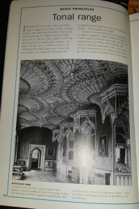
Below is an example from John Hedgecoe’s guide, showing a photograph which contains a full tonal range. As you can see, the photograph contains a range of grey tones, from the white tone in the bright window areas and the black tones in the unlit shadow areas.
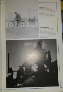
Below is another example from the guide, showing a light toned photograph and a dark toned photograph.
The light toned photograph is a portrait of the artist Henry Moore cycling past one of his sculptures. The image has a restricted tonal range to the light end of the scale. The dark frame of his bicycle, the shadow area beneath his coat and the sculpture itself , however, help to ‘Sharpen’ the overall appearance of the print.
The dark toned photograph is a view of a refinery that was taken against the light and most of the subject is therefore seen in shadow. This is relieved by the small, but intense highlight in the middle of the frame, which attracts the eye and also prevents the image appearing flat and two-dimensional.
Contrast:
In photographic terms, contrast refers to the exposure difference between the brightest highlight in a scene and the deepest shadow. This is relevant because in both film and digital imaging chips, are capable of recording subject detail in both of these parts of the frame only if the exposure difference is not too great. The contrast that they can ‘see’ without loosing detail is far less than that which the human eye can deal with.
In general, it is reasonable to assume that a slow to medium film for example ISO 200, will be able to record a wider contrast range than a fast film of ISO 800. Similarly, film in general is slightly better at dealing with high contrast than digital devices.
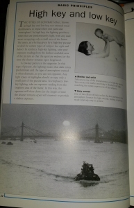
Two types of contrast effect, known as high key and low key, use unusual tonal distributions to impart their own particular ‘atmosphere’. In High Key, the lighting produces tones that are predominantly light, with any dark areas occupying only a small area of the frame. To reinforce high key lighting, take your exposure reading from the darkest available area if the picture so that the aperture widens or the time the shutter remains open lengthens.
Below are two examples of High Key photographs, from Hedgecoe’s guide. The high key lighting has given an open, airy feeling to the photograph.
A Low Key photograph is the complete opposite of a High Key photograph. Low Key lighting result in a photograph where dark tones dominate most of the image, creating a dramatic atmosphere. Any light tones or highlights should occupy only a small amount of the image. To emphasize low key lighting, take an exposure reading from the brightest area of the frame. In this way, the aperture will close down, or the length of time the shutter remains open will shorten to produce a darker exposure.
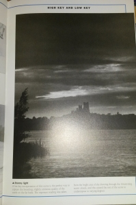
Below is an example of a low key photograph taken from Hedgecoe’s guide.
Using low key for this photograph has enabled the photographer to capture the brooding, slightly ominous quality of the castle on the far bank.
Once you extract colour from a photograph, other surface characteristics of the subject or location become more important. Texture is extremely important in black and white photography as texture shows the degree of roughness or smoothness of the subject, which adds vital visual information and interest to a photograph. Surface texture gives you the sense that the picture you are viewing has a tactile quality to it which enables the viewers to feel as though they can almost reach out and touch whatever is depicted in the photograph.
Texture in a photograph is created when light strikes the surface of the subject at a distinct angle. The light therefore illuminates the high points, whilst casting shadows that leave the corresponding hollows or low points, in darkness. With a portrait, moving in closer to your model can give the skin of the model a three dimensional reality, in a landscape, it can make you feel as if you could walk into the frame.
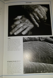
Below are three examples of photographs taken from Hedgecoe’s guide, showing how texture has been used when photographing still life and the human body.
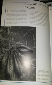
When photographing still life, using the photograph above of the leaf as a reference, the low angle of the light has illuminated only the highest surfaces of the dried leaf, leaving the cool shadows on the lowest parts. This gives the leaf an almost 3D feeling, making it stand out. You can see the texture of the dried veins in each leaf. The roughness of the stone wall has also been accentuated.
I love this photograph of the hands above. The use of daylight has enabled strong lighting to fall on the skin, highlighting the smoother parts of the skin, whilst the wrinkles are darkened by their own shadows, helping them to stand out more. You are able to see all of the different textures on the hands, from the smoother areas of skin to the rougher, more wrinkled areas of skin, you can also see the small ridges in the nail beds, showing a different type of texture. This photograph shows an extreme difference between light and shadow, producing a photograph where texture is the main subject.
When you select a small part of a subject in a photograph, you are able to emphasize the texture of that certain area, which may have otherwise been un-shown or less visible. In reference to the bottom photograph above, this was a selection taken from a larger photograph of a Buddha statue. By zooming into the frame and selecting a smaller section, you are able to see all of the smaller details on the statue. The contrast between light and shade in this photograph, produces a sense of depth.
Digital Camera World published an online article written by Jeff Meyer, which gave advice on techniques to help you produce the best monochrome photograph. Meyer quotes “Look out for subjects that feature simple, strong lines and shapes. It’s often the shadows that define shape and form, so pay attention to areas of darkness, as well as light … Fine detail, or strong textures such as weather-beaten stone, foliage or clouds, can help to give your black-and-white shots depth and interest” Jeff Meyer for http://www.DigitalCameraWorld.Com
http://www.digitalcameraworld.com/2015/01/26/black-and-white-photography-how-to-make-monochrome/
Composition and viewpoint play a major role when attempting to capture texture and form in a monochrome photograph. Photographers usually use the rule of thirds when shooting, however, many cease to use this rule when shooting for monochrome images. For example, if I am photographing a tree, knowing that I would be producing a final monochrome photograph, rather than framing the tree in the centre of the frame, showing the full trunk and branches, I would consider moving closer to the tree, perhaps closer to the trunk. I would position myself so I could include as much texture, detail and form, of the tree trunk, as by doing so, I will be able to produce a final monochrome photograph which is full of the texture and detail of the tree trunk, giving it an almost tactile 3d effect, where the viewer can almost touch it through the photograph. Of course, the angle in which I frame the trunk will help and the way the lighting falls on the trunk will play a role too. This is where I would then experiment with the camera and shoot from different angles and viewpoints.
But why Monochrome?
If colour is great, then why do we continue to photograph in black and white? Many argue that colour within a photograph is a distraction and can be too busy. Colour captures your attention, however, it can obscure details, texture and tones and can also distract you as a viewer, from understanding the purpose of the photograph. However, colour is not a bad thing and it can be used to produce amazing photographs. You are able to use a variety of colour hues and tones that you cannot use in black and white. Colour contributes a broader effect to an image, as it helps us judge time. Autumn leaves are yellow and red, as opposed to green in the summer. Early morning and late evening light is more golden than midday light. Removing color de-emphasizes time, which is useful if time doesn’t matter to your vision for the photo.
You should opt for colour if colour is the key element in your photograph. For example, take Steve McCurry’s famous portrait photograph ‘Afghan Girl’.
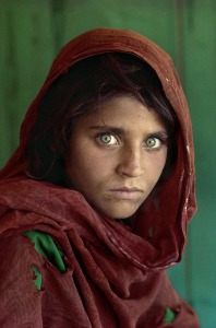
Afghan Girl. Steve McCurry 1984, Afghanistan.
Whilst photographing freelance in India, McCurry learned to watch and wait whilst photographing people. Even though this quote was not said in regards to his work in Afghanistan, I believe it sums up this photograph well, McCurry quotes “If you wait, people will forget your camera and the soul will drift up into view.” Steve McCurry, India. Sometimes, the best portrait photographs are those in which the subject is entirely relaxed. If the model is relaxed, their own personality and soul will begin to show through in the photographs.
This world famous photograph was taken in colour rather than black and white. McCurry has managed to use complementary colours rather than contrasting colours. By doing so, the colours are subtle, harmonious and work well together, rather than contrasting colours which can be bold, harsh and clash if you don’t use them correctly. He has used a background colour, similar to the girls beautiful green eyes. Knowingly or un-knowingly, he has incorporated a dark red scarf, which frames her olive skinned face and shoulders. It balances the photograph as it breaks up the green coloured background and helps to draw the attention to her eyes.
Because there isn’t much texture or detail within the image, as she has beautiful, soft smooth skin and a plain scarf and background, converting the image to monochrome would not be a great idea. The complementary colours would be similar in tonal contrast when converted to black and white and would therefore not stand out that well and would blend in together. Her eyes wouldn’t have that much of an impact as the beautiful colour is what makes this a world famous photograph as they stand out and draw the viewers attention in. Canadian photojournalist Ted Grant quotes, “When you photograph people in colour, you photograph their clothes. But when you photograph people in Black and white, you photograph their souls!” Ted Grant
I can somewhat agree and disagree with his statement. I agree that when photographing in black and white, you are able to focus more on the details, textures and tones rather than worrying about the colour. You are able to focus on the persons facial features such as their eyes, which can draw the viewer in. However, in regards to the Afghan Girl, I disagree with this statement. McCurry hasn’t photographed the girl in ‘Colourful’ clothes as the clothing is of subtle colours and is therefore are not harsh, so they don’t distract the viewer to an extent. There is a well known saying that the ‘Eyes are the windows to the soul’. Dis-regarding Ted Grant’s statement and remembering that if this was taken in black and white, the eyes wouldn’t have had the same impact, I believe that McCurry has managed to use colour photography to take advantage of the colour of her eyes, to produce a beautiful photograph which captures her soul through her eyes.
American photographer, Paul Outerbridge quotes, “One very important difference between color and monochromatic photography is this: in black and white you suggest; in color you state. Much can be implied by suggestion, but statement demands certainty… absolute certainty.” Paul Outerbridge. So why do we choose black and white over colour. Is it because we are unsure and uncertain whether or not the colour within our photograph is distracting, have we chosen the right decision to shoot in colour, or is it because some photographers are cautious when converting their photographs to black and white, as manipulating their photographs can sometimes be harder than you expect. Everyone’s opinion is different, I don’t believe that photography should be limited to shooting in black and white or colour simply because of the subject or location you photograph. I believe that there are certain cases where shooting in colour is appropriate and in times where black and white is appropriate, it is also a personal choice as some prefer colour photographs and some prefer black and white.
There is nothing more classic than black and white photography. It is timeless and nostalgic and reminds us of the past when black and white was the only medium available. Black and white is the foundation of photography, as this was the starting point when the first ever camera was made. Photographer Paul Gallagher, wrote an article for the Practical Photograph Magazine regarding black and white photography. He quotes, “Having taught photography for many years, I still feel it should be a starting point for any budding photographer because it only deals with luminosity. When you train your mind to identify light and dark without being distracted by colour, then this opens up a whole new world of ‘Seeing’.” Paul Gallagher, Practical Photography Magazine.
When I was studying photography at college, we began with the basic 35mm film camera. We were taught the basics of black and white photography, then moved on to learning how different camera settings could be used in order to produce a well shot black and white photograph. When shooting, I had to remember that I was shooting with a black and white film, and therefore when going out photographing, I would have to look at certain subjects, objects and locations in a different way than I would with colour, as I would need to look our for different types of lighting, texture, shapes and forms, different tones in buildings, colour tones etc. Black and white allows you to concentrate on the image itself, rather than worrying about colour. You are able to focus on certain details in the composition which may have been lost or obscured by colour, it allows you to cut back on the distractions and to only focus on the importance of texture, shape, form and tones. You therefore find yourself photographing pieces of buildings or objects that you would not have thought to shoot in colour, such as the small details on a leaf or the roughness on the buildings wall. You are able to emphasize drama within a photograph, by using strong contrasts with high key and low key.
In regards to black and white photography, rather thank thinking about why you want to convert the image to black and white, you should focus on what type of message or feeling you are trying to convey. Focus on what elements of the photograph you want to emphasise and enhance in order to create a certain mood or feeling, and decide whether or not by converting it to black and white, it will have the effect you want, or if colour would work better. If you are looking to produce a timeless piece which is nostalgic and pay homage to the past, then the black and white medium is definitely the way to go.
Portrait photography in monochrome is classic, elegant and timeless. It is a medium which has always been popular and I doubt it will ever go out of fashion. Choosing monochrome to shoot portrait photographs, enables the photographer to discard any distractions caused by colour, allowing emphasis on certain emotions and moods within the photo, from sadness, depression, scared, happiness and much more. As mentioned previously, photographer Paul Outerbridge quotes “…in black and white you suggest; in colour you state. Much can be implied by suggestion” Paul Outerbridge. One portrait can have several emotions or moods, by simply changing an expression or the lighting, something which could be difficult with a colour portrait as you have to take into consideration the colour of clothing, backgrounds, make up and much more.
A good portrait is never primarily about photography, the light or technical settings. It’s about the person, the moment and the expression. A great portrait is one which draws the viewer in, it creates a reaction or an emotion from the viewer. A portrait which answers all of your questions is boring, a great portrait is one which leaves the viewer with more questions than answers. Portraits are unpredictable, it is a powerful thing to be able to capture a person as they are at a particular point in time. The photographer essentially freezes that moment in time.
Mentioned previously, photographer Ted Grant quoted “When you photograph people in colour, you photograph their clothes. But when you photograph people in Black and white, you photograph their souls!” Ted Grant. When we ‘Look’ at a persons face, we usually focus on their eyes, as the eyes can tell a lot about a person. For example, if you are having a conversation with someone, you tend you look at them in the eye, not only out of respect, but by doing so, you create a connection between you and the other person. You are also able to perceive how the other person is feeling. The eyes are also windows to the soul and can tell a story about the person. With the removal of colour distractions, a monochrome portrait enables the viewer to focus on the eyes of the subject, helping them to perceive the emotion and mood in the image, building a strong connection between them.
A monochrome portrait provides a great tonal range between the deepest blacks to the whitest whites, which means that no matter what ethnicity, colour or race you are, monochrome portraits will always work. With the correct use of lighting, shadows and highlights can reduce or enhance the texture of the persons skin. Lines, wrinkles, imperfections, scars, pigments and discolouration of skin can also become enhanced or reduced with monochrome, depending on the lighting and contrast. For example, keeping scars visible in the portrait can help to tell a story and can provide an emotion within the photograph, or you can reduce the tone of a scar in order to hide it in the photograph.
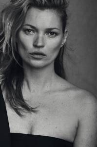
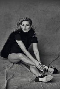
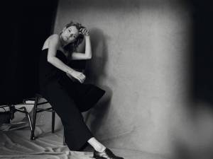
Photographer Peter Lindbergh has built an entire career shooting portraits almost exclusively in black and white. In January 2015, Lindbergh was commissioned to shoot portraits of model Kate Moss, for the fashion magazine Vogue Italia. Their main goal for this shoot was to keep it ‘Natural’. The magazine insisted that model Kate moss wore barely any makeup, and that every photograph was to remain untouched by Lindbergh.
Kate Moss, Vogue Italia 2015 by Peter Lindbergh.
Kate Moss, Vogue Italia 2015 by Peter Lindbergh.
Kate Moss, Vogue Italia 2015 by Peter Lindbergh.
Lindbergh produced a set of untouched photographs which show just how talented he is when shooting in black and white. He has used lighting and composition to produce portraits which all have even skin tones. There are no visible skin discolouration’s, scars or imperfections of the skin. Even with basic makeup, he has used lighting to produce highlights and shadows which give the effect of contouring make up which is used in most portrait photography. Contouring makeup gives the effect of visible cheekbones, thinner nose area and brighter eyes, however, Lindbergh has managed to produce the same effect with the use of lighting and composition, causing highlights and shadows in certain areas. The details and textures are also very clear in the photographs, giving us the viewer, the feeling as though you could almost step into the photograph and be on the set of the shoot. I am unsure as to what emotion or mood Lindbergh was attempting to create in the portraits of Kate Moss, however, my personal opinion is that the portraits have a calm, relaxed mood to them.
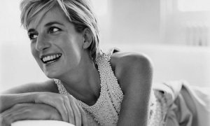
In 1997, photographer Mario Testino produced a set of 15 portraits for the magazine Vanity Fair, of the late Diana Princess of Wales. An exhibition was opened at Kensington Palace in 2005, which showcased the last ever official portraits of the Princess, before her unfortunate death later in the year. Testino quotes “Photographing Diana, Princess of Wales for Vanity Fair in 1997 was one of the most memorable days of my career. I am honoured to have been asked to show some of the photographs from that day in surroundings as unique as Kensington Palace and design the rooms that pictures and dresses are to be exhibited. I hope that the design will reflect my respect and admiration for her in this light celebration of her life” Mario Testino.
When meeting Diana for the first time, Testino quotes “…I knew from the start that this shoot would be different …. I was amazed by this person who, even though she had everything, she would go to feed the homeless and visit sick children and Aids victims. It was like a fairy tale. Who was she really? Why did she do this? She was trying to find love. I wanted the world to see her kindness, her humility: I think she realised that would be her way.” Mario Testino. However, even though he was somewhat star struck, Testino did not hesitate to orchestrate every detail of this shoot, down to his subject’s eyeliner: “I did say to her, ‘More black here, less curl here, more lipstick here.’ But that is how I work. I spend the day with the subject, make them relax, we eat together, we drink together and when we are having a good time I say, ‘Let’s decide what the look should be…” MT.T
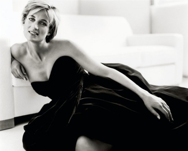
Diana, Princess of Wales, London, Vanity Fair 1997. By Mario Testino
In regards to the portrait above, the words elegant, beautiful, classic and entrancing spring to mind. Testino has used tonal contrast, to produce a well balance portrait. The dark black dress covers the lower half of her body, (except for one area of her leg poking through), making her stand out against the pure white sofa in the background. From the way the light is falling in this photograph, it would seem as though there is a window off to the right hand side of the frame. The dress is extremely dark, however, the highlights from the light have fallen on the creases of the dress, enabling you to see the folds. It gives the dress form and texture, in what would have otherwise been an extremely dark area within the photograph.
The pure white sofa in the background, has been used to help frame the smooth, even toned, porcelain skin of the Princess’ top half. With the use of lighting, the sofa has been burned out in places, and some of the detail is missing. The pure whiteness in certain areas of the photograph, gives the Princess a somewhat angelic aura around her top half. With the positioning of her arm, Testino breaks up the large amount of dark black dress, thus leading your view to her facial area. Testino quoted that he wanted to show Diana’s kindness and humility in these portraits. When I look at Diana’s facial expression in this portrait, I take into consideration Ted Grant’s quote “…When you photograph people in black and white, you photograph their souls”. Ted Grant. Even though she is smiling, I find her smile somewhat false. Comparing the portrait above and first portrait below, she seems sad. I get the feeling from these portraits, that she enjoyed herself somewhat. Perhaps she did feel comfortable with the photographer, as Testino mentioned that they both relaxed before the shoot, however, it can be awkward being photographed. Maybe she was a little nervous being photographed, however, she seems to be hiding sadness, her eyes give it away. No matter how hard you try to hide sadness behind a smile, you will never be able to hide it completely. We must remember that not long after these portraits were taken, Diana sadly passed away. Did she somehow know that these would be the last portraits of her, is that why she is sad, or is she sad because of things troubling her at the time? I suppose we will never know. I think that is what gives these portraits a sad mood to them.
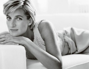
Diana, Princess of Wales, London, Vanity Fair 1997. By Mario Testino
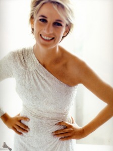
As mentioned previously, one portrait can have several emotions or moods, by simply suggesting. Changing an expression or the lighting can give one portrait several different emotions. In regards to the portrait below, this could not be any more true. With this portrait, Testino has captured Diana smiling and laughing, but not directly at the camera. This one portrait does have a different mood and feeling to it, compared to the others and Diana does seem happy in this portrait. Is it because she isn’t looking directly at the camera, she is looking off to the side. Because we cant see her eyes, we assume from her large smile and in mid laugh, she is happy. Again this is caused by Mario Testino simply making her laugh before the shot was taken, in order for him to suggest to us that she was happy in this shoot.
Diana, Princess of Wales, London, Vanity Fair 1997. By Mario Testino
Testino not only photographed Diana in monochrome, he also photographed her in colour on the same day. In regards to the photograph below, Diana appears somewhat uncomfortable. Her pose does seem comfortable and it looks staged as though Testino told her how to pose in this photograph. Her smile still looks uncomfortable and false. It is a lovely photograph, however, the use of a white dress on a white background is confusing, especially with it being a colour photograph. He has used her tanned skin to help break up the whiteness within the photograph. If I had to choose between his colour portraits or his monochrome, I would choose the monochrome, as they show a lot more texture, tone, form and detail.
Diana, Princess of Wales, London, Vanity Fair 1997. By Mario Testino
I read an extremely interesting article written in July 2015, by columnist Jonathan Jones for the Guardian online. The article is called ‘Testino’s Portrait of William and Kate is a Sickly Sweet Lie’. Even from the name, you get the feeling that this columnist is not a fan of Testino’s work.
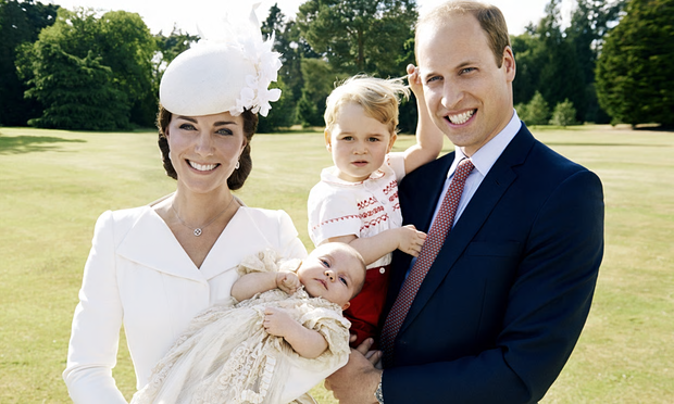
The Duchess of Cambridge, Princess Charlotte, Prince George and Prince William. Princess Charlotte’s christening, London 2015. By Mario Testino
“No one can photograph a fake smile like Mario Testino can. I am not saying the huge cheesy grins on the faces of Kate and William in his christening portrait of the royal nuclear family are fake. After all, they have plenty to smile about – the free houses, the free money, the free adulation, the fact there’s no chance of their kids ever having to worry about student loans, tax credits or the minimum wage. All smiles all the way. But Testino, the world’s most horrible flatterer of wealth and status, makes every smile look phoney. He makes reality itself seem a glib and cynical charade. Their faces lit up by hysterical joy, their hair wispy in the sun, their teeth shining like diamond walls of privilege, and their eyes betraying no signs of thought whatsoever, the Cambridges are robbed of true personality by Testino’s faux-honest glamour shot. Their children are so glossily celebrated that they look like fashion accessories, hired for the day. George, you can tell, is bored and hating this. He gives away the fact that, far from casually encountering Testino’s lens” Jonathan Jones
In regards to columnist Jonathan Jones statement above, I agree with some of his views and disagree with other parts. I especially agree with the section where he quotes “…makes every smile look phoney. He makes reality itself seem a glib and cynical charade….” Jonathan Jones. As mentioned in regards to the portraits of Princess Diana, I believed that her smile was somewhat false, as you could see that she was hiding her sadness. You could therefore say that Testino has made her smile look ‘Phoney’, almost put on just for the camera. I disagree with his quote “…and their eyes betraying no signs of thought whatsoever”, as I believe that Diana infact shows deep sadness through her eyes. In regards to the portrait of The Duchess and Prince William at Princess Charlotte’s christening, I also disagree with his statement. Testino has managed to capture a ‘Happy’ family on what was a joyous day for them. The Duchess and Prince William both look happy and you can tell this from their eyes.
I do understand how Jonathan Jones could believe that they look fake and false in the photograph. When photographing children, it can be a long day trying to make sure that the children are looking directly at the camera, therefore, I think Testino has done well by capturing both Prince George and Princess Charlotte, both looking directly at the camera lens. Yes, this may have been the 5th or the 20th attempt at taking this photograph, making sure that everyone was looking where they should be, but I don’t agree with Jonathan Jones criticism and judgement in regards to how Prince George is ‘Looking’ “George, you can tell, is bored and hating this.”. Below is a second portrait taken on the day in monochrome, of just Prince George and Prince William. In this photograph, both Princes’ look extremely happy, again you can tell this not only from their smiles, but from their eyes, therefore Jonathan Jones criticism does not apply to this photograph. It’s hard to say which photograph I prefer out of the two, as they are both completely different. The photograph below looks more relaxed and jolly, as though Prince William said something to Prince George in order to make him laugh or smile, whereas the photograph of the whole family does look ‘Staged’ and formal to an extent.
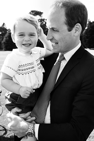
Prince George and Prince William, Princess Charlotte’s Christening. London 2015, By Mario Testino
“They deserve better, and so do we. Testino is a bland and banal photographer whose images lack any shred of emotional depth” Jonathan Jones. I completely disagree with this statement. As mentioned previously, I believe that some photographs look better in black and white, and some look better in colour. It all depends on the colouring, the lighting, details, texture and form and contrast. Testino has produced a set of beautiful portraits of Princess Diana. I do believe that Testino completed what he set out to achieve, and that was to capture Princess Diana’s humility and kindness. His use of lighting and shadows and highlights, have produced portraits of her where she is framed by the light, making her appear some what pure and angelic in a way. Her eyes speak a thousand words, and even though these are beautiful portraits, you can see the sadness in her eyes. Of course we know now that she would not be alive long after these were taken, and I think that by knowing this, we seem to look differently at these portraits of Diana, compared to other portraits of her taken previously beforehand. We as viewers of these portraits are captured by her eyes and a connection is made between us where we can then see her sadness within these photographs.
I do not agree that Testino is a bland and banal photographer. Testino has produced a vast range of portrait photographs of many celebrities. Each portrait is different and I congratulate him on the fact that he has managed to produce a unique and different portrait depending on the person. He has not ‘stuck’ to the simple portrait photography. He has experimented with colour and monochrome photography and by doing so, he has captured individual portraits relevant to the certain model being photographed.
Photographer Research:
When I think of well known monochrome photographers, I instantly think of Ansel Adams. Ansel Adams was born in San Francisco in 1902. He began his career in photography after an encounter with photographer Paul Strand in 1930. Strand’s use of ‘Pure Photography’ made a lasting impression on Adams and motivated him to clarify his own intentions. In 1932, Adams began using certain compositions and techniques with his photography which enabled him to emphasize the greatest depth of field as possible and the sharpest reproduction of details. He particularly favoured close ups of individual subjects. “Some photographers take reality… and upon it impose the domination of their own thought and spirit. Others come before reality more tenderly and a photograph to them is an instrument of love and revelation.” Ansel Adams. The Portfolios of Ansel Adams.
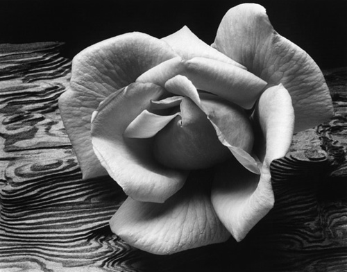
Rose on Driftwood, Ansel Adams 1933. Gruber Collection.
In regards to Rose on Driftwood, Adams has used the full range of tonal contrast for this photograph. He has composed the image, so the light has fallen onto the rose, creating shadows on certain parts of the petals and highlights on the other parts. The shadows enable you to see extremely fine lines on the petals which are almost like veins, creating texture to those certain parts of the image and the highlights have produced areas which look smooth. You as a viewer can almost reach into the photograph and feel the petals between your fingers, feeling the smoothness of some petals and the texture on the others. The highlights and shadows have produced an almost 3d effect, enabling the rose to have a 3d form within the photograph. Each petal is curved and rounded and is not flat in the photograph, this helps it stand out against the background. The patterns on the driftwood that the rose has been placed onto, breaks up the dark shadow areas, enabling the brighter tones of the rose petals, to stand out from the background. The driftwood has its own texture and details, however, it is not distracting your attention away from the rose.
I don’t think this photograph would have worked well in colour as I believe that the patterns in the driftwood may have been distracting in colour. I think it depends on the colour of the rose. If the rose was an orange or red colour, on a brown driftwood background, it may have worked as it would be almost autumnal colours, whereas a bright pink or yellow rose may not have. If colour was used, you may not have been able to see the full amount of detail on each petal. Monochrome has definitely worked well for this photograph.
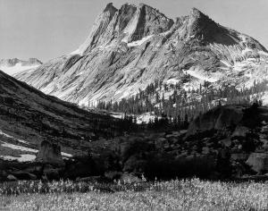
Adams became interested in nature and spent a considerable amount of his life as a landscape photographer in America’s National Parks. He wanted to focus his photography on the natural world and man’s relation to it. “To photograph truthfully and effectively is to see beneath the surfaces and record the qualities of nature and humanity which live or are latent in all things” Ansel Adams, The Portfolio of Ansel Adams. He began photographing nature during the time of the great depression. Mother nature was harsh on many people, hurricanes, dust bowls and crop failure was unfortunately very common. His love for the wilderness began after a family trip to Yosemite National Park in 1916. He fell in love with the Sierra Nevada Mountains, and began working as a custodian at the headquarters of the Sierra Club at Yosemite. Soon enough, he began working as a guide, he explored the mountains with his camera in his hand, photographing the sheer beauty of the mountains. Throughout the 1920’s, Adams took hundreds of photographs, progressing from the soft focus, traditional landscapes, to the more direct style he is now famous for.
Adams was known to stay in the wilderness for months at a time and was known to use a large format view camera. Using a large heavy camera in order to shoot, meant that he would have to take tripods, films and portable dark rooms along with him. Adams therefore retreated to the wilderness with the assistance of a donkey who carried his photographic equipment. Using a view camera, enables the photographer to control every step of taking the photograph. Adams would therefore be able to use large format negatives in order to produce prints which would show even the smallest amount of detail. He would have been able to control tonal contrast and controlled which part of the photograph was in focus or out of focus.
However, it was a large, heavy piece of equipment, therefore pre-visualisation of your photograph would have been crucial in order to produce a well exposed, well composed photograph. Adams was a master of using light, and produced the Zone System alongside photographer Fred Archer in 1939-1940. The Zone System is a set of important techniques which enables photographers to have the greatest control over the characteristics of black and white film. This system works well with sheet film, it can be exposed and developed one piece at a time. It becomes the negative used when printing the photograph.
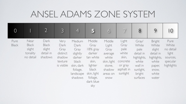
When using the Zone System, you should follow the simple steps below. Below is an explanation of the Zone System, taken from an article written on http://www.CreativePhotography.org
- previsualize the subject scene in shades of black and white [using the Zone-Scale Card]
- take a light meter reading of target zones using a hand-held light meter, and sometimes a gray card as well
- decide if adjustments need to be made in the exposure to effectively record the amount of light on the film
- determine if the contrast, or range of values from black to white, will need to be adjusted by varying the development time of the film. A shorter than normal development time decreases contrast; a longer than normal time increases it.
- analyze the print during the printing process to determine if the tones of the photographic image are aesthetically pleasing as they were previsualized.
Definitions:
development: a chemical process, carried out in the dark, which makes the image exposed on the film visible and permanent in negative form.
exposure: the amount of light that falls on the film (which will become the photographic negative). This is regulated by controlling the size of the aperture through which light enters the camera and/or the length of the exposure.
gray card: a standardized card, used for measuring light, which corresponds to Zone V, or mid-tone gray.
hand-held light meter: a light-measuring device that is separate from the camera. A spot meter, which covers a one degree angle, is ideal for measuring target zones.
previsualization: a mental exercise in which the photographer imagines the subject in terms of the black, white, and grays desired in the final photographic print.
spot meter: a type of hand-held meter that allows the photographer to easily measure light falling on very small areas within the subject matter.
zones: a specific set of tonal values consisting of pure black, the base white of the black-and-white photographic paper, and eight or nine shades of gray in between [see Zone Scale Card]. When the Zone System is used, the darkest areas of a photographic image are referred to as low values (Zones I — III), the gray areas are called middle values (Zones IV — VI), and the light areas are high values (Zones VII — IX). The zones are always referred to by roman numerals
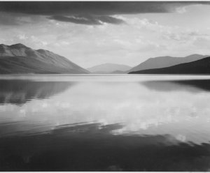
Evening, Ansel Adams. McDonald Lake, Glacier National Park. 1933-1942
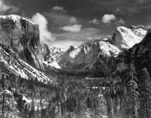
Yosemite Valley Winter, Ansel Adams. 1938
Boaring River, Ansel Adams. Kings Region, Kings River Canyon. 1936
In regards to the landscapes above, similar to the Rose on Driftwood photograph, Adams has used the full range of tonal contrast in each photograph. From the distance between the camera and the mountains in the photograph, it is unbelievable that the details in the Yosemite and Kings River photographs are extremely precise and clear. Adams has managed to use lighting and composition, in order to produce highlights and shadows in certain areas. By doing so, he has accentuated the highlights on the white snowy areas, making them stand out against the darker tones, whilst at the same time, using shadows in order to show the texture and forms of the different breaks in the mountains and the details on. You are also able to see the fine details in tree. With Adams landscapes, they are that detailed and textured, you as a viewer feel as though you are inside the photograph looking directly at the mountains yourself. They are simply stunning.
Assignment Three:
Planning:
I knew that I would be going on a trip to Kidderminster/Bridgnorth on the steam train. As I had not visited Kidderminster or Bridgnorth before, I was unaware of what to expect, in terms of how many trains there would be, would there be a lot of people, what would the weather be like, would I be able to get close to the trains in order to photograph ‘parts’ of the trains, would I have enough time as we were on a time limit.
I planned these previous exercises and assignment around this trip as I knew that this trip would work well for not only producing final photographs for my assignment, but also for the individual exercises previous to the assignment. Therefore, for this assignment, I would be keeping the same theme I have been using for the previous exercises, which was trains. I knew that I would have to plan in advance what type of situations, locations and trains I would be looking out for, and any interesting shots that may occur. I took notes of what the assignment required me to do, and what I would be looing for.
Photographer Research:
After deciding that I would be keeping the train theme, and before I knew what types of images to shoot, I decided to research into photographers who photograph trains, mainly steam trains, and in black and white, in order to gain some inspiration.
The first photographer I researched was O. Winston Link.
O. Winston Link was an American photographer, born in Brooklyn 1914. He was well known for his black and white steam locomotive, railroad photography in the United States in the late 1950’s. In Virginia 1955, whilst on another photography job, Link became focused on the nearby Norfolk and Western Railway (USA). He took his first night shot of the railway in 1955. 20 visits and 2400 negatives later, Link had unknowingly documented the end of the steam era for Norfolk and Western Railway, by the end of 1960.
His decision to shoot at night was simply because monochrome photographs created romantic and dramatic photographs. He was able to enhance the white tone of steam being produced by the trains making it more striking against the dark black background, compared to photographing it in the daylight, which would produce a dirty grey colour steam rather than bright white. Link knew that photographing railroads and capturing moving trains, in the right position, at night would be difficult “I can’t move the sun, and it’s always in the wrong place, and I can’t even move the tracks, so I had to create my own environment through lighting” O. Winston Link. Therefore, he knew that his visions required him to develop new techniques for flash photography on such a large scale. He used an assistant to help set up his equipment and used a 4 x 5 Graphic View camera, with black and white film.
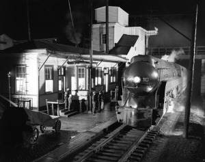
Train 2 arriving at Waynesboro Station. O. Winston Link. Waynesboro, Virginia, April 14th 1955.
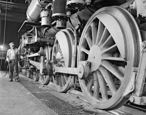
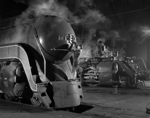
Lubricating Wristpin. O. Winston Link. Bluefield, West Virginia, June 20th 1955.
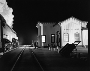
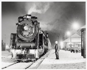
Train 17, The Birmingham Special, Arriving at Rural Retreat. O. Winston Link. Rural Retreat, Virginia, December 26th 1957.
Electrician J. W. Dalhouse, A Close-up View. O. Winston Link. Shaffers Crossing, Roanoke, Virginia, March 19th 1955.
Similarly to Ansel Adams, Link used a large view camera. By doing so, Link would have to, like Adams, pre-visualize the photograph he wanted before he took it. Shooing at night would also make it difficult for link, as he could not use daylight as a light source, therefore he had to rely on his own lighting and flash. Link would not only have to set up his camera in the right location, he would have to make sure the composition of the frame was correct, the lighting was correct and that each photograph would be exposed correctly, all whilst shooting in the dark and only relying on your own light sources. For any photographer, would be a challenge.
In regards to Links photographs above, I really like them. I am amazed that he took these photographs, not only in the dark, but with black and white film, and relying on his own light sources. No post processing. He used his knowledge of photography to produce well exposed photographs, with a wide range of tonal contrast, form and texture. Each photograph is controlled, planned, and constructed. He used the lighting to create shadows and highlights which fall in the correct places. In reference to the photograph of Train 17, he has used highlights to enhance the white tone of the steam making it stand out against the dark black tonal background. The details in the steam are also extremely clear, as well as the surrounding areas. Each photograph contains sharp details and texture, they each have an almost 3d effect, which makes you as a viewer, feel as though you could be stood at that moment in time, ‘Seeing’ what Link was seeing. Each photograph tells a story, and he uses composition to tell stories that you wouldn’t usually look out for. For example, he photographs the underside of the steam train (Lubricating wristpin), to show the details of the wheels. He uses a slight diagonal composition, in order to draw your attention to the worker, in order to produce a unique final photograph. I will definitely be using inspiration from Links work.
Links work has been published in several books, O. Winston Link: Life Along the Line (Abrams), being one of them. An article was published on http://www.TheAtlantic.com regarding the book. Below is a quote taken from the article.
“Much of the book showcases these employees, men at work on the trains, but whose jobs disappeared with the steam engines … Steam may be just a bunch of hot air, but that hot air packed a lot of power, fueling a region and the people who lived there for decades. In Link’s images we see that power, lighting up a night sky and a lonely town” Rebecca J Rosen.
Taking the statement above into consideration, you are able to understand why this collection of photographs were nostalgic for the workers who lost not only their jobs from the decline in the railways and the boom of the American Car, but their homes and much more. Therefore, similarly to Mario Testino’s portraits of Diana, Princess of Wales, they are beautiful photographs, however they have a sad mood to them. We feel nostalgia around Links photographs simply because this all happened in the past. Everything has changed, everything is modern now, we can’t appreciate the beauty of these hardworking machines because they are no longer there. Link has managed to capture a moment in time which no longer exists.
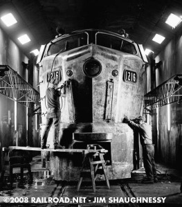
The second photographer I researched was Jim Shaughnessy.
Shaughnessy began taking photographs in the late 1940s, capturing the end of steam in the northeast U.S., Canada, and Mexico, and continued photographing the first and second generation diesels that followed in New England and throughout the U.S. He photographed railroads for 40 years, between 1946 and 1988. He began photographing steam locomotives in his home town of Troy, New York, and similar to O. Winston Link, He documented the dramatic steam to diesel transition.
Jeff Brouws, a friend, photographer and fellow “rail fan,” to Shaughnessy, helped produce a book, The Call of Trains: Railroad Photographs, showcasing 170 duotone photographs, taken from Shaughnessy’s 40 years as a photographer. Brouws initially had a collection of 300-400 photographs to choose from, but ended up narrowing it down to the 170 final photographs. Brouws wrote an introductory essay that puts Shaughnessy’s work in biographical and historical context within the book.
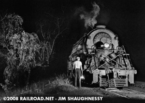
On a Cold Night in Sherbrooke, Que. Jim Shaughnessy, February 1957. The Engineer of Canadian National 4-6-2, No 5293 admires his steed.
Jim Shaughnessy. Taken From, The Call of Trains: Railroad Photographs by Jim Shaughnessy.
Jim Shaughnessy. Taken From, The Call of Trains: Railroad Photographs by Jim Shaughnessy.
Jim Shaughnessy. Taken From, The Call of Trains: Railroad Photographs by Jim Shaughnessy.
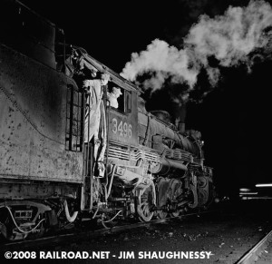
Similarly to O. Winston Link, Shaughnessy would have had to pre-visualise his photographs before he went to shoot. He too, shot dramatic night portraits that were painstakingly lit and were often staged similarly to Links. They soon became part of his own signature style. Thus meaning that like Link, Shaughnessy would have to rely on his own light sources and available light, in order to produce the required exposure, to produce highlights and shadows that he would need in each of his photographs. He uses the full range of tonal contrast in each of his photographs. With the use of light available, he has managed to produce highlights which show off the smoothness of the snow in photograph On a Cold Night in Sherbrooke, they also show the smooth texture of certain areas on the metal panels on the trains, as you can see in the last photograph of Shaughnessy’s above. Similar to Links Train 17, you are also able to see detailed steam plumes. The shadows enhance the details, scratches, dents and rough textures on the panels, bolts and wheels, which help to show the age of the train and give the trains individual characters and stories.
Shaughnessy quotes in Classic Trains Magazine, “I like pictures with people in them or something, not contrived, that capture a moment in time … There is more to it than just the locomotive. The station scenes, the countryside, umpteen million possibilities.” Jim Shaughnessy. In the final photograph above, similar to Links Electrician J. W. Dalhouse, A Close-up View, his unique composition has managed to capture the workers whilst busy maintaining their locomotives. His use of composition for this photograph, has enabled him to produce a photograph which gives the appearance of the train having a face. The two windows look like large eyes, the round middle area looks like a nose and there is a ridge which could pass as a mouth. The two workers therefore look as though they are ‘Looking after’ or ‘Retouching’ the trains face. Shaughnessy has managed to give the train in this photograph human characteristics, similar to Links Electrician photograph. It is as though the trains are being ‘Pampered’ before their next adventure.
Shaughnessy doesn’t just focus just on the locomotives, he uses his own original compositions, to photograph parts of the railroads, sheds, tunnels, viaducts, yard stations, mechanics and much more. His interest in mechanics led to striking close up photos similar to Links Lubricating Wristpin photograph. His unusual angles made the viewer part of the action, and his inclusion of people within the photograph, similar to Link, helped to broadened the scope of traditional rail photography. Jeff Brouws quotes, “This decision to place [people] within the context of the railroad landscape…became an important component of his emerging style…By seeing the railroad milieu as a social space, he humanized the industrial environment, exploring the relationships between the railroad and the people that interacted with it.” Brouws. By doing so, he has managed to build a collection of unique and interesting photographs which show us as the viewers, an insight into how the railroads worked, how the locomotives worked and the people who worked on them. Like Link, Shaughnessy has managed to capture a key historical era which can no longer be visited.
After studying both of these photographers, I have gained a lot of inspiration from them both. I really admire just how much work they have put into each of their photographs, especially as they both shot their work at night, only relying on available light or their own light sources. You can see that they pre-visualised they type of final photograph they wanted, and each photograph looks controlled, planned and constructed. They have both used the full tonal contrast range, and have managed to produce striking highlights and shadows within their photographs. Each photograph contains enormous amounts of clear detail, thus enhancing textures of scratches, dents, bolts, plumes of steam and much more. They both use their own unique compositions, which enabled them to produce photographs for example of the mechanical side of steam locomotives. Mechanics which we as passengers or public, would not have been able to see up close. They both include workers in their photographs which help to humanize their prints. Below are a few bullet points which I will be using as inspiration when taking my photographs.
- Use the available light or think about whether or not a flash would work for that certain photograph. Think about how the highlights and shadows will fall.
- Look out for unusual compositions. Focus on the mechanics of the trains (Wheels, Underneath, The sides of the trains, Bolts, Panels, Damages, Scratches, Dents). Look out for the railroads, or railway tracks. These sometimes have a lot of detail on them and can be interesting.
- Look out for railway workers. Can I photograph them whilst working on the trains. Will I be able to photograph the engine area with the coal and fire.
- Try and think about photographing the train with plumes of steam. Try to include as much detail if possible.
- Think about my surroundings. Platforms usually have interesting things on them, train related. Maybe they have old parts of trains, suitcases, wheels, cogs etc.
- Plan for the weather and other passengers. Link and Shaughnessy don’t include passengers in their photographs, so I may not want to.
Decisions:
As this assignment wants you to focus on form, texture and tonal contrast and after my photographer research, I have decided that for his assignment, I would be focussing on all aspects of steam locomotive trains. For example, taking inspiration from Link and Shaughnessy, I will not only focus on the locomotives themselves, but I will photograph train tracks, bolts, cogs, damage to the locomotives, workers on the locomotives, how the locomotives work, platforms and objects and subjects with a lot of detail or texture.
Knowing that I would be shooting these photographs in colour, in order to convert them to monochrome, I knew that when shooting, I would have to not focus on the colour whilst shooting, but focus on the lighting. I would need to make sure that areas with details and texture were correctly exposed, in order to enhance them and make those areas clear, so that when they are converted, they are clear in the monochrome photographs. I also had to remember that unlike Link and Shaughnessy, I would not be shooting at night, as my trip would be taken in the day. Therefore, I would not be able to achieve the dramatic night shots that they both took, however, this means that I can produce my own versions of steam locomotive photographs.
As mentioned previously, I was unaware of what the day would hold whilst I was there, as I have never been on this train journey. I would need to think about weather, other passengers and time as we are on a strict time schedule. Therefore, making sure that I went on this journey with ideas of what I wanted to photograph, a plan in my head and inspiration from Link and Shaughnessy, I knew that I would be ready for any challenge that arose or I could always change my mind once I was there, if things did not go to plan. I knew that I would be unable to go back to the Kidderminster/Bridgnorth train stations to re-shoot any images, as I only went for the day. However, there is a steam train line near where I live, that I would be able to visit if I did need to re shoot any images, or take any more.
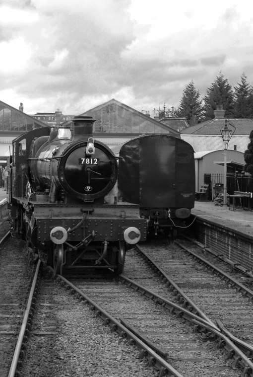
Kidderminster-Bridgnorth Railway Journey:
I went on the trip towards the end of October. I was unaware of Halloween celebrations that were taking place in the Kidderminster train station, as they were doing a Halloween special, steam train ride. This therefore meant that the entire train station had been decorated and dressed in cobb webs, dangling ghosts, ghouls and spiders. Not what I had expected, but it did look exciting. Unfortunately though, I didn’t want to include the Halloween decorations in my work, mainly because I wanted my photographs to look authentic and old fashioned, which meant that I had to avoid as many decorations as possible. This meant that for this assignment, the inside of Kidderminster train station would not work for my final photographs. I would therefore have to rely on the outside, and hope that I could get the interesting shots of trains that I was looking for. The weather outside was a mix between bright sunshine at one moment, cloudy at the next, to rain in the evening. Not the situation for taking the photographs.
When stood on the platform waiting for our steam train to arrive, it was quiet and empty. I thought this would be great as I would be able to capture some great shots of the train arriving at the platform. However, my plan was disrupted by the large amount of people who piled onto the platform around me when the train arrived. I was stood out of the way, camera ready, in order to capture the train moving and pulling into the station, however, after being pushed around and hurried along, as I had to board the train in order to get a seat, I was unable to capture the ‘Perfect’ shot of the steam train arriving. Also, as the weather had created a pure white sky, capturing the white steam plume was hard to capture, as I couldn’t use a tripod on the platform due to the amount of people stood in the way, and the time schedule meant that we had to leave fast. Thankfully, my train carriage was the last one on the train, which meant, when I looked out of the train, I was able to photograph the front of the steam train, changing over, to drive up to the ‘front’ of the train now.
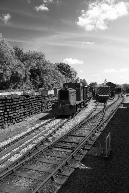
As the journey progressed, and we stopped for a while at several train stations, I was able to photograph train tracks, wheels of the other trains that we had stopped by and a variety of other things. I spent most of the journey with my camera, and my head, out of the pull down window, at the back of the train.
Being high up inside the train carriage, and being at an angle to the other trains, train tracks and locations, I was able to compose very interesting images, similar to Link and Shaughnessy, that I knew would make great monochrome photographs. It was great because one of the train conductors who was an elderly gentlemen, enquired as to what I was photographing. After explaining what I was photographing, he told me that he does photography himself, and in his spare time, he photographs some of the trains he works on. He gave me a few tips and advised me where the best stations were to photograph the ‘ mechanical parts’ of trains were, which was a great help.
I took a large number of photographs that day, and when I got home, I decided to visit the Avon valley railway (Bitton) not far from where I live, in order to photograph some things that I was unable to photograph whilst in Kidderminster. I knew that if I took a ride along the tracks, I would be able to see old trains that were damaged, or broken, as they have a large amount of areas where old trains are parked, along with tools etc, behind the railway station itself.
Choosing my final images, and processing:
I had a large amount of photographs to go through, so I opened up a folder and put what I thought would be the best ones, into it. After that, I narrowed it down to 10 final photographs. I chose ones that I felt showed the best texture, form, details and tonal contrast. I wanted final images that would show unique and interesting compositions, similar to those of Link and Shaughnessy. I used Light Room and Photoshop Elements 9, to process my images. I shot some using JPEG and some using JPEG+RAW. I will discuss each photograph.
Final Photographs:
One
This first image was inspired by both Link and Shaughnessy. Both of them have photographed steam trains with the steam puffing out from the top, and train tracks in the foreground. This image was taken whilst I was standing, looking out of the carriage window, at the end of the train. The front of the train was changing tracks in order to drive up to the top, which would then take us on our way. I composed this image similar to Link and Shaughnessy, so that the train was off centre, in order to allow the train tracks to guide your eye diagonally, from the train to the bottom of the foreground. It gives the train a ‘Moving’ feeling. The weather at the time, meant that the sky was almost pure white, with hints of clouds, therefore, the white plumes of steam were not 100% clear and visible when shooting in colour.
The colour version of this image was very distracting. It contained a mixture of red, green, grey and brown. Details and texture were not that striking due to the weather and you were definitely distracted by the colour. I converted the image to black and white, and adjusted each colour saturation slider, in order to darken or lighten certain areas of the image. I adjusted the contrast, shadows, highlights, sharpened some of the details, and dodged and burned a few places, in order to bring out more detail. The cloud area was the hardest to dodge and burn, because of the plume of steam. It took me a while to get the plume of steam into the image, as I had to contend with the white sky area as well.
Now that this image has been converted to monochrome, you are able to see a range of tonal contrast. The whites are still a little grey in tone, however this is something which can be altered if necessary in the future. The details and texture of the tracks, bolts and surrounding areas and objects are very noticeable. They could have been clearer if I had used a tripod, however, I was unable to at the time and the train was also moving, therefore, I had to shoot before it drove past.
Two
The second image contained a bright blue sky, bright green train, and green trees. Colour with this image was a distraction. Some areas were dark and you were unable to see all of the detail, especially towards the bottom of the frame. However, I knew that this situation contained a lot of tonal contrast, a lot of texture, form and details, and would make a striking monochrome image.
I remembered the quote from Rensselaer Magazine, regarding Shaughnessy’s work “His unusual angles made the viewer part of the action” I composed this image in order to lead the viewers eye through the photograph, and to give you the feeling of being on board the train, just about to pull up to the station. It’s also a composition which gives you the feeling that you are either stood on the tracks, walking forward.
I converted this image to black and white, and adjusted the colour saturation sliders in order to lighten or darken certain areas of the image. I adjusted the contrast, shadows, highlights, sharpened the details in the image, and dodged and burned a few places, to bring out more detail, especially in some of the darker areas. I slid the blue colour saturation slider, in order to make a dramatic looking sky, in order to create more tonal contrast.
Three
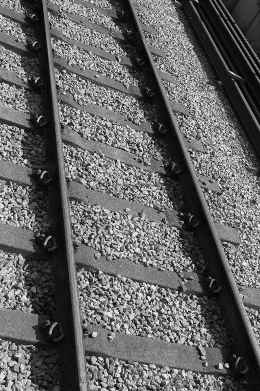
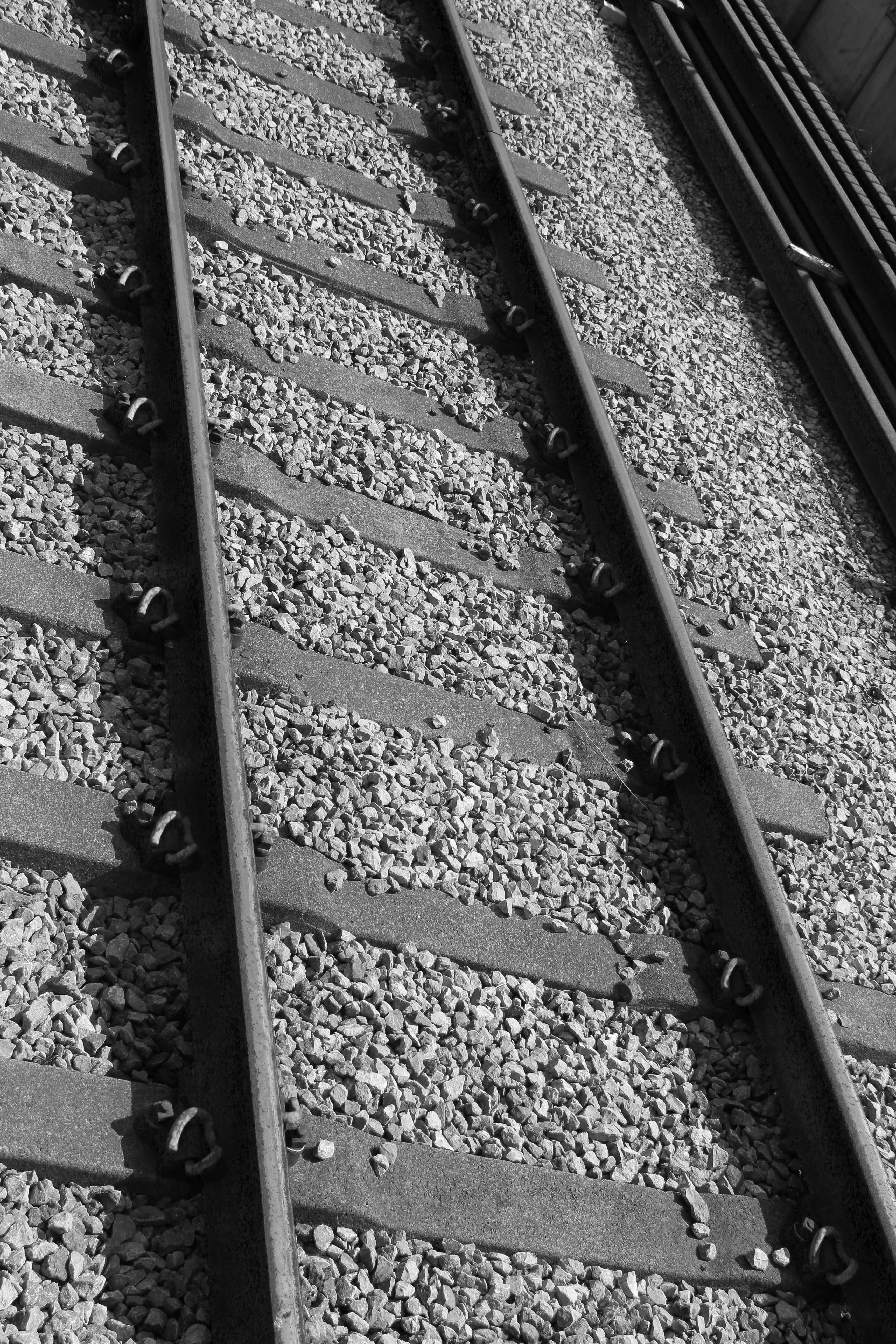
The third image was taken whilst stationed at a platform. I was stood looking out of the window, at an angle. I noticed that these train tracks would make a great monochrome image, simply because there was no colour, except grey and brown. I remembered that the online digital photography school quoted that simplicity is the key to a great tonal contrast image.The grey rocks/stones, would be great for texture and form, and the tonal contrast between the metal tracks and the grey rocks, would be very striking when in monochrome.
Similar to the previous image, I remembered the quote about Shaughnessy and his unusual angles. I composed this image diagonally in order to lead the viewers eye through the photograph. I wanted to create an abstract image.
I converted the image to black and white, adjusted the colour saturation sliders to darken and lighten certain areas in the image. I then sharpened the detail, adjusted the contrast, brightness, highlights and shadows. I dodged and burned a few places to lighten some of the areas, in order to make the detail sharper.
Four
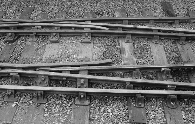
The fourth image was also taken whilst stationed at a platform. I admired the amount of detail in the train tracks. I noticed that this would be great for showing tonal contrast and texture, and with it being a crossed over pair of tracks, I knew that it would make an interesting monochrome image.
I decided to compose this image horizontally, in order to fill the frame, because I wanted the focus to be on the detail of the tracks.
I processed this image the same as the image above.
Five

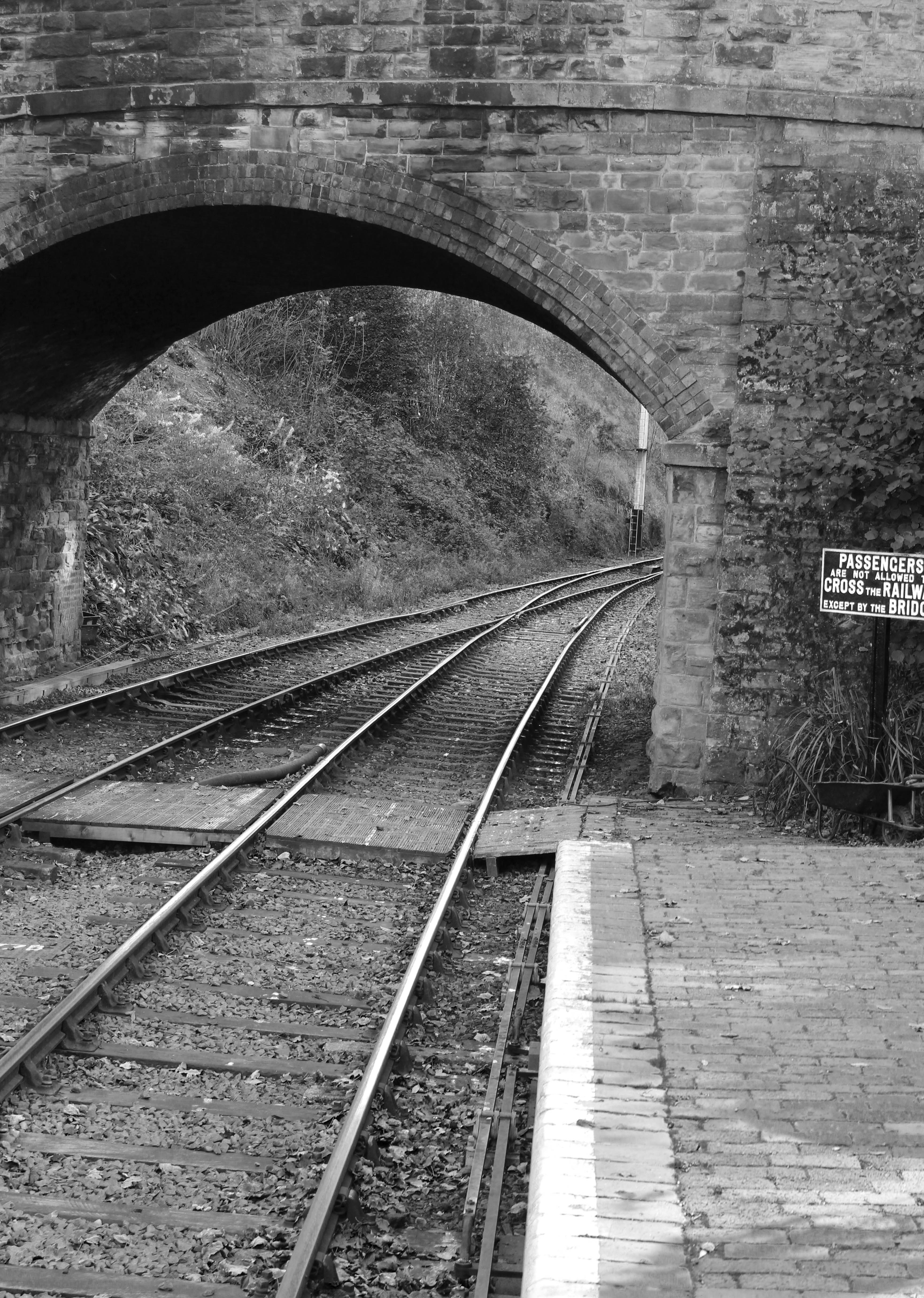
The fifth image was taken whilst stationed at a platform. I know I mentioned that I didn’t want to photograph the train stations or platforms, however, I decided to take this photograph because I thought it would be interesting. I spotted the texture and shapes of the brickwork on the bridge and platform. I knew that there was a lot of detail, texture and form in this image, and I knew it would make an interesting monochrome image, because there was a lot of tonal contrast.
I composed this image, in order for the viewer to see the bend of the train tracks. It leads the eye, and leaves this photograph open to the viewers interpretation. It’s a photograph that makes you think. Are you waiting for a train to arrive? Do you want to follow the line and see where it goes? What is around the corner?
I converted this image to black and white. Adjusted some of the colour saturation sliders in order to lighten or darken certain parts of the image. I then sharpened the detail, adjusted the contrast, brightness, highlights and shadows. I dodged and burned a few places to lighten some of the areas, in order to make the detail sharper.
Six

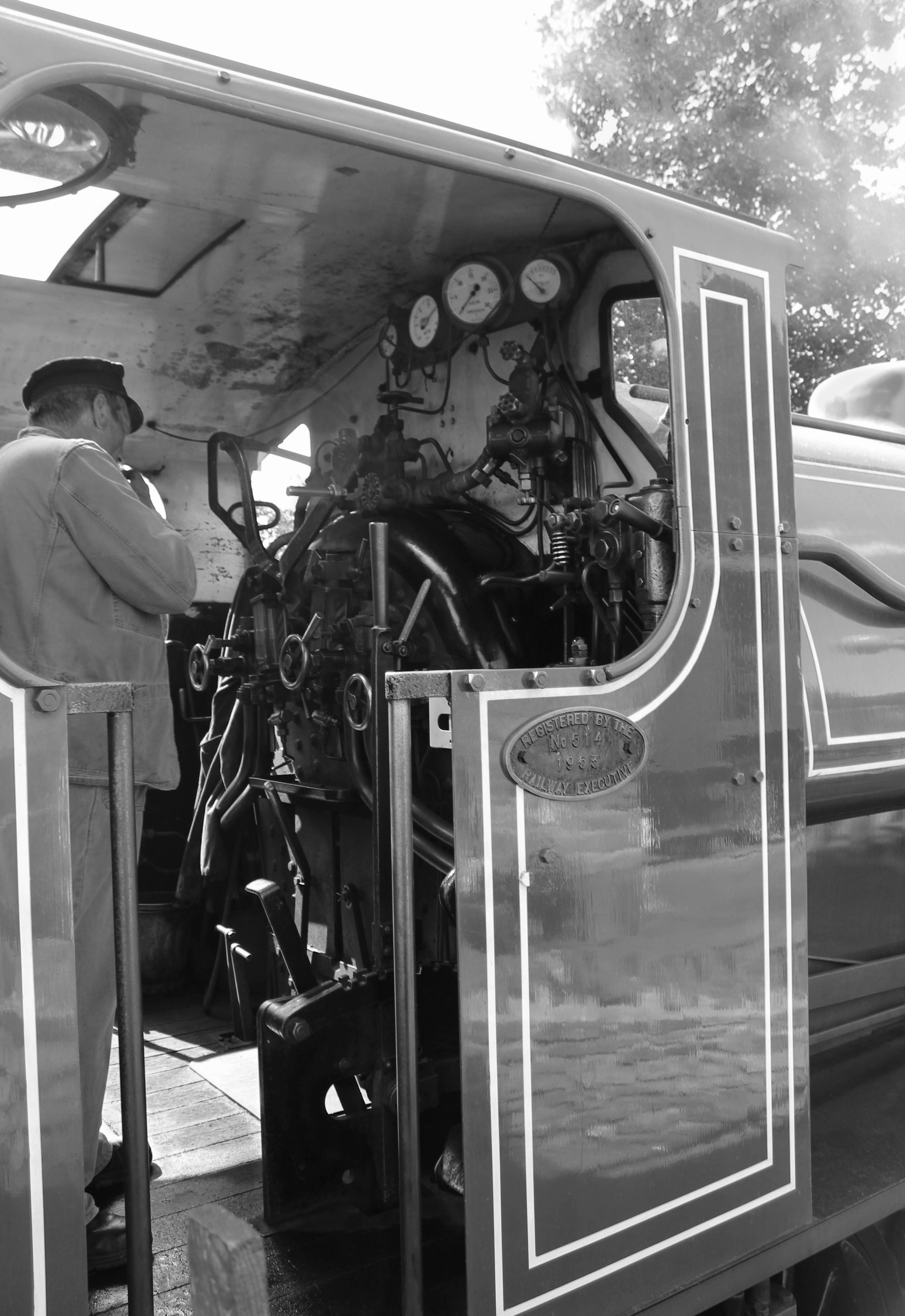
Shaughnessy quotes “I like pictures with people in them or something, not contrived, that capture a moment in time”
“his inclusion of people broadened the scope of traditional rail photography” Rensselaer Magazine 2008 (Shaughnessy)
The sixth image is of the train driver. I took several of the train drivers whilst working on the train, but this was one of the best I could capture in time. I stood at an angle for this image because I wanted to include the driver, and the insides of the engine room. I knew that area contained a lot of form, texture and tonal contrast.
However, It was also one of the difficult ones to process. The coloured version of this image, only contained brown, black and blue. Nothing too over powering. The sky was over exposed, and had loss of information in areas. When I converted this image to black and white, I had to adjust a lot of settings, in order to still have the tonal contrast, but to show the inside of the engine room detail, which, when converted to black and white, became slightly too dark. I used dodge and burn for the insides of the engine area, in order to bring out the detail of the ‘Nuts and bolts’. I darkened the drivers uniform slightly.
Seven
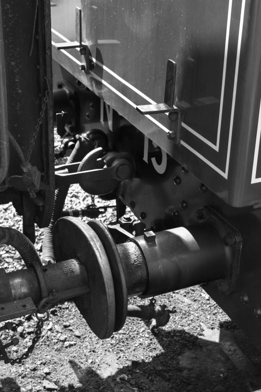
“His interest in mechanics led to striking close-ups” Rensselaer Magazine (Shaughnessy)
I remembered the quote regarding Shaughnessy’s love of mechanics, which lead to interesting close up images. For this seventh image, whilst stood on a platform, I positioned myself as close to the edge as possible, in order to photograph the mechanism that joins the two carriage’s together.
As there was no colour to this, except black, red and grey, I knew it would convert to a great monochrome image. I converted it to black and white, and adjusted some of the colour saturation sliders. I also adjusted the contrast, brightness, highlights and sharpened the details in the image.
Eight

“His interest in mechanics led to striking close-ups” Rensselaer Magazine (Shaughnessy)
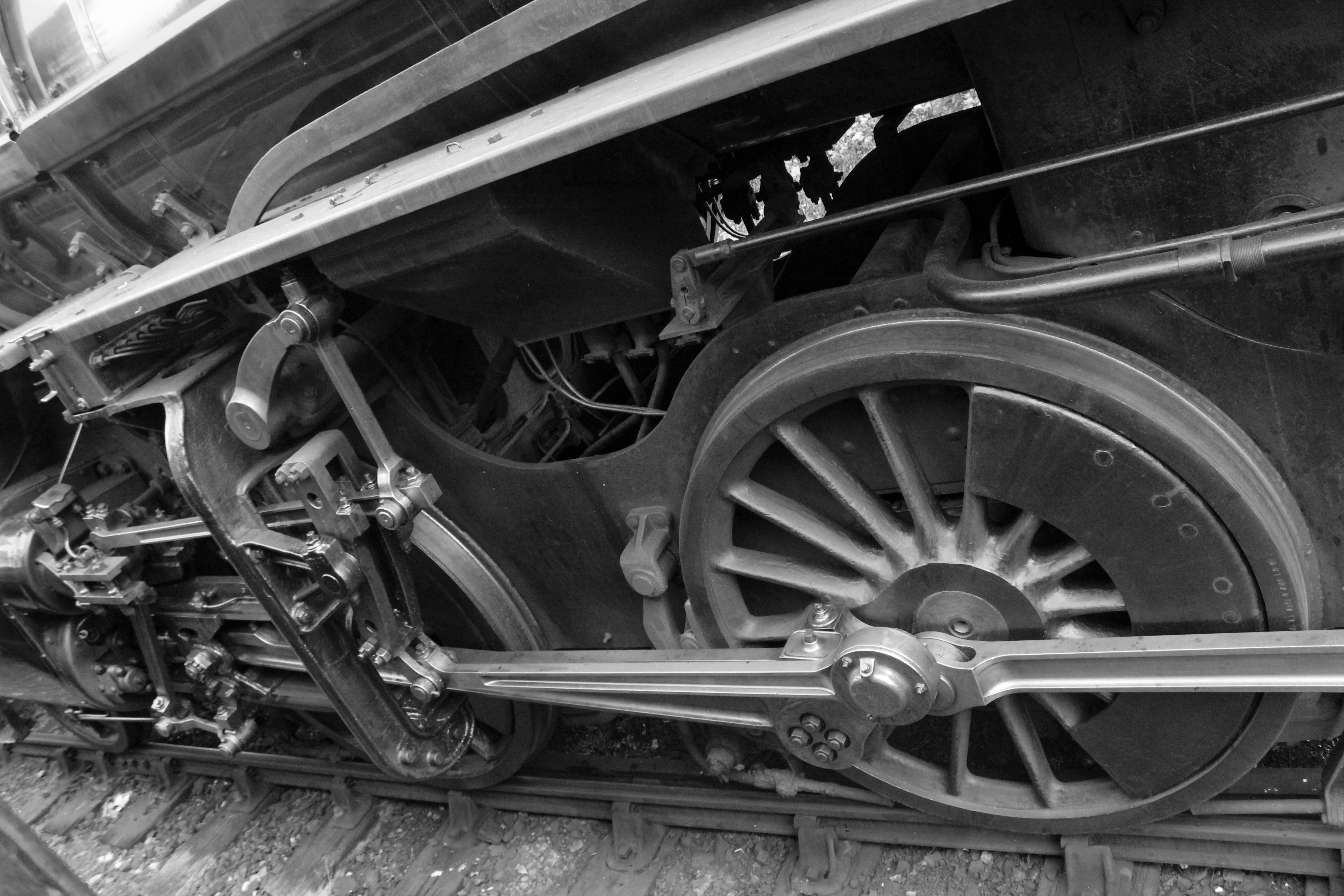
For this eighth image, I was leaning out of the window, whilst stationed at a platform. Another steam train was stationed at the opposite platform. I remembered O. Winston Link’s photograph (Lubricating wristpin), of the giant steam train wheels. I knew this would be perfect as a monochrome image, and is similar to Link’s photograph which is just what I wanted.
Being higher up on the train, I was able to get a better view of the wheel area and the mechanical parts. Because I was stood looking out of the window, the image would have to be horizontal, and at some sort of angle, in order for me to capture the full detail, similar to Link’s photograph, only his image was taken whilst knelt down.
As there was no colour to this, except black and grey, I knew it would convert to a great monochrome image. I converted it to black and white, and adjusted some of the colour saturation sliders. I also adjusted the contrast, brightness, highlights and sharpened the details in the image.
Nine
For the ninth image, I spotted this old, rusty, broken train, parked and left in a corner of the train station. The train was bright red and bright blue, with huge brown rusty spots. The colour was distracting, however, my eyes were draw into the detail of the broken, rusty areas, which I found fascinating. I walked over, and positioned myself. I took several pictures of this in different angles, horizontal and vertical, however, I found the vertical to be more effective. I knew that with the amount of damage, texture and form, this would make a unique, striking final photograph.
I converted this to black and white, and instantly, it became a striking image. I adjusted the colour saturation sliders to darken the train, and the sky area, but I lightened the highlights and grey areas, in order to bring out the detail. I also used doge and burn for some of this. I sharpened the image, to see all of the amazing broken and rusty areas, which were perfect for showing texture, and tonal contrast.
I would go on to say that this would be one of my favourites.
Ten
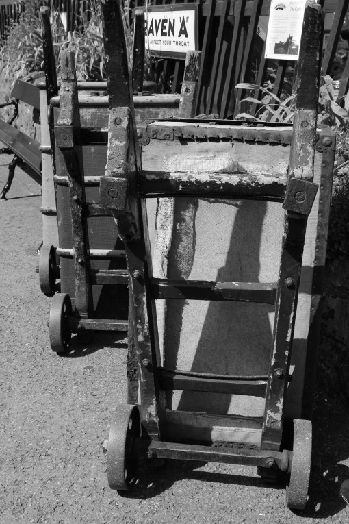
For the tenth image, I spotted these old, battered suitcases, on old trolley jacks, placed on the side of the platform. They were different shades of brown and beige, on dark red trolley jacks. The texture of the ripped fabric, and the bolts and screws were very interesting. I knew that it wasn’t a train or a mechanical section of the train, however, I really liked the detailing and texture of these.
I composed this image so that the suitcases were almost at a diagonal within the frame, which would lead your eye through the image.
When I converted this image to black and white, I adjusted the colour saturation sliders in order to lighten or darken certain areas. I adjusted the contrast, shadows, highlights, sharpened the details in the image, and dodged and burned a few places, to bring out more detail, especially in some of the darker areas.
Conclusion:
Knowing that I was set to go on the trip to Kidderminster and taking the steam train, allowed me to plan this assignment in advance. Yes, I did have problems, which I have discussed above, regarding not knowing that the station area would be decked out in Halloween decorations, a lot of people pushing and shoving to get to see the train and weather. However, I believe that I have achieved what I set out to achieve. Having researched O. Winston Link and Jim Shaughnessy previous to the assignment, I was able to draw inspiration from their work, and I was able to take photographs that were unique to me, with thanks to the inspiration I gained from them.
I kept remembering quotes that I read from online articles; “Look out for subjects that feature simple, strong lines and shapes” “To introduce a feeling of drama, movement or uncertainty, look for diagonal lines instead” “His interest in mechanics led to striking close-ups” Remembering these quotes, allowed me to look out for picture situations that I wouldn’t usually have photographed, and composed images in ways I wouldn’t usually.
I believe that I have produced a set of photographs that are interesting and unique. I have not seen many pictures of rusty trains or the mechanical side of trains. I think my images show a range of tonal contrast, texture and form.
I do admit that I am still learning how to use my Light room, for processing my images. The version of Photoshop Elements I have doesn’t process RAW images, nor does it allow some adjustments, that I can get when using Light Room. I don’t usually shoot with intent to convert to monochrome, so for me, this exercise was a learning process, with regards to shooting the correctly exposed image for a conversion of black and white, and when processing a monochrome image. I do believe that I could process my images some more, however, I would need to read some more online forums and watch some more processing videos, in order to learn new techniques which would help me when processing my images,
However, as stated before, I am pleased with my final images. I will wait now for my tutors feedback, which I will post on here.
References:
John Hedgecoe 2005. John Hedgecoe’s Complete Guide to Black and White Photography. Collins & Brown, London.
ISBN: 1 84340 316 1
Monochrome Article by Jeff Meyer, January 26 2015
http://www.digitalcameraworld.com/2012/04/12/10-rules-of-photo-composition-and-why-they-work/
McCurry, Steve.
Afghan Girl, Steve McCurry 1984, Afghanistan. Published on National Geographic Front Cover, June 1985.
http://stevemccurry.com/galleries/portraits?view=grid
Practical Photography Magazine, September 2013. Practical Photography Camera School Guide, Pages 10 -11. Article by Paul Gallagher.
Lindbergh, Peter.
Kate Moss, Peter Lindbergh, Published in Vogue Italia 2015.
http://www.fubiz.net/en/2016/01/30/kate-moss-unphotoshoped-portraits-by-peter-Lindbergh/
Testino, Mario.
Diana, Princess of Wales, Mario Testino, London, Vanity Fair 1997.
Diana, Princess of Wales
Article – Testino’s portrait of William and Kate By Jonathan Jones. Published on The Guardian, July 09 2015.
http://www.theguardian.com/commentisfree/2015/jul/09/mario-testino-portrait-william-kate-children
The Duchess of Cambridge, Princess Charlotte, Prince George and Prince William. Princess Charlotte’s christening, London 2015. By Mario Testino
Prince George and Prince William, Princess Charlotte’s Christening. London 2015, By Mario Testino
Adams, Ansel.
Ansel Adams Photographs. Leopard 1995.
ISBN: 0-75-0017-X
Rose on Driftwood. Ansel Adams 1933. Gruber Collection. Published in 20th Century Photography, Museum Ludwig Cologne, Taschen, London 1996.
ISBN: 3-8228-8648-3
The Zone System, Produced by Ansel Adams and Fred Archer, 1939-1940. Article written by Trudy Wilner Stack, Curator on Creative Photography Website.
Ansel Adams Branson Wedding Photographer
Evening, Ansel Adams. McDonald Lake, Glacier National Park. 1933-1942. Published in Mater of Light, Ansel Adams and His Influences. Therese Lichtenstein, Todtri, New York 1997, Page 101.
ISBN:0-7651-9150-4
Yosemite Valley Winter, Ansel Adams. Yosemite National Park 1938
Boaring River, Ansel Adams. Kings Region, Kings River Canyon. 1933-1942. Published in Mater of Light, Ansel Adams and His Influences. Therese Lichtenstein, Todtri, New York 1997, Page 99.
ISBN:0-7651-9150-4
Winston Link, O.
O. Winston Link, Biography, article written on Danziger Gallery Website.
http://www.danzigergallery.com/artists/owinston-link
Life Along the Line, A Photographic Portrait of America’s Last Great Steam Railroad. Abrams, 2012.
ISBN: 978-1419703720
Train 2 arriving at Waynesboro Station. O. Winston Link. Waynesboro, Virginia, April 14th 1955. Published in Life Along the Line, A Photographic Portrait of America’s Last Great Steam Railroad. Abrams, 2012.
ISBN: 978-1419703720
Lubricating wristpin. O. Winston Link. Bluefield, West Virginia, June 20th 1955. Published in Life Along the Line, A Photographic Portrait of America’s Last Great Steam Railroad. Abrams, 2012.
ISBN: 978-1419703720
Train #17, the Birmingham Special, arriving at Rural Retreat. O. Winston Link. Rural Retreat, Virginia, December 26th 1957. Published in Life Along the Line, A Photographic Portrait of America’s Last Great Steam Railroad. Abrams, 2012.
ISBN: 978-1419703720
Electrician J. W. Dalhouse, a close-up view. O. Winston Link. Shaffers Crossing, Roanoke, Virginia, March 19, 1955. Published in Life Along the Line, A Photographic Portrait of America’s Last Great Steam Railroad. Abrams, 2012.
ISBN: 978-1419703720
O. Winston Link Article, A Gorgeous Photographic Elegy to the Last Great Steam Train. By Rebecca J Rosen. Published on The Atlantic website, October 4th 2012.
http://www.theatlantic.com/technology/archive/2012/10/a-gorgeous-photographic-elegy-to-the-last-great-steam-train/263220/
Shaughnessy, Jim.
The Call of Trains: Railroad Photographs by Jim Shaughnessy. W. W. Norton & Company, New York, 26th August 2008.
ISBN: 978-0393065923
On a Cold Night in Sherbrooke, Que. Jim Shaughnessy, February 1957. The Engineer of Canadian National 4-6-2, No 5293 admires his steed. Published in The Call of Trains: Railroad Photographs by Jim Shaughnessy. W. W. Norton & Company, New York, 26th August 2008.
ISBN: 978-0393065923
Jim Shaughnessy Photographs, Taken from The Call of Trains: Railroad Photographs by Jim Shaughnessy book. Published in The Call of Trains: Railroad Photographs by Jim Shaughnessy. W. W. Norton & Company, New York, 26th August 2008.
ISBN: 978-0393065923
http://railroad.net/articles/columns/reviews/thecalloftrains/
Article Chasing Trains, Jim Shaughnessy, By Margaret M Knight, Published on Rensselaer Magazine. December 2008
http://www.rpi.edu/magazine/dec2008/chasing_trains2.html
Article Jim Shaughnessy, Published on Classic Trains Magazine, May 09th 2006. Taken from Classic Trains Magazine Fall Issue 2001.
http://ctr.trains.com/railroad-reference/photographers/2006/05/jim-shaughnessy